A Placement can be technically complete and still be difficult to understand. The image may look attractive at full size but become unreadable on the Canvas. The title may promise one thing while the website link opens a general home page. A larger rectangle may create more room without giving the visitor a stronger reason to click.
The solution is not automatically more pixels. Start by making five parts agree: the action you want, the main visual, the selected area, the written message and the page that opens next. When those parts form one short path, your small promotion becomes easier to understand and easier to measure.
Start with one job for the Placement
Choose what the right visitor should understand or do. A designer may want people to open one portfolio project. A local service may want an enquiry. A new shop may want a visitor to inspect one product. A charity may want somebody to read about a campaign before deciding whether to help.
Write that job in plain language. “Promote my brand” is too broad to guide an image or destination. “Help people who like hand-drawn animal portraits find my commission page” is specific enough to shape every choice that follows.
- Recognition: show a memorable name, product or visual style.
- Discovery: lead to a portfolio, story, event or useful page.
- Action: invite an enquiry, signup, download or purchase.
A single Placement can support more than one long-term business goal, but its first impression should have one main job. Several small promises, multiple logos and a paragraph of text usually compete for the same limited space.
Design for recognition before detail
Your source image may contain thousands or millions of pixels. The public Canvas shows it inside the rectangle you select, and visitors can view the Canvas at different sizes. Fine lines, long sentences and several equally important objects can lose their hierarchy when the Creative is reduced.
Keep one strong subject: a face, product, character, symbol, short phrase or recognisable logo. Use a clear difference between the subject and its background. The W3C Web Accessibility Initiative recommends sufficient foreground-to-background contrast and warns against relying on colour alone to communicate meaning. Its designing for accessibility guidance also recommends considering different viewport sizes and readable text.
This does not mean every Creative must look minimal. Detailed artwork can work when its silhouette or main subject remains recognisable. The permanent record and destination page can carry the close-up details, longer explanation and full story. The Canvas image first needs to earn enough curiosity for somebody to inspect it.
Choose the smallest area that stays understandable
Area should serve readability, not an abstract belief that bigger always performs better. Preview the Creative at the actual rectangle shape. If the subject is recognisable, the important text is readable and the image does not look accidental, the area is doing its job. If not, first try simplifying or reframing the artwork. Buy more room only when the message genuinely needs it and the larger cost still fits your test budget.
A square logo may remain clear in a compact square. A landscape portfolio image may need a wider rectangle. A poster with a headline may need enough height for the headline to survive. There is no universal best number of pixels because the necessary space depends on the visual, the words and the intended viewing size.
| What you see in Preview | Try before buying more pixels | When more room may help |
|---|---|---|
| Text becomes a grey line | Shorten it or move the explanation to the record | A short, essential name is still unreadable |
| The subject disappears into the background | Increase contrast or remove competing details | The subject needs a wider or taller shape |
| The crop removes an important edge | Use Show full image or reposition the frame | The complete composition needs visible breathing room |
| The image is clear but the purpose is vague | Improve the title and destination | More area will not repair an unclear promise |
Use Show full image and Fill area deliberately
LatticeSpot provides two framing choices. Show full image keeps the entire source visible. When the source and selected rectangle have different proportions, the unused space is treated as part of the presentation rather than stretching the image. Fill area fills the rectangle and crops the parts that extend beyond it. The same framing is carried into the published Placement.
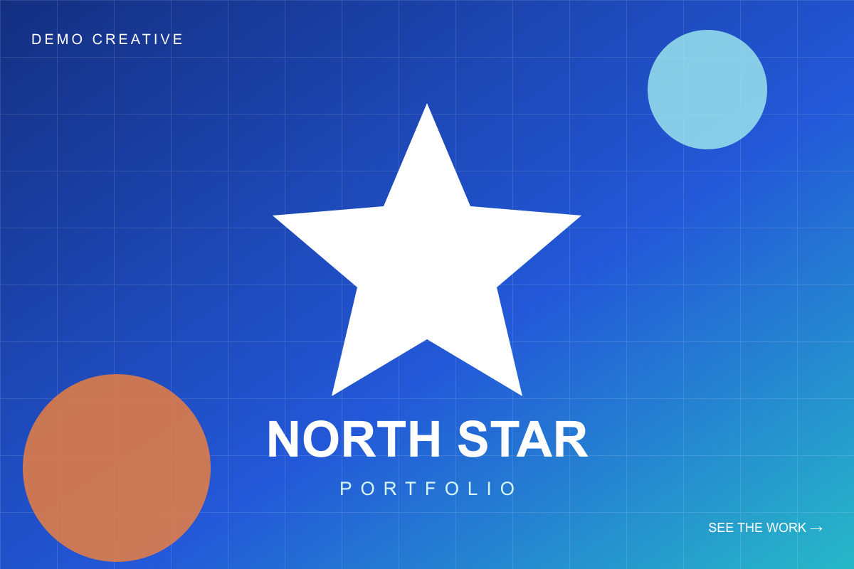
Every edge remains visible. The central subject is slightly smaller.
The rectangle is fully covered. Some top and bottom detail is cropped.
Use Show full image when every edge matters: logos, posters, certificates, packaging or artwork with text near its boundaries. Use Fill area when a photograph or illustration has safe space around the subject and a clean crop produces a stronger block. In either mode, inspect the smallest expected view. A crop that looks dramatic on a large monitor may remove the product or face on a phone.
The practical test above establishes a visual trade-off, not a performance winner. Until enough comparable, anonymised results exist, it would be misleading to claim that either framing mode produces more traffic.
Make the title and image tell the same story
The title should identify what a visitor is seeing, not repeat a slogan that only the owner understands. A photograph of a ceramic mug with the title “Handmade cups from Penang” forms a clear pair. The same photograph with the title “Dream Bigger” may be attractive but gives the visitor less evidence about where the link leads.
Use the short introduction for one useful detail: what the work is, who it is for or what appears after the click. Avoid stacking several calls to action. The visitor will make the next decision on your destination page.
Send visitors to the page that continues the promise
The best destination is usually the most relevant public page that can complete the Placement’s job. A home page is reasonable when the Creative introduces the whole organisation and the home page immediately explains it. A specific product, portfolio or event page is stronger when the Creative features that exact item. A dedicated landing page is useful when you need one focused offer and one measurable action.
Google Ads describes landing-page experience in terms of relevance and usefulness. Its landing-page guidance recommends making the intended action easy, keeping important information visible and avoiding unnecessary clutter. The principle remains useful for a small referral experiment even when you are not running Google Ads.
Before using the URL, test it on a phone and in a private browser window. Confirm that HTTPS works, the promised content appears, the primary action is obvious and an unexpected login wall or popup does not hide the page. Do not send visitors to a page merely because it is your most important page internally; send them to the page that makes the most sense after the Creative they saw.
Label the visit before it happens
Add consistent UTM parameters if your analytics setup uses them. Google Analytics explains that utm_source, utm_medium and utm_campaign can identify custom campaign traffic in the Traffic acquisition report. Keep the names lowercase and stable so one test is not fragmented into several rows.
https://example.com/commissions?utm_source=latticespot&utm_medium=referral&utm_campaign=portrait_launch&utm_content=star_creativeThe Google Analytics URL builder documentation explains the available fields. Never put private customer information into a UTM value because URLs can appear in reports, browser history and logs.
Use the permanent record as a second doorway
A published Placement receives a permanent record with its own URL. That page keeps the Creative, public introduction, coordinates and history together, subject to safety and moderation rules. Share this record when people need context before visiting the destination: in a portfolio update, social post, newsletter or article about the work.
The record does not make the live Canvas position permanent, and sharing does not guarantee that a social network will distribute the post. It does give you a stable public page that can continue representing that particular publication even as the shared Canvas evolves.
Measure the next useful action
Public Display Time records how long a Placement was publicly displayed; it is not a count of impressions. Eligible Placements may show cumulative outbound clicks, which count qualifying Destination-link activations. They are not guaranteed visitors, unique people, completed page loads or conversions.
Complete the picture with your own site analytics. Compare the tagged sessions with the action selected at the beginning: a project view, signup, enquiry, download or purchase. Our small-promotion measurement guide explains why platform clicks and destination sessions may differ and provides a simple measurement sheet.
- Placement job
- What should the right visitor understand or do?
- Main visual
- Can it be recognised without reading a paragraph?
- Area and framing
- Is the smallest preview clear in Show full image or Fill area?
- Message match
- Do image, title, introduction and destination make one promise?
- Measurement
- Which UTM label and useful action will answer the test?
Change one variable at a time
If people activate the Destination link but do not complete the next action, review the landing page and message match before increasing the area. If the Creative is hard to recognise, test a cleaner image or different framing. If nobody can explain what the Placement offers, simplify the title. Changing the image, area, title and destination together makes it difficult to learn which change mattered.
Label your conclusions honestly. A current interface rule is a Product fact. A comparison you can see in Preview is a Practical test. A claim about what improves clicks requires enough comparable evidence to become a Data-backed pattern. This guide contains product facts and practical tests; it does not claim a proven click-maximising formula.
Preview the whole path before you pay.
Choose an area, compare the framing and check the destination while the Placement is still a draft.
Choose pixels →