Bag Balm
The familiar green tin connects a seasonal hero to a compact range of care products.
Website overview
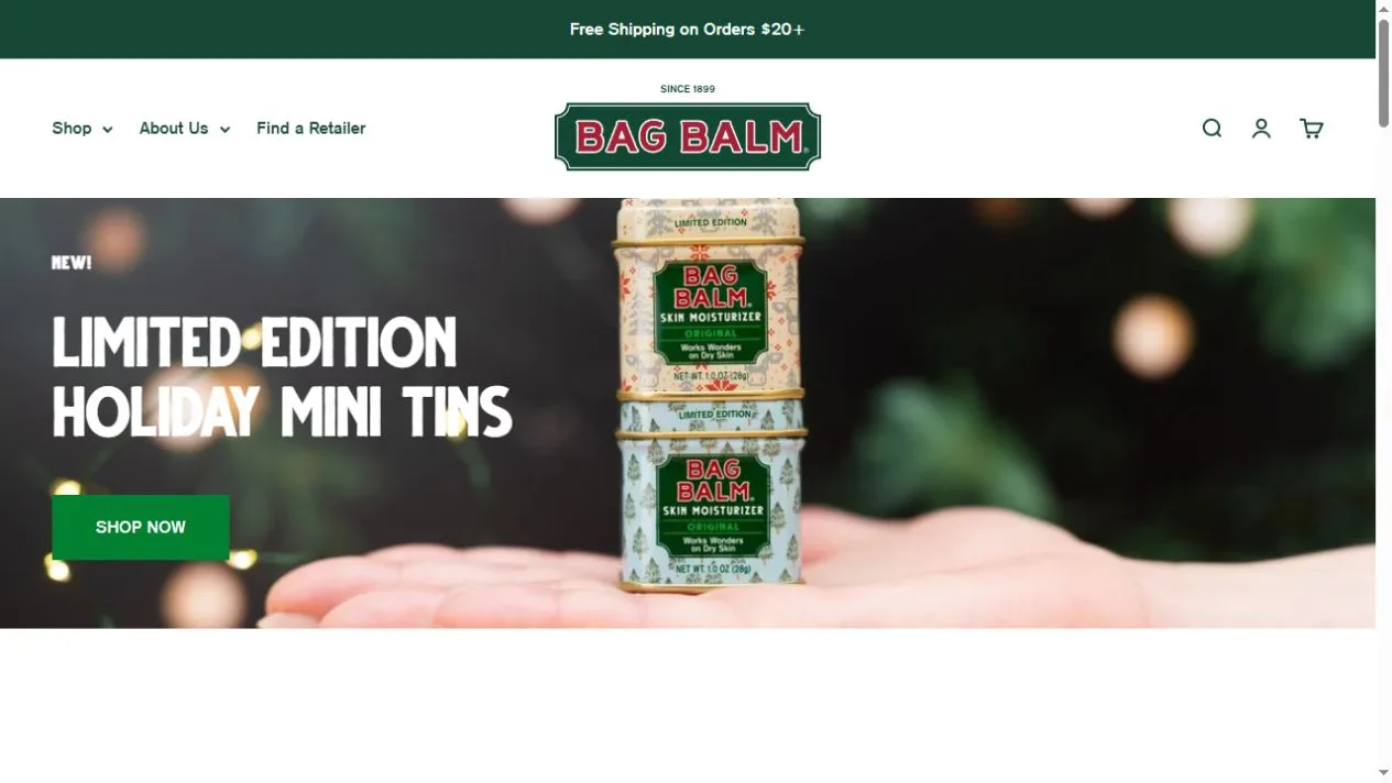
Bag Balm uses its packaging as a visual anchor for a store that sells tins, lip balm and other personal care products. The holiday hero shows stacked tins at close range. The red wordmark, deep green navigation and straight product grids connect the campaign with the rest of the storefront. The captured layout gives the tin a bigger role than any decorative graphic.
What caught our eye
On the first screen, the green packages remain the center of attention against a soft, dark background. A narrow stack of tins gives the photo a recognizable silhouette. The image communicates a seasonal edition through packaging details, while the nearby shopping button gives the feature a concrete purpose.
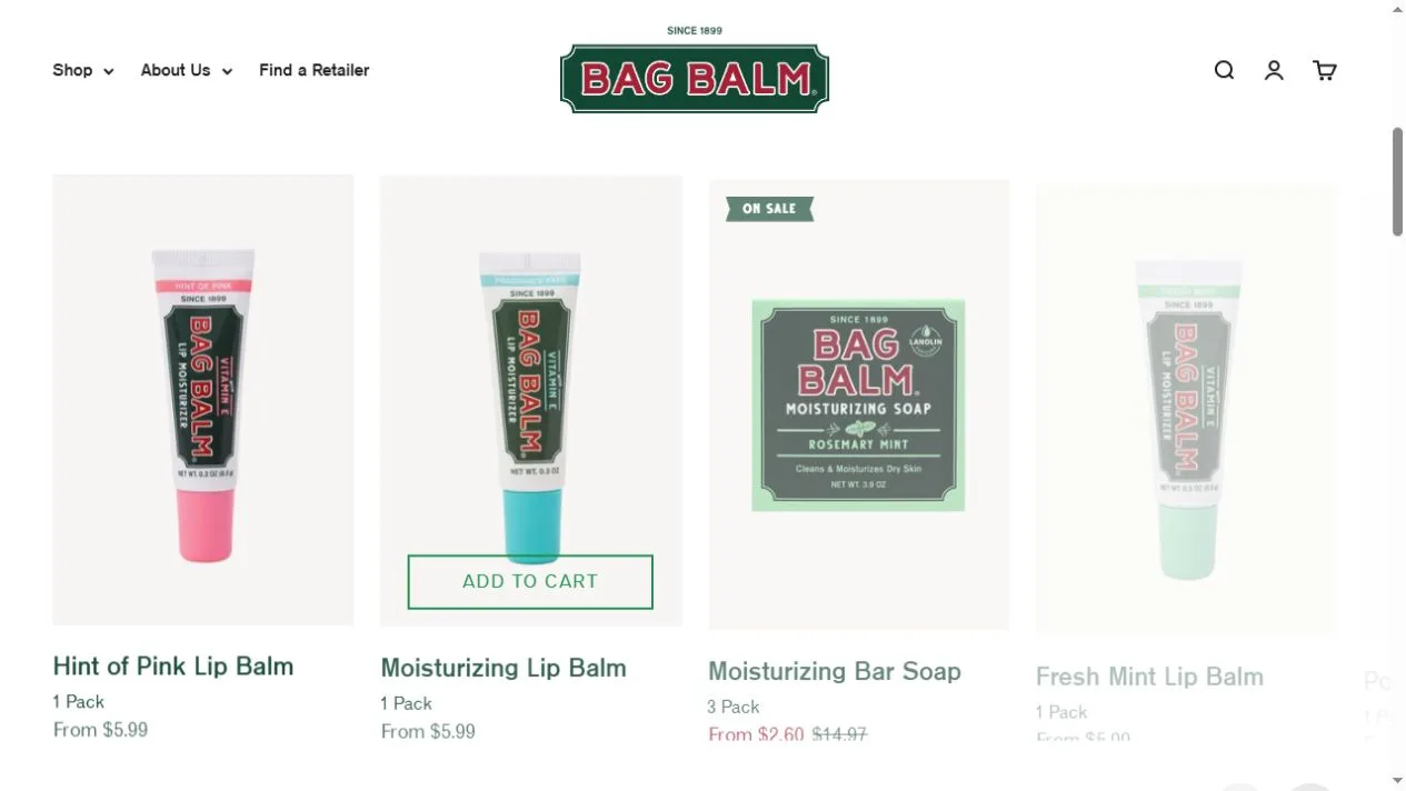
The bestsellers section changes the photography to a simpler presentation on light backgrounds. That shift makes the tube, tin and bar easy to distinguish. Prices and product names appear in a similar place across the row. Notice how this more neutral layout still feels connected to the hero because green returns in type, packaging and shopping controls.
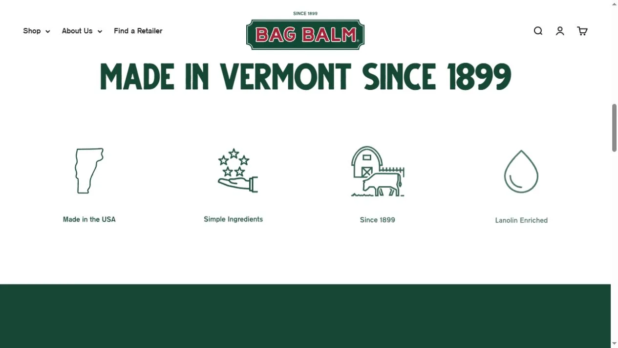
The heritage section uses a prominent Vermont heading and a row of small line icons. The page can tell a longer brand story elsewhere, while this section supplies quick cues about origin and product identity. A maker with a recognizable container can use this layout as a reference for carrying that container across seasons. Keep the signature colors and label easy to recognize, then use the surrounding photography to signal what is new.
Who might find it useful?
Designers and founders studying branded storefronts.
Website screenshots