Small business
Liz Wilcox
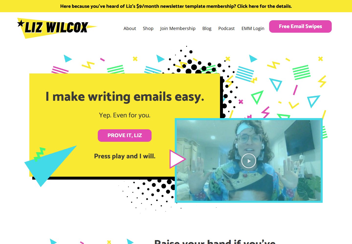
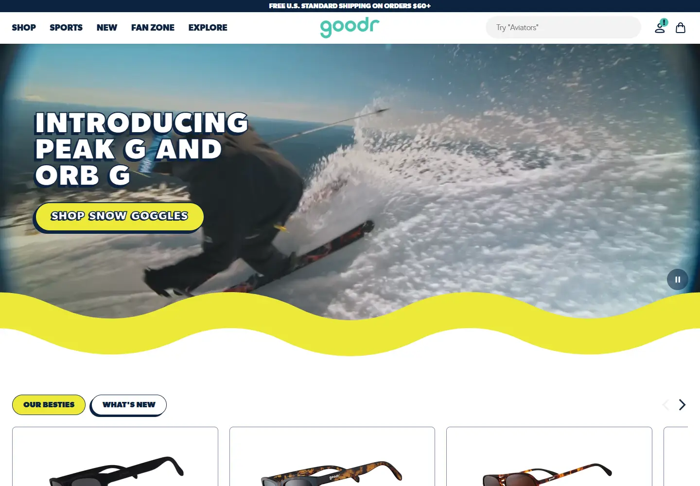
A yellow hero, a pink invitation and a face behind the promise.
View placement →80 websites
Browse by colorColorful websites10 examples. Bold backgrounds, bright accents and unexpected pairings.Explore the color study →A yellow hero, a pink invitation and a face behind the promise.
View placement →
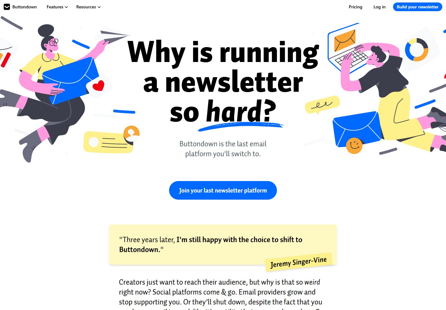
A newsletter service that leads with the writer’s frustrations.
View placement →
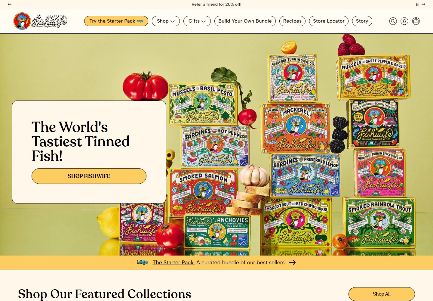
Illustrated tins fill the hero; a quiet title card makes room for the message.
View placement →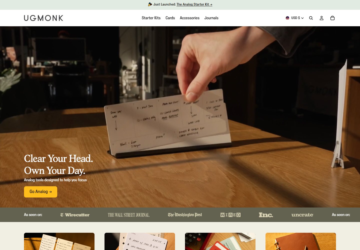
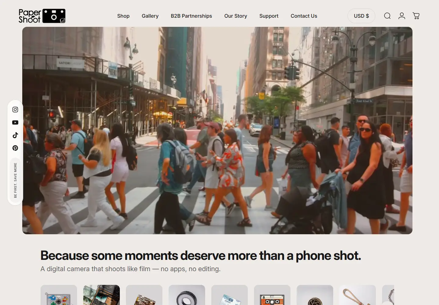
Warm desktop scenes, a yellow shopping cue and paper tools shown in use.
View placement →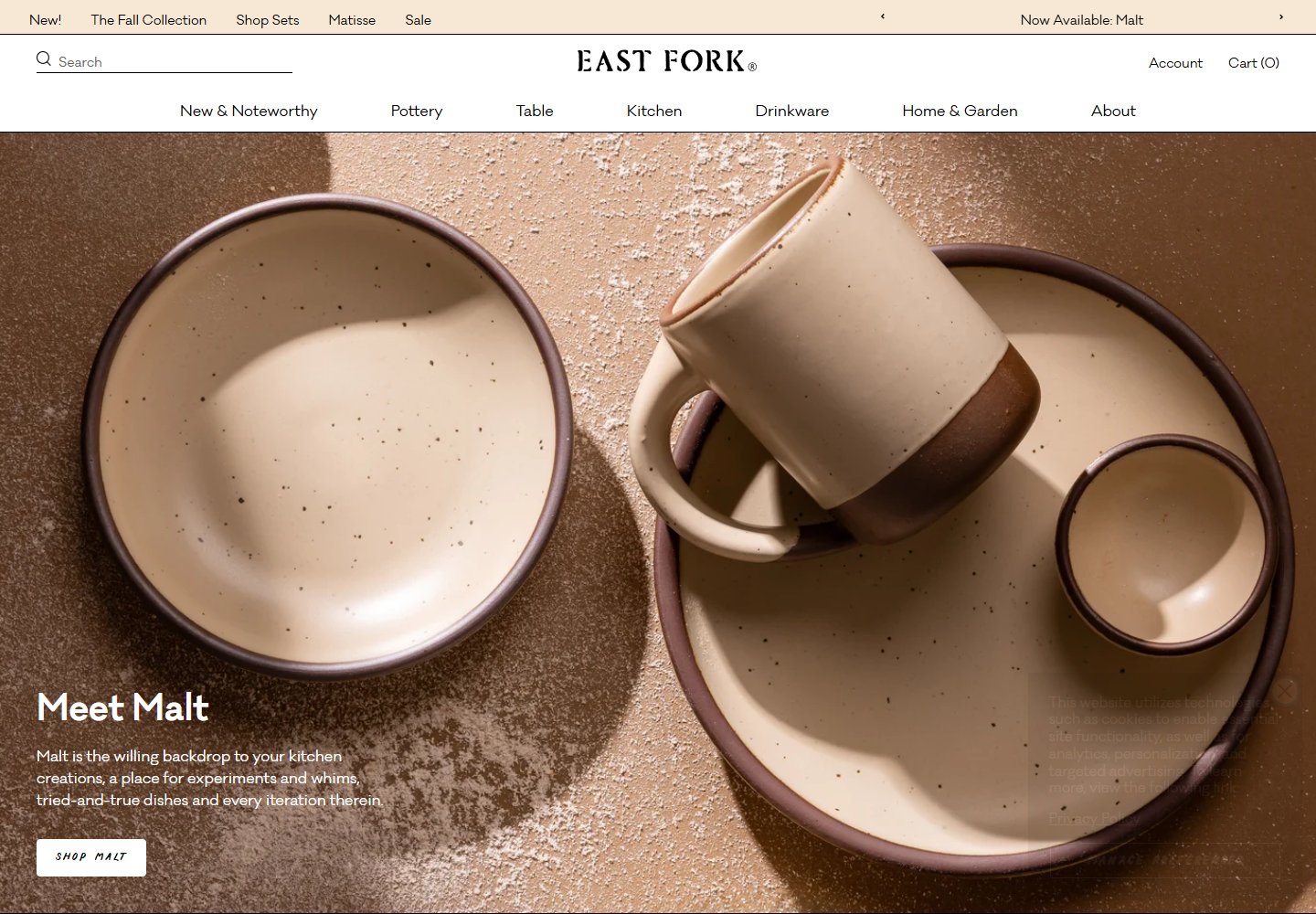
Oversized pottery photography turns glaze and texture into the homepage hero.
View placement →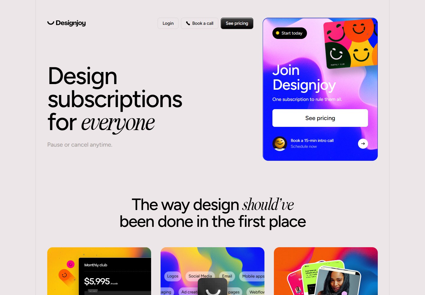
Oversized type meets a vivid membership card, with pricing beside the promise.
View placement →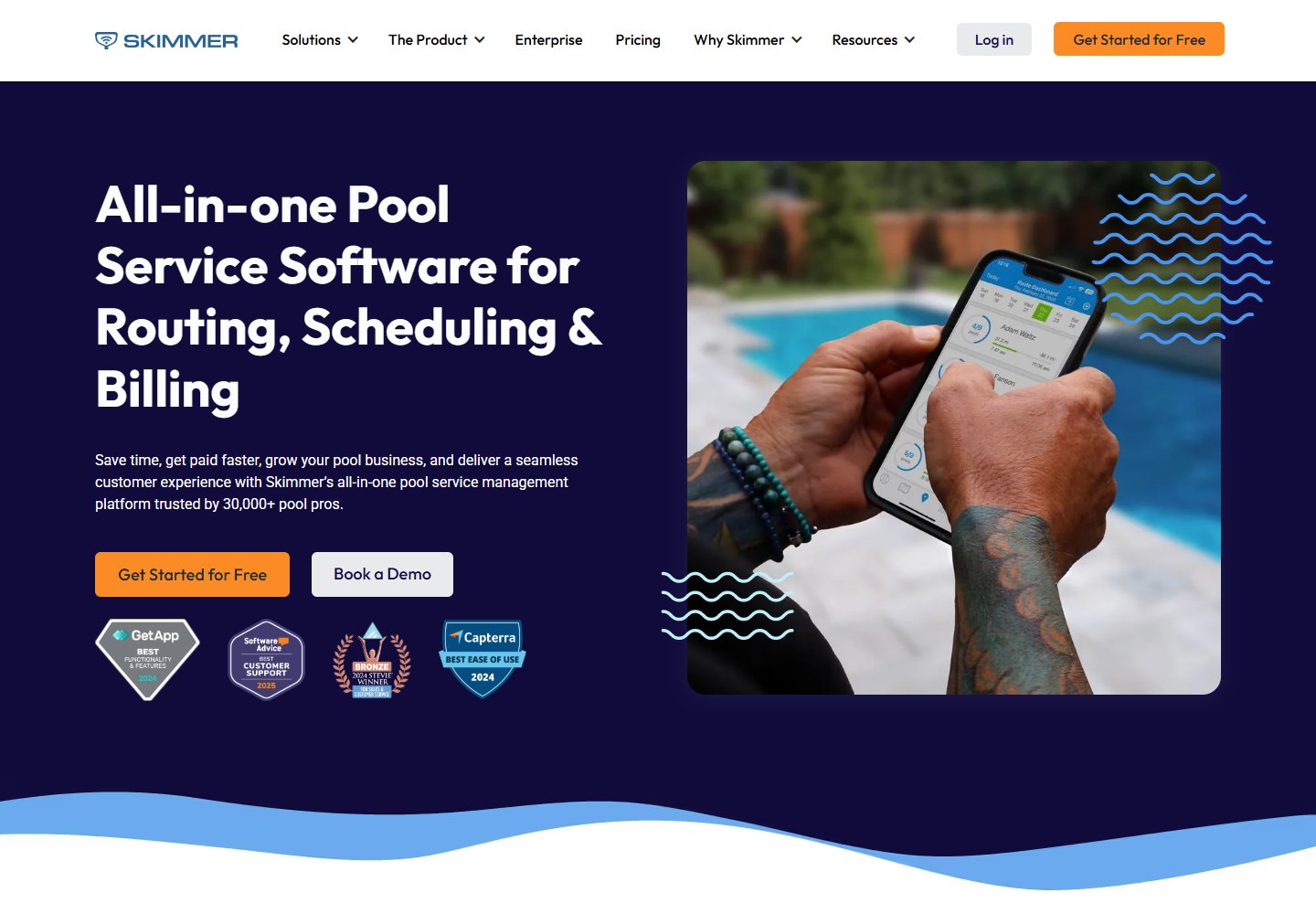
Pool-service software built around the technician, the route and the service visit.
View placement →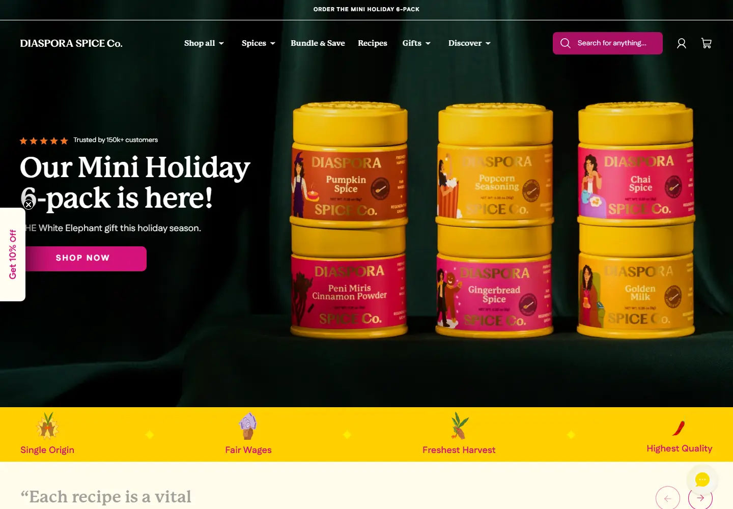
Yellow spice tins turn a pantry staple into a gift worth displaying.
View placement →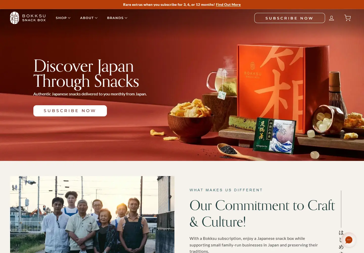
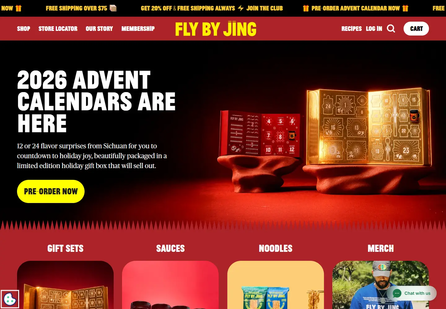
Red, yellow and oversized type make chili sauce hard to scroll past.
View placement →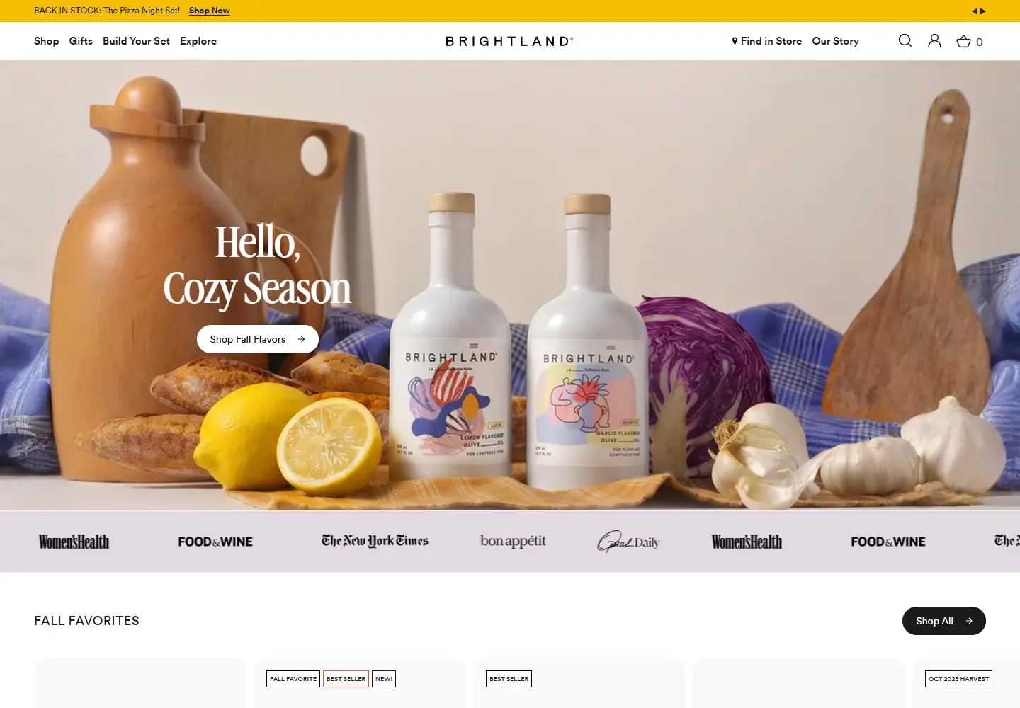
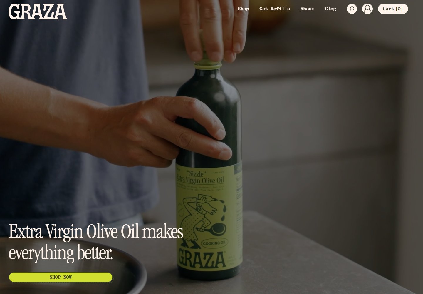
Olive oil becomes a still life, then a neatly organized shopping shelf.
View placement →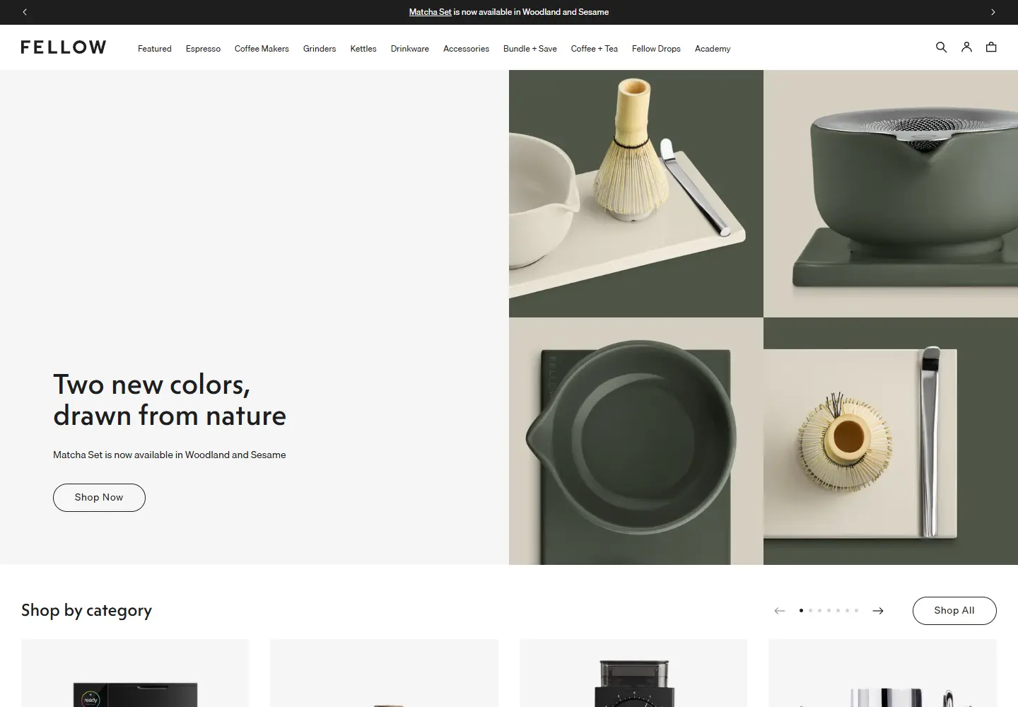
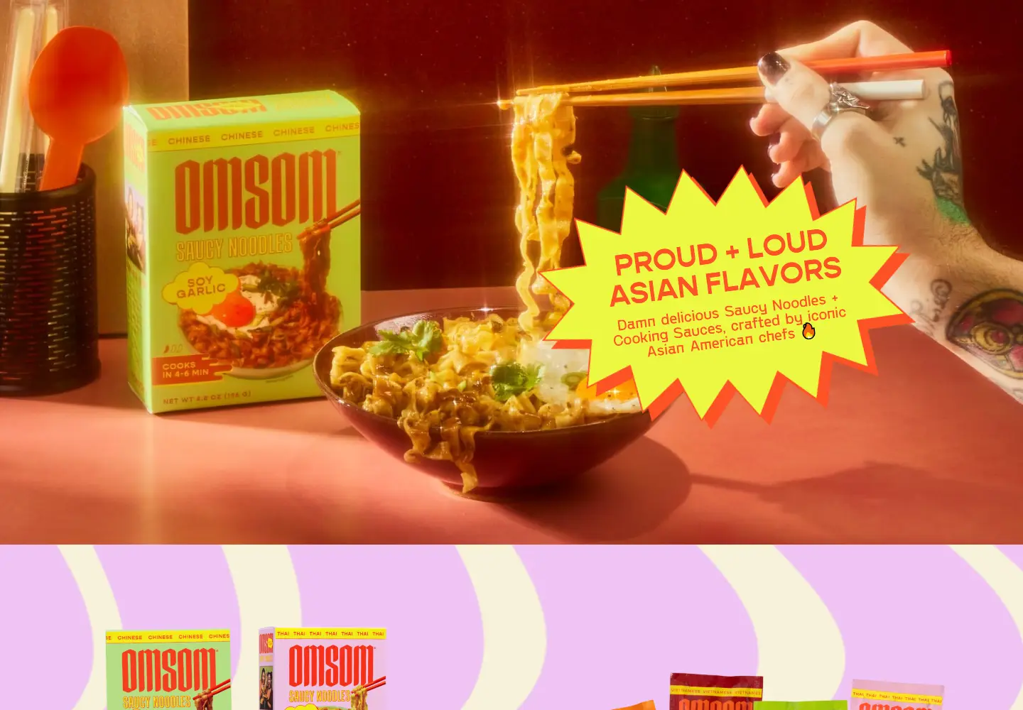
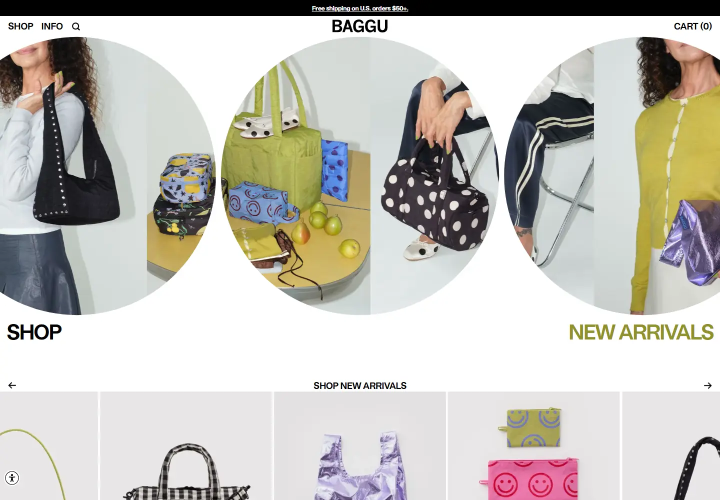
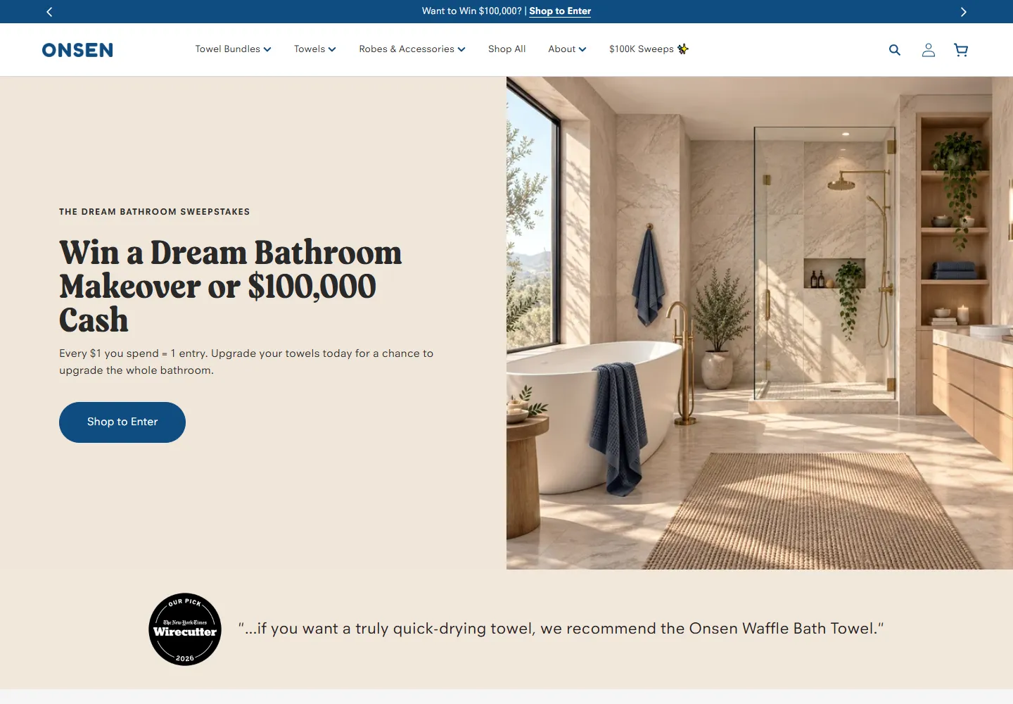
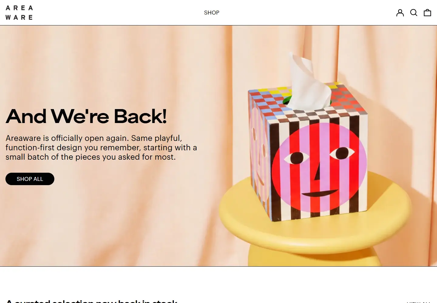
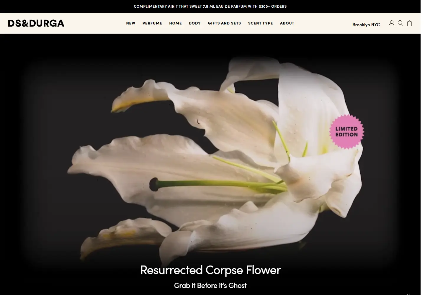
Fragrance is introduced through a flower, a mood and a short product story.
View placement →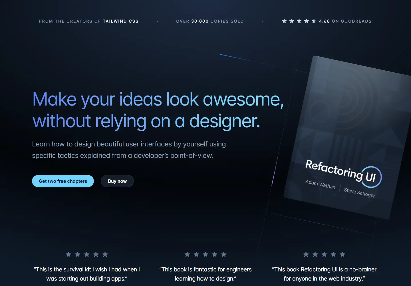
A dark book launch pairs a clear promise with chapters you can inspect.
View placement →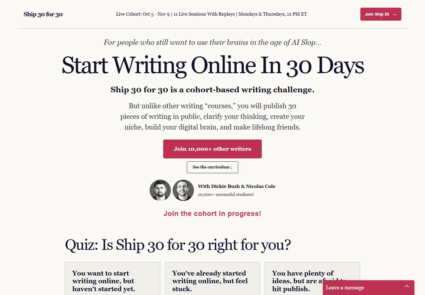
A writing course uses editorial type and a visible cohort schedule.
View placement →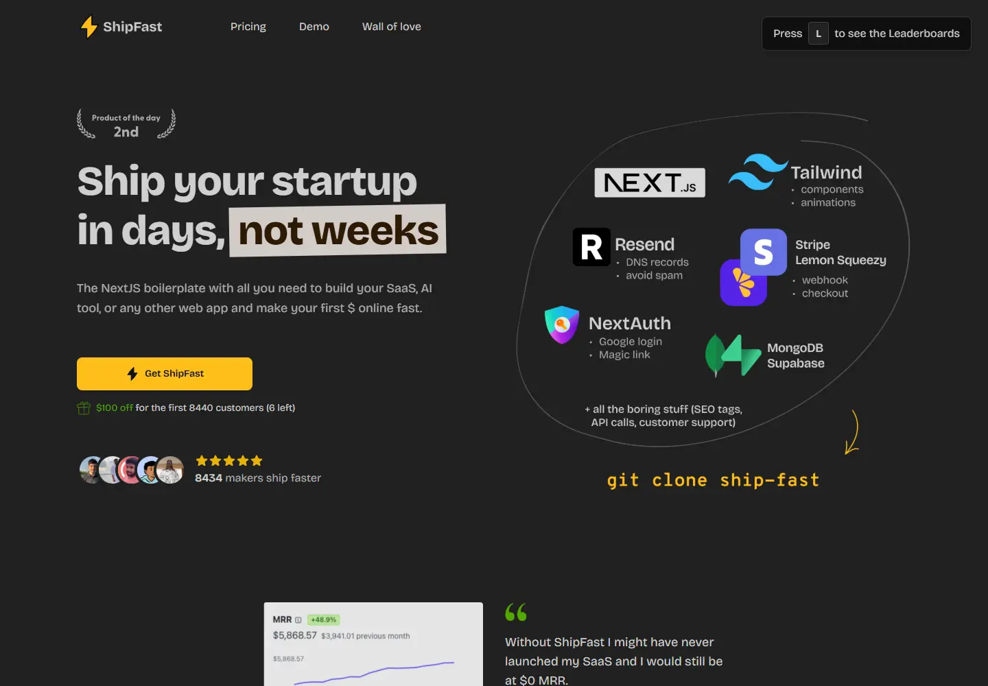
A software starter kit makes its ingredients visible beside the headline.
View placement →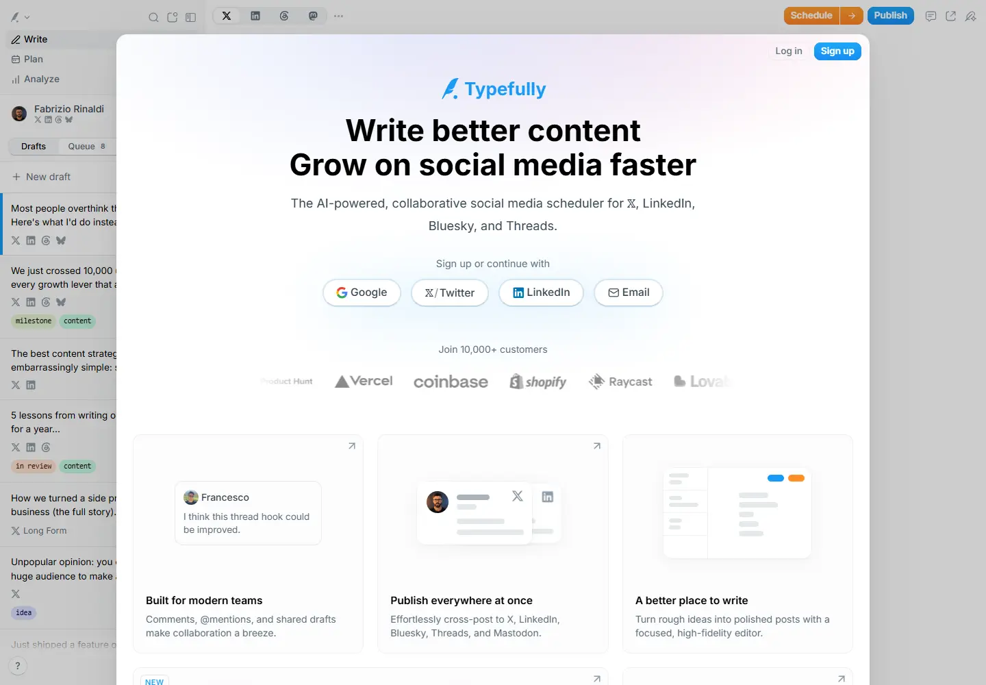
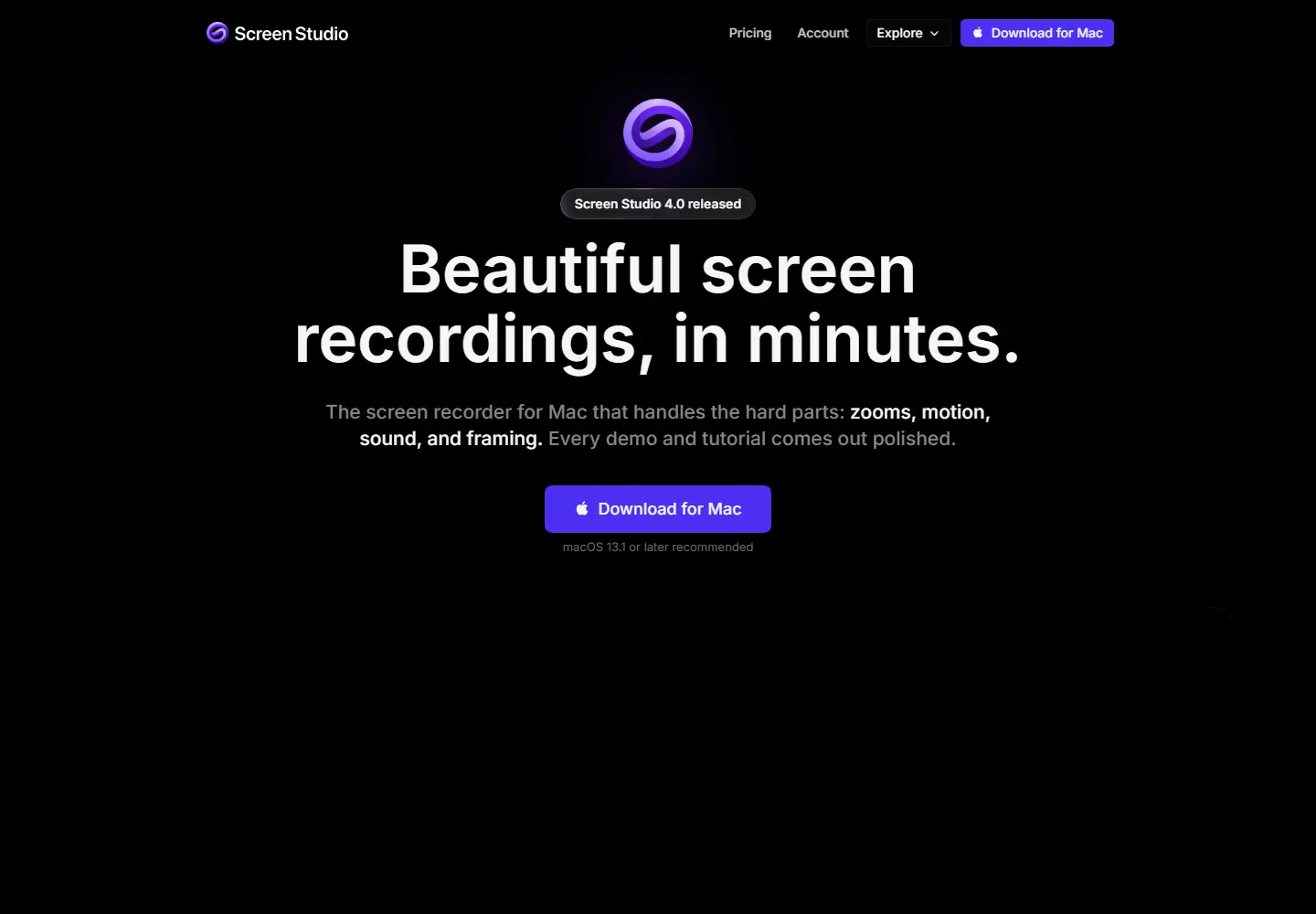
Purple accents and recorded examples sell the look of the output.
View placement →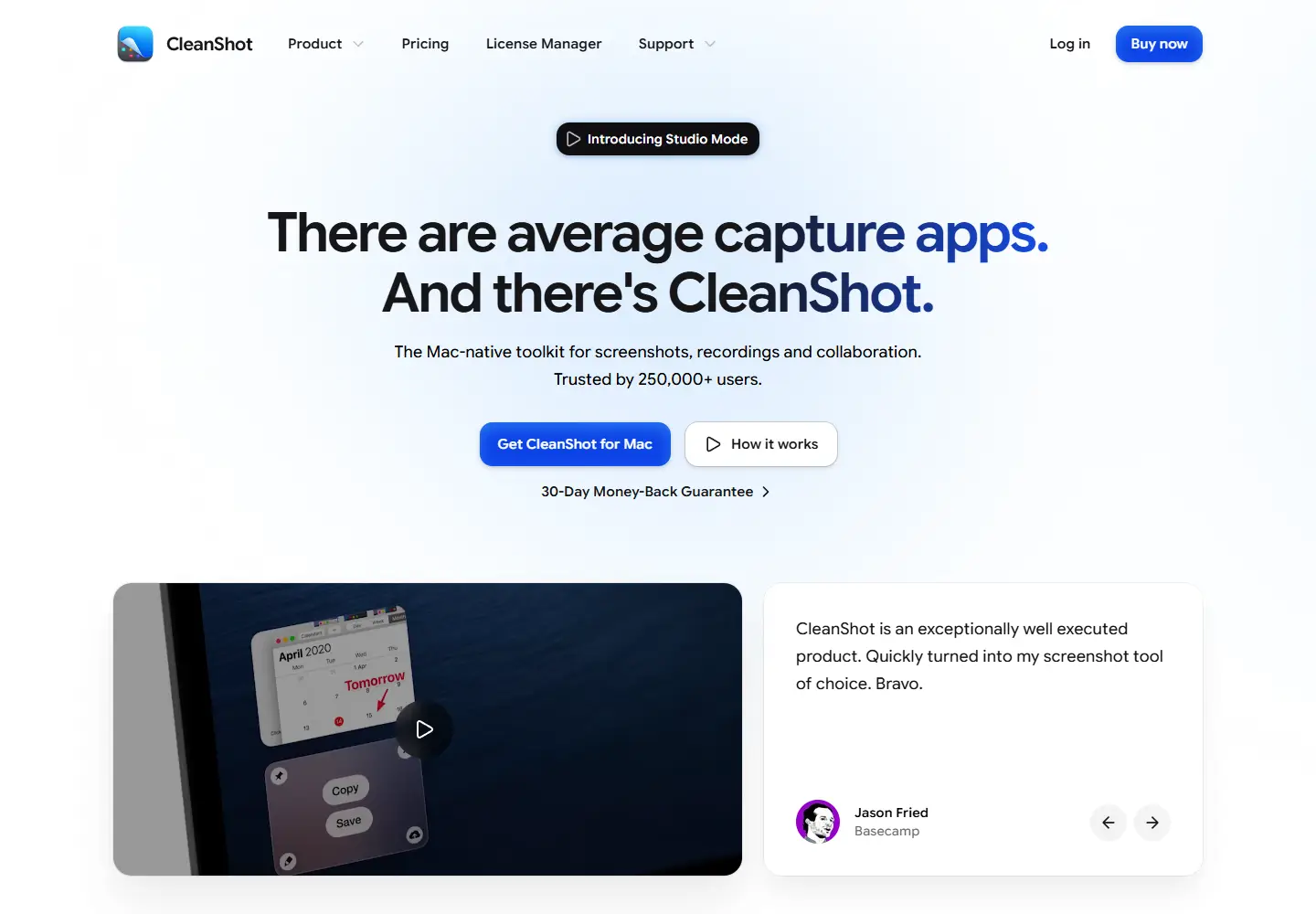
A screenshot app puts its demo and a named endorsement side by side.
View placement →
Portable toilets and septic routes have their own software category.
View placement →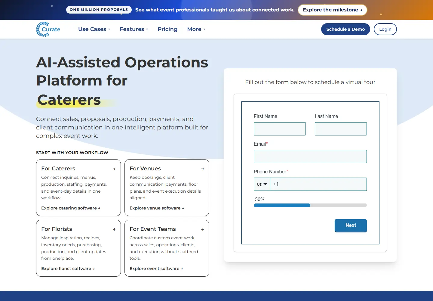
Event software connects a proposal to the ingredients needed to deliver it.
View placement →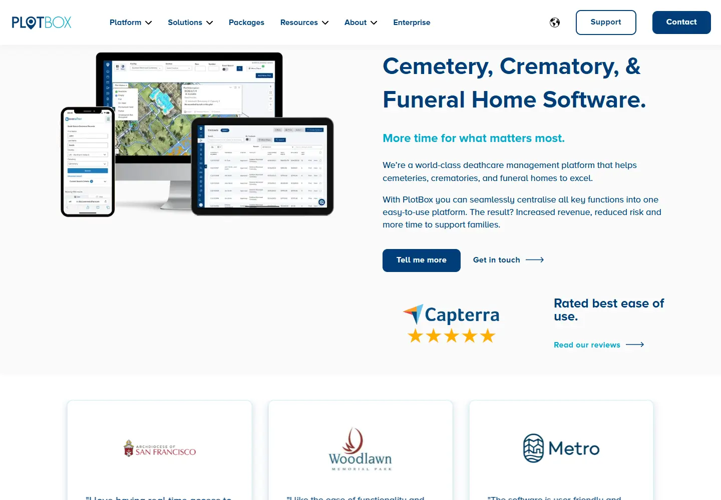
A cemetery map becomes a working interface for records and operations.
View placement →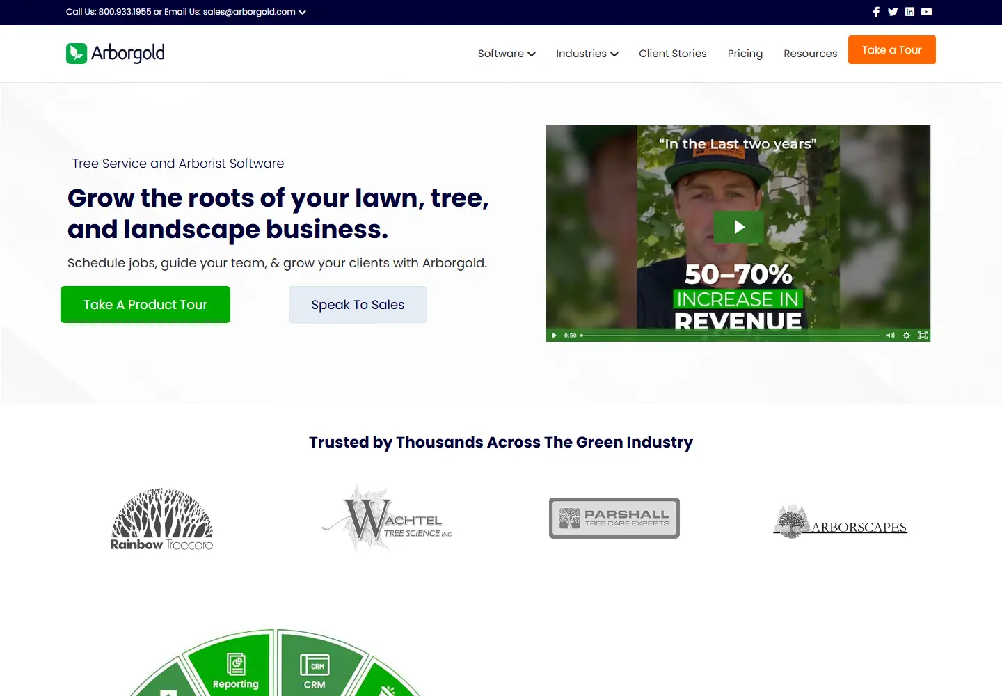
Tree care turns into a software workflow of estimates, crews and mapped jobs.
View placement →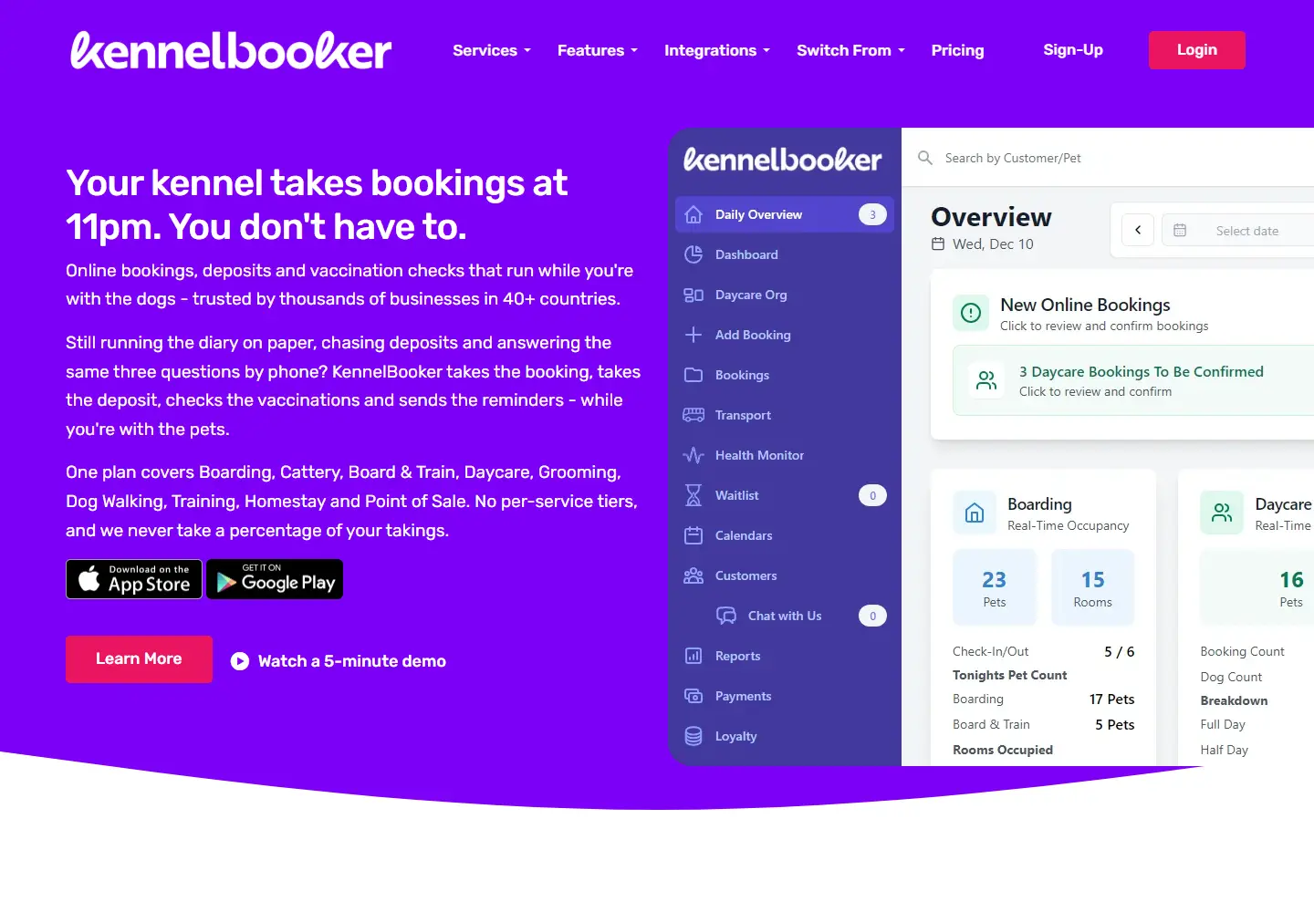
Pet boarding software starts with the booking that arrives after closing time.
View placement →
A cleaning-business site speaks in jobs per day, crews and recurring visits.
View placement →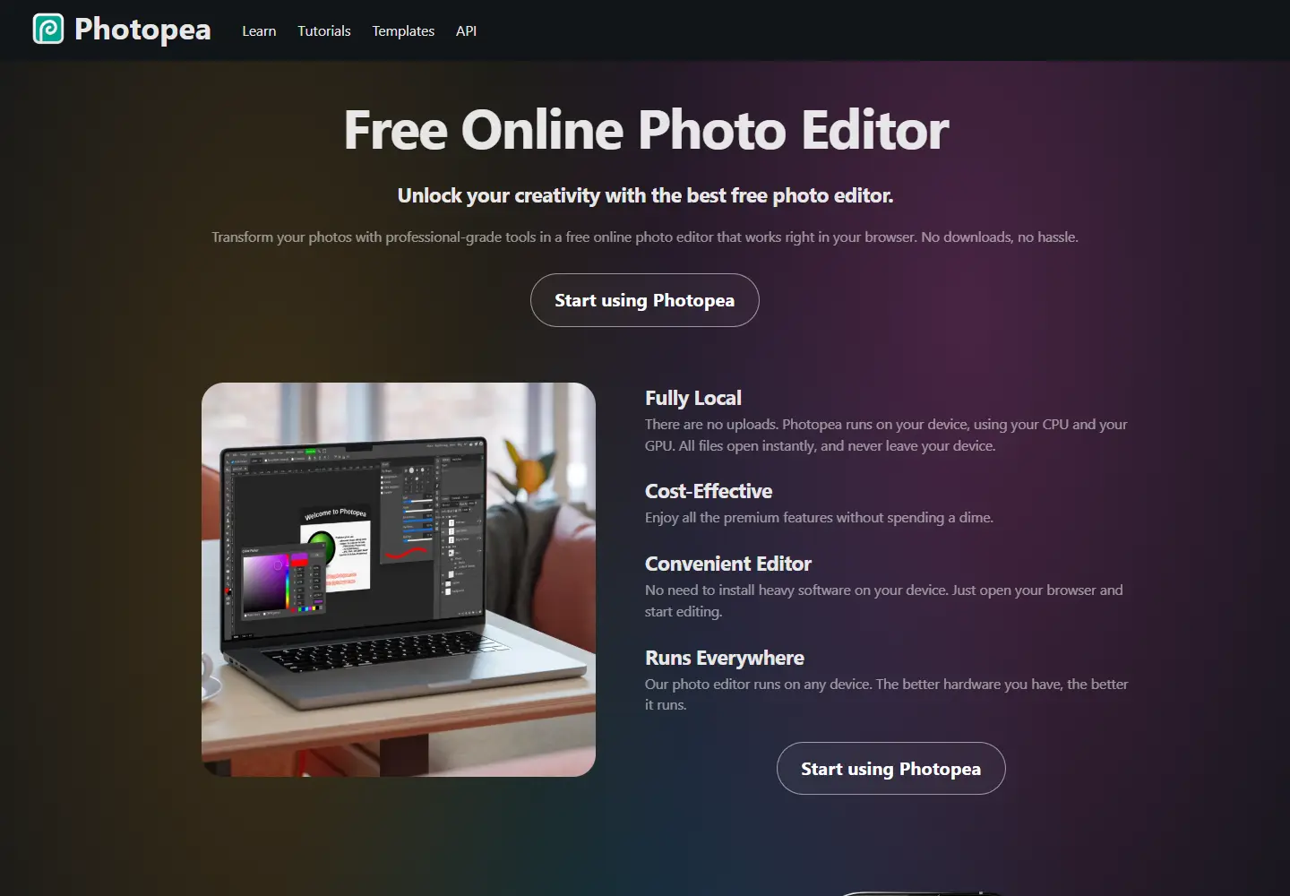
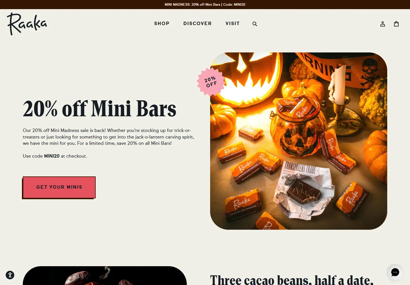
Chocolate shopping framed by a bright seasonal campaign and a distinctive process.
View placement →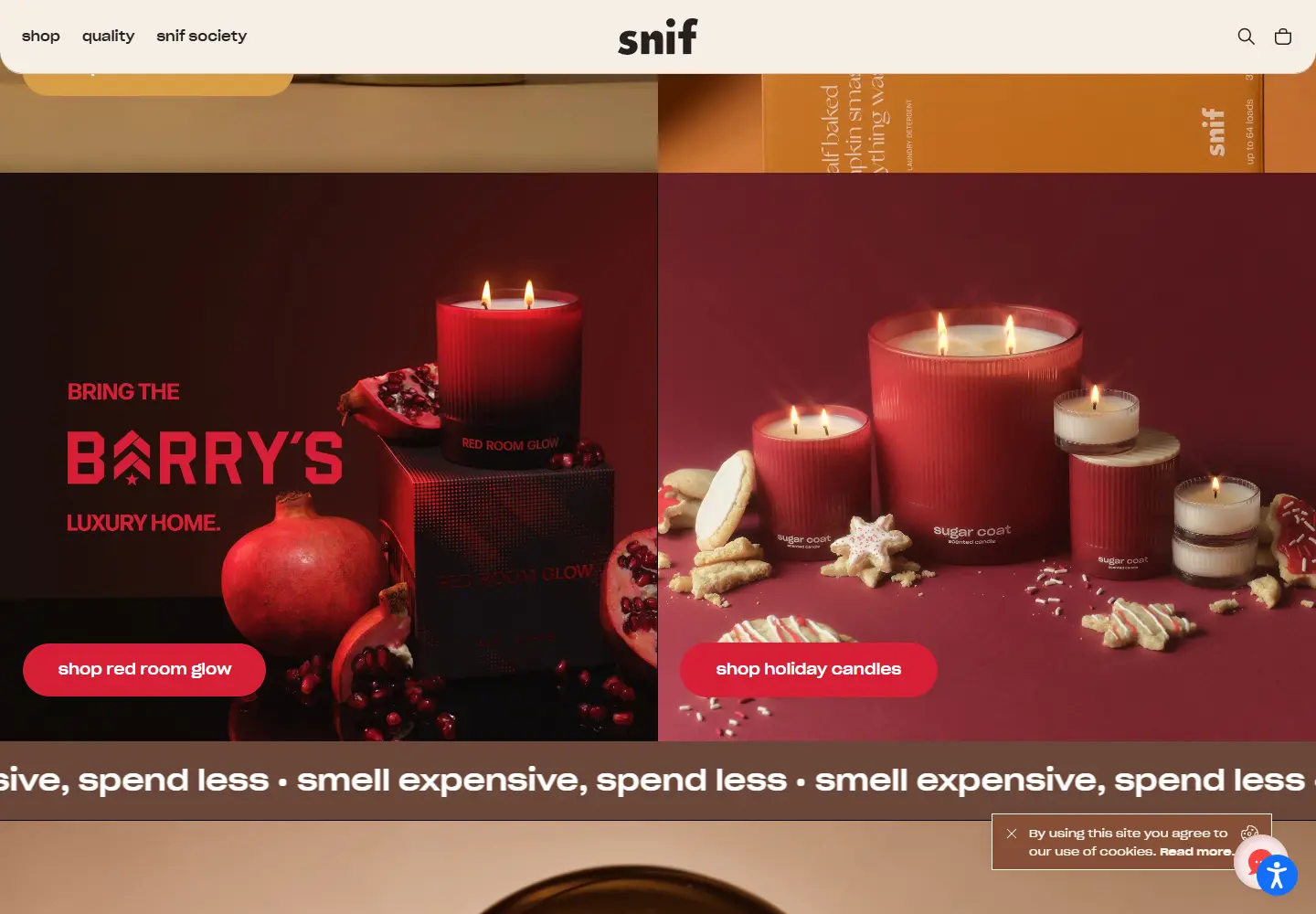
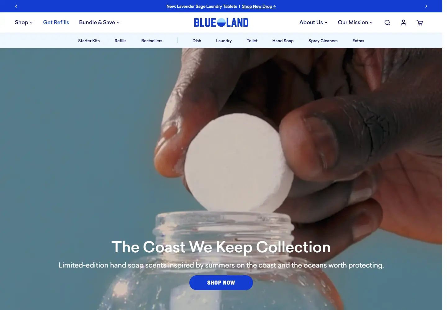
Refillable home products shown through the bottle, tablet and routine.
View placement →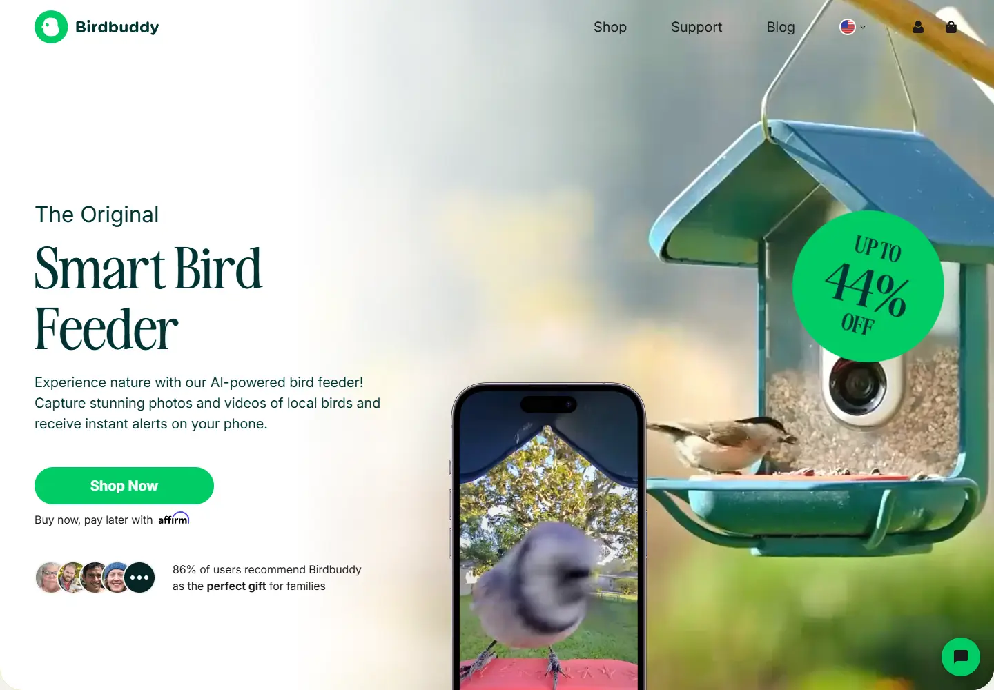
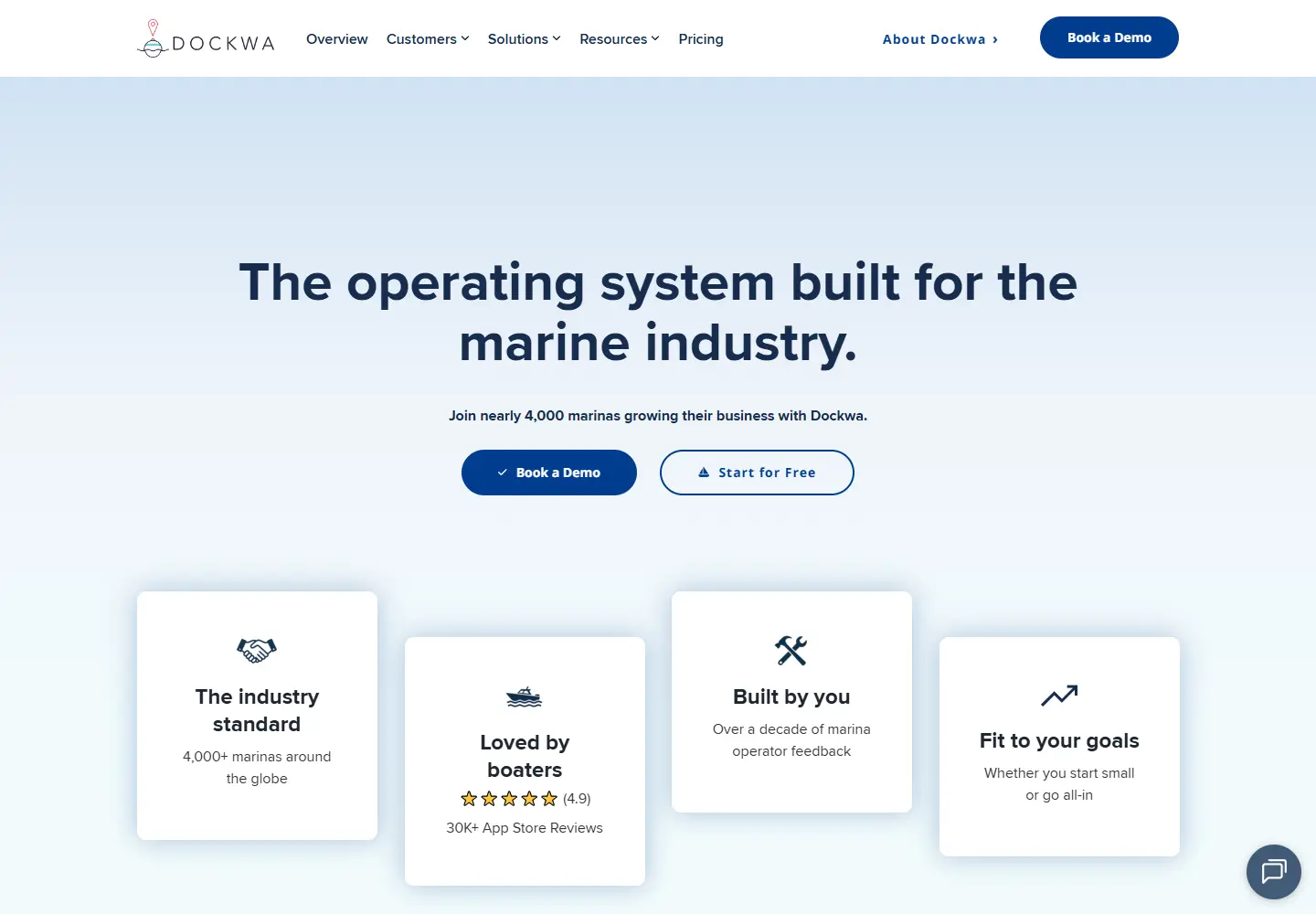
Marina software lists the waterfront operations it needs to handle.
View placement →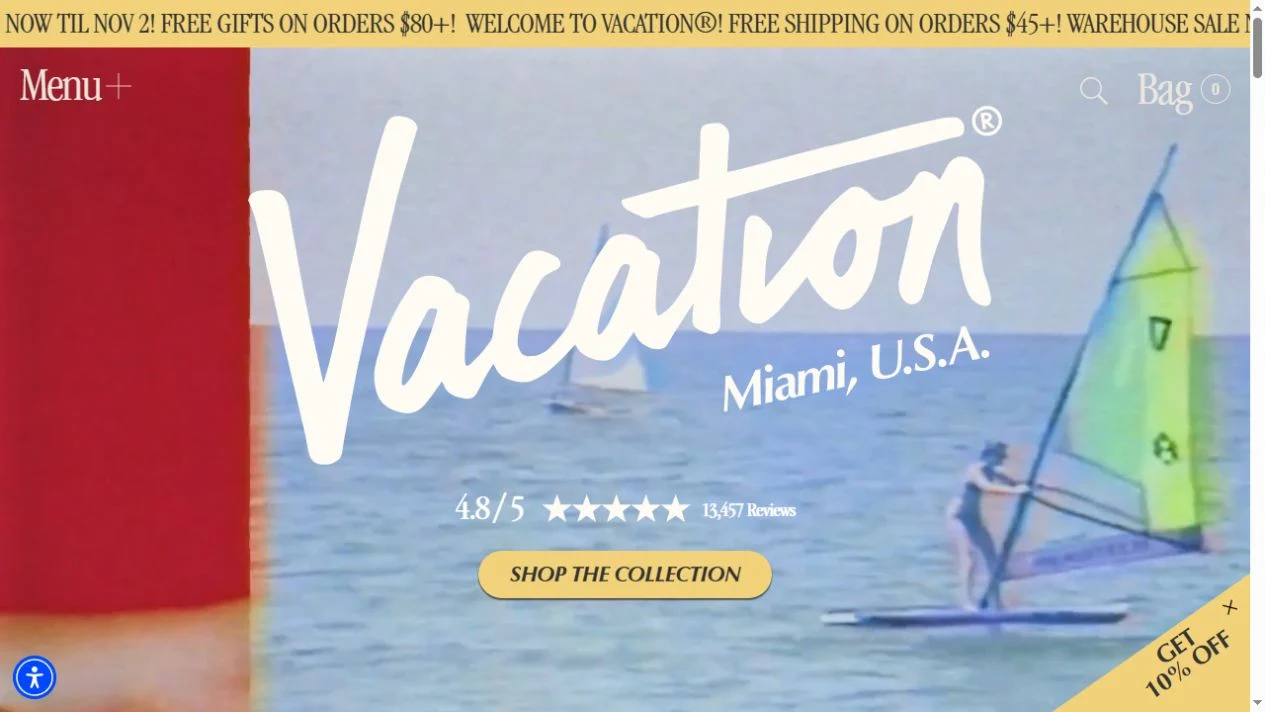
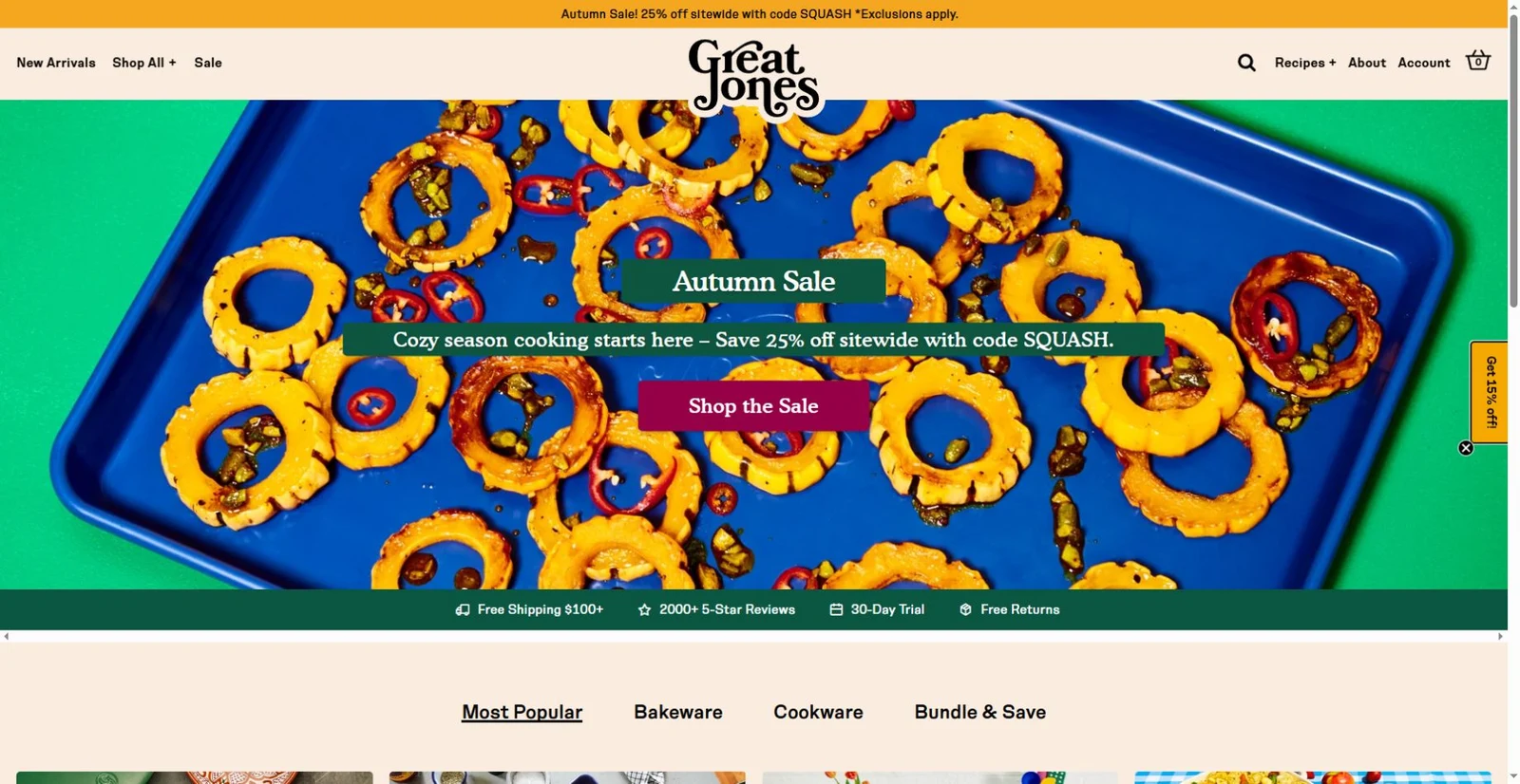
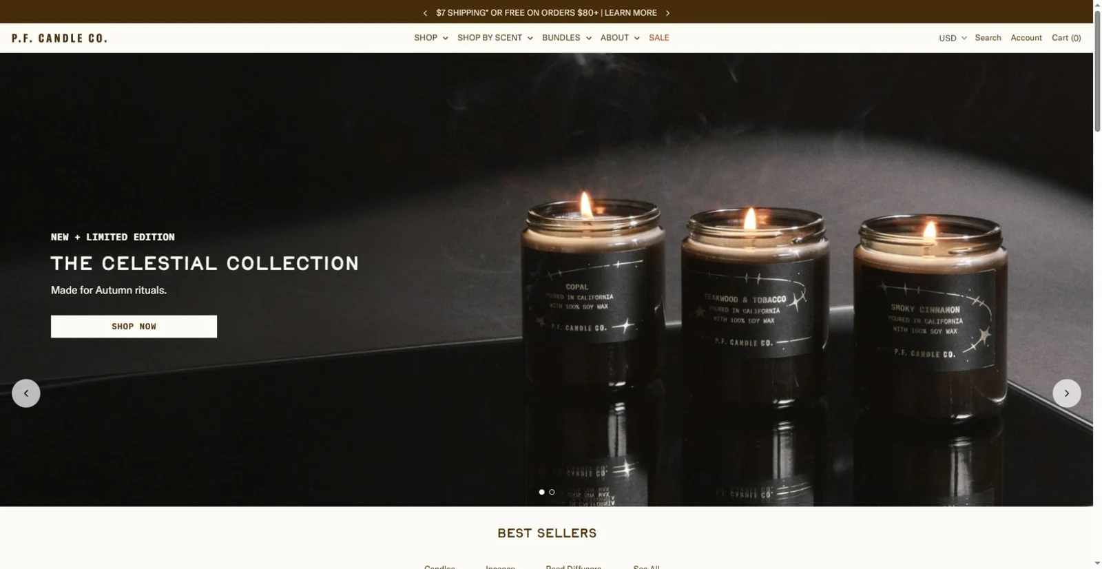
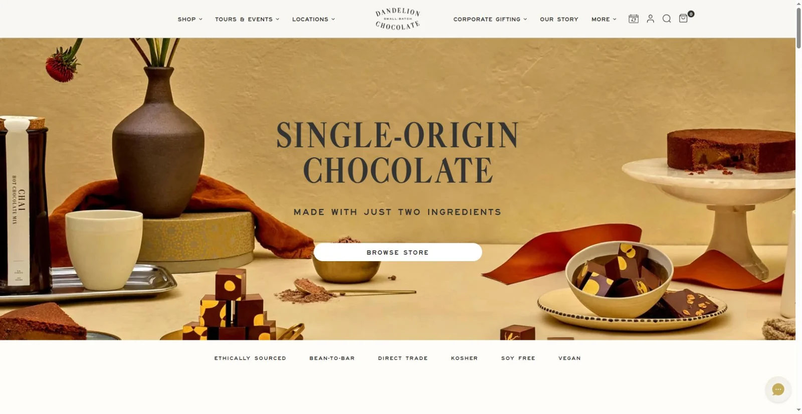
A chocolate storefront that connects ingredients, origins and visits.
View placement →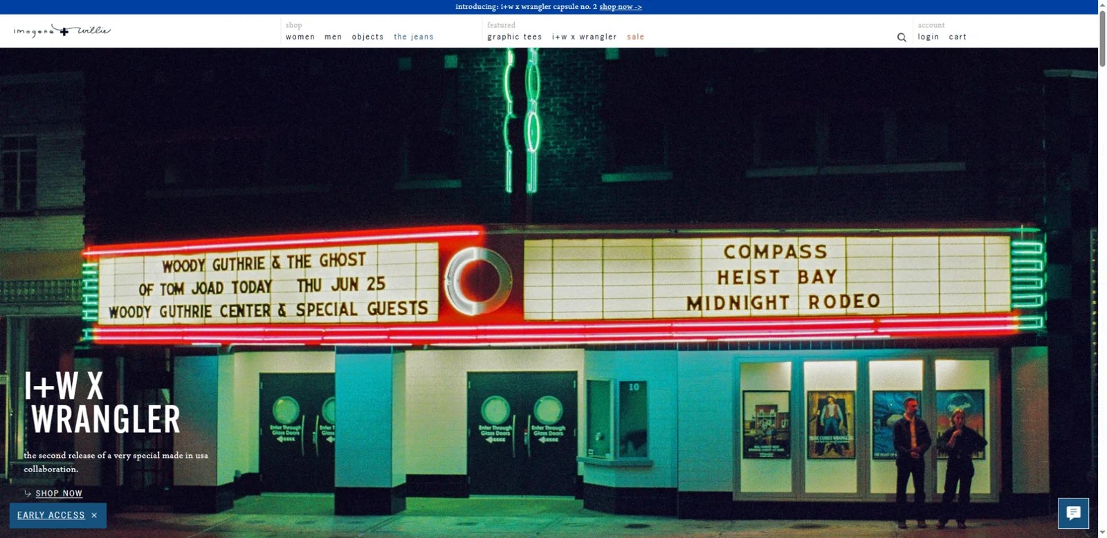
Denim collections, material details and the people behind the shop.
View placement →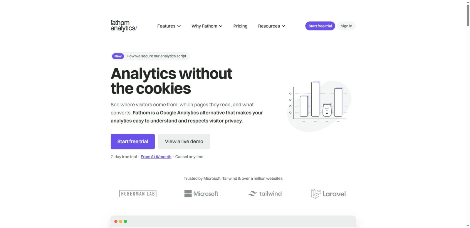
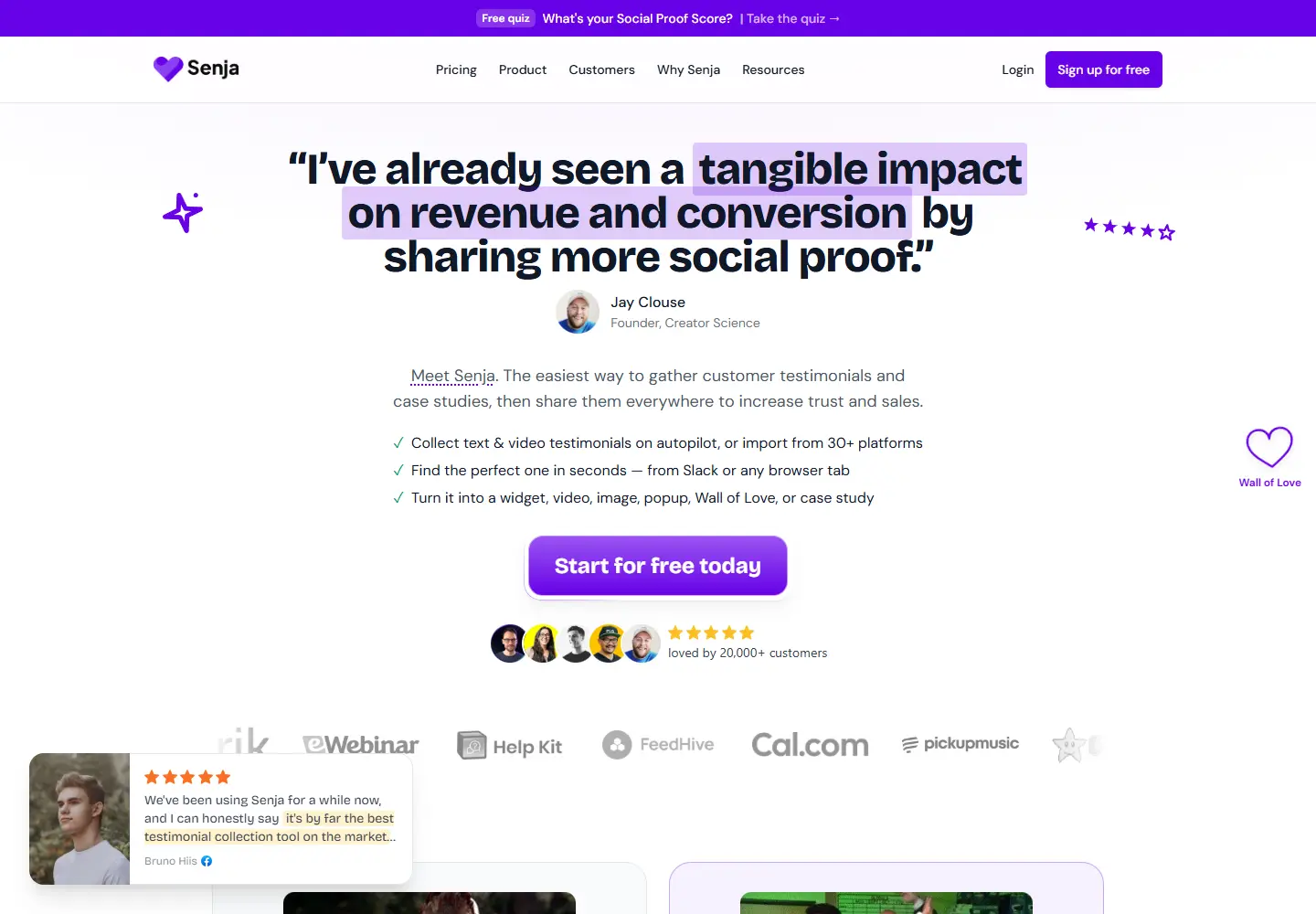
A direct promise, a purple trial button and a second path into the product.
View placement →
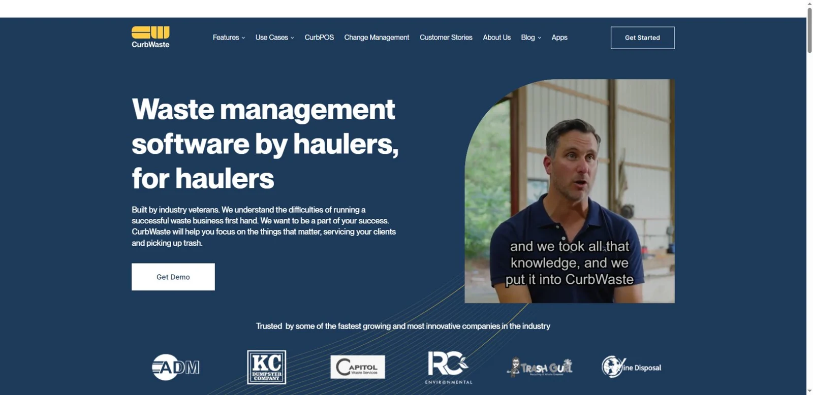
The business behind picking up trash has dispatch, inventory and invoices.
View placement →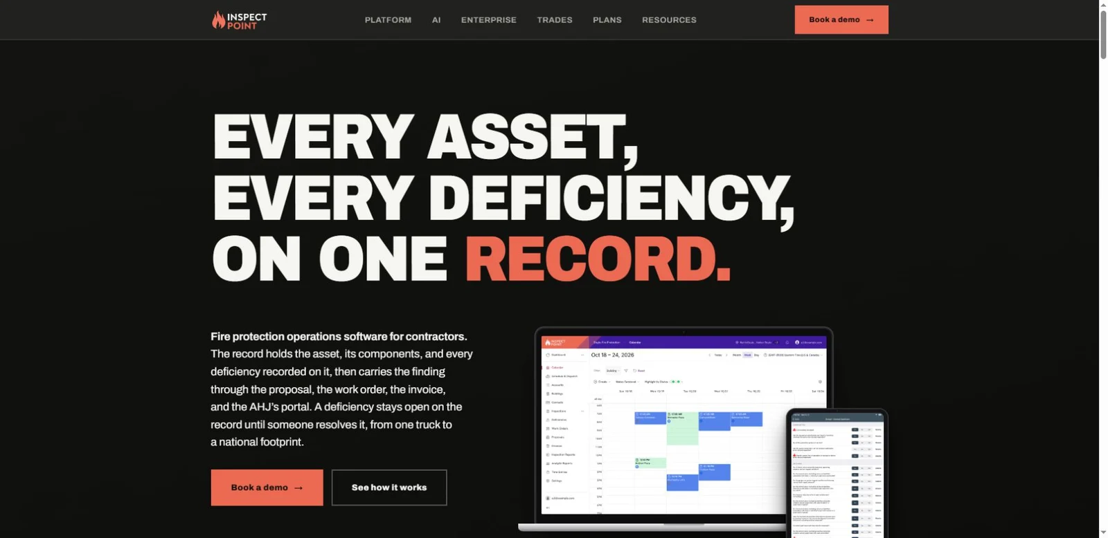
A fire inspection record can become a proposal, work order and invoice.
View placement →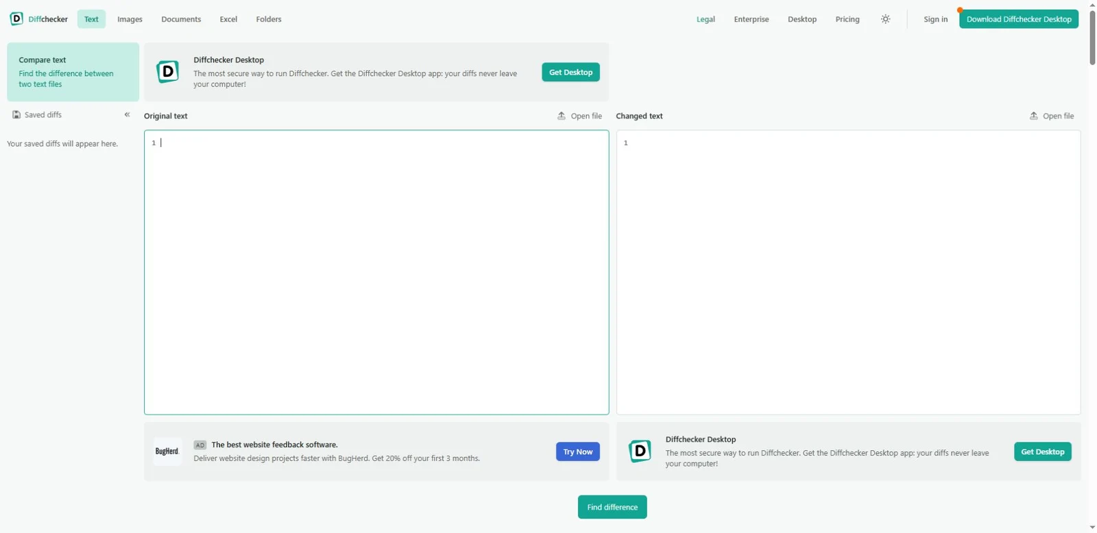
Two document versions, with the changed words and layout made visible.
View placement →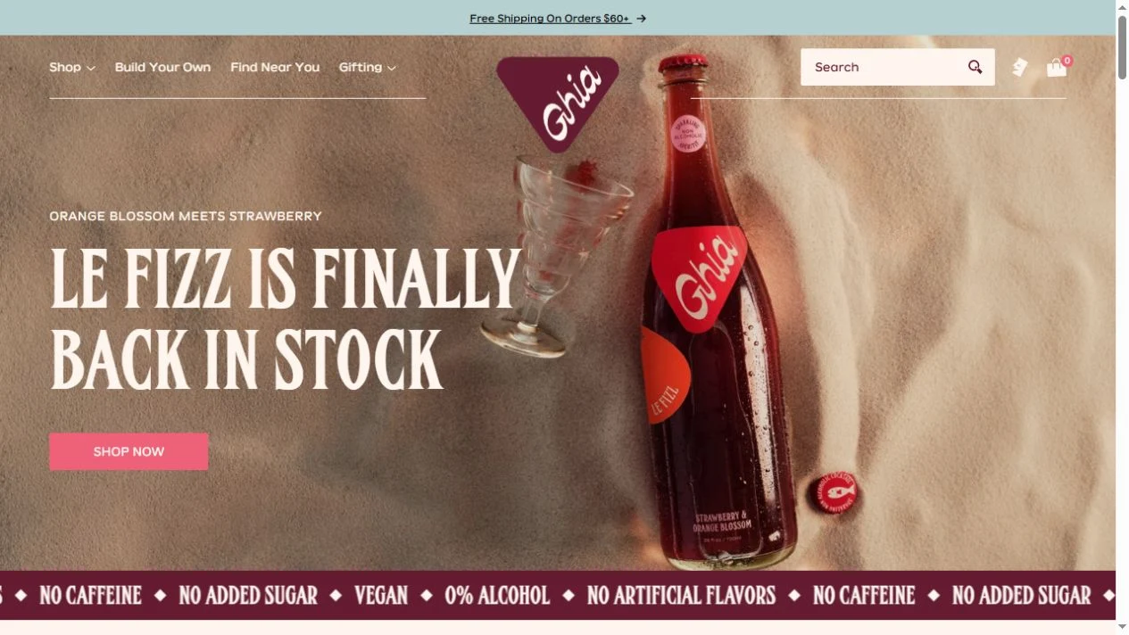
A burgundy bottle, tactile photography and an aperitif brand with a world of its own.
View placement →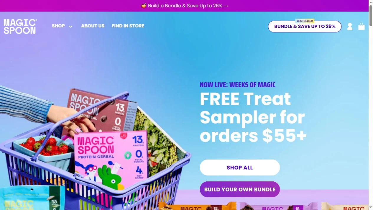
Bright packaging and a shopping-basket hero turn breakfast into a colorful storefront.
View placement →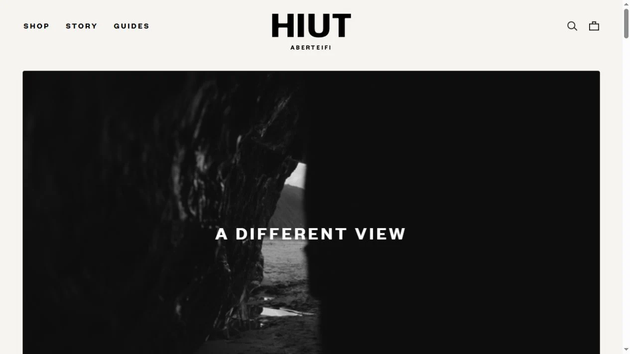
Restrained typography, denim fits and workshop stories give a clothing shop an editorial rhythm.
View placement →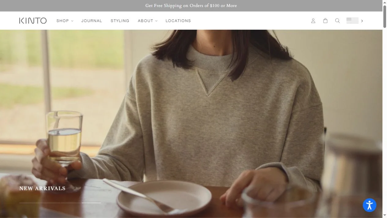
Quiet everyday scenes make glassware, cups and bottles the center of the page.
View placement →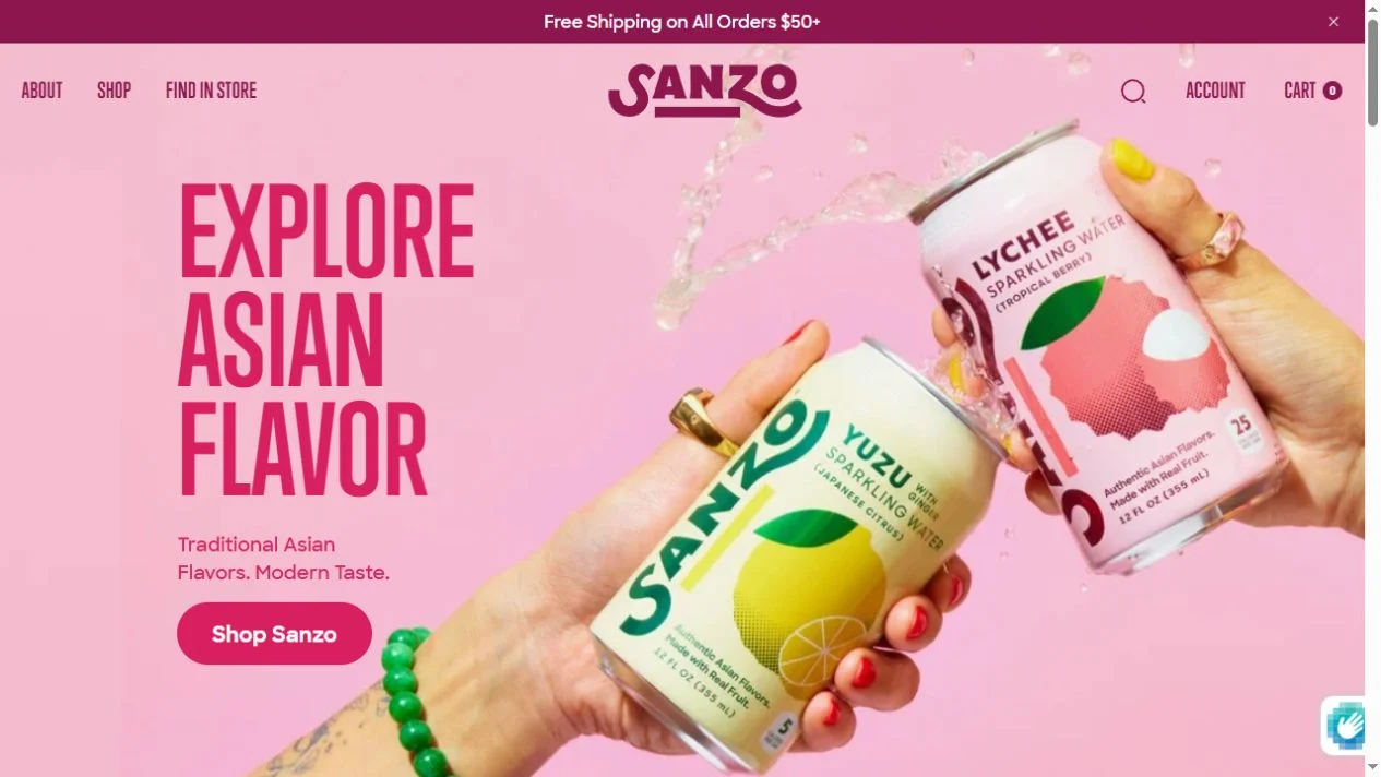
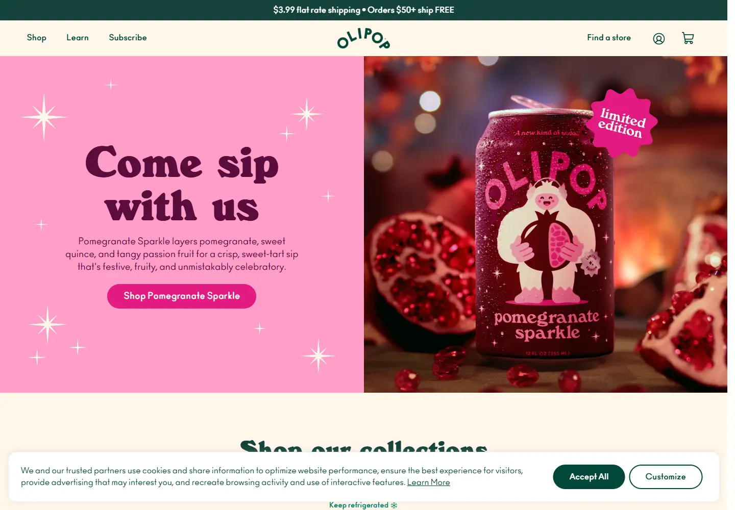
Oversized magenta type and fruit-led can photography make flavor a visual theme.
View placement →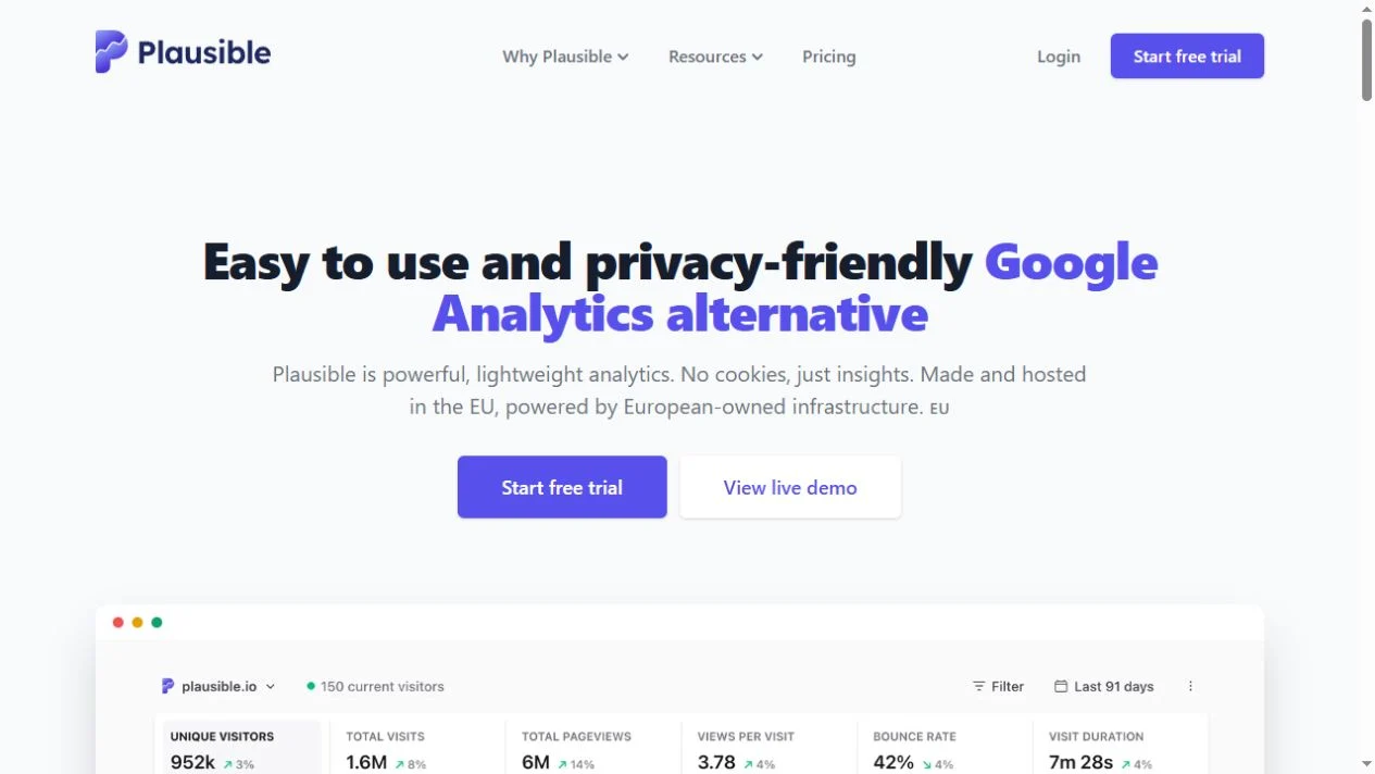
A direct alternative headline and a large dashboard connect the promise to the product.
View placement →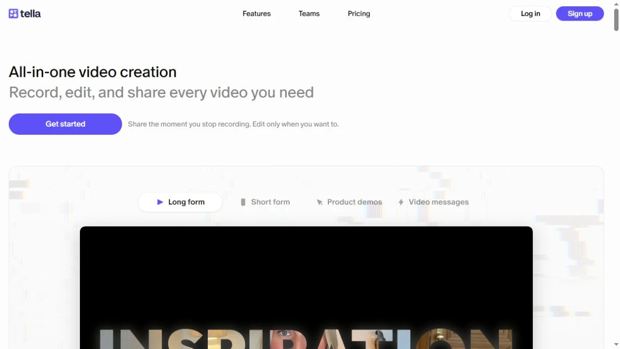
A short promise, moving examples and product UI explain a video-making workflow.
View placement →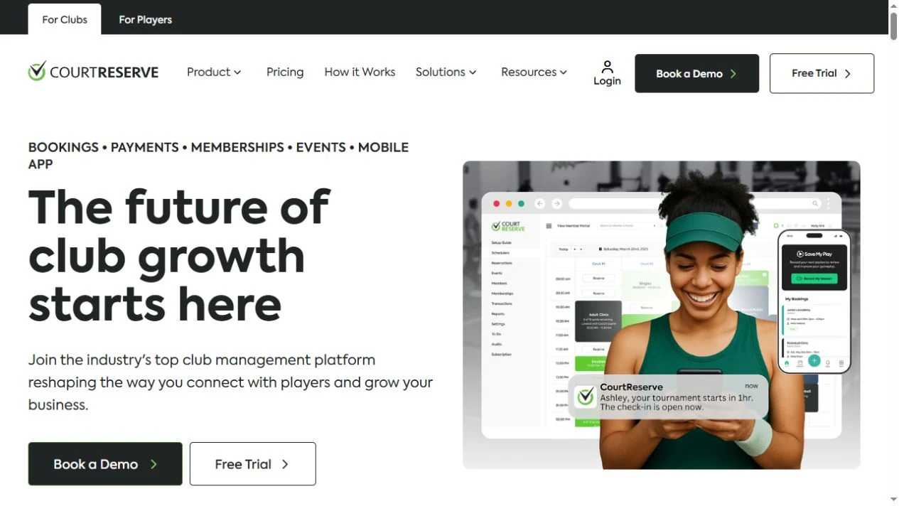
Court reservations, memberships and club operations in one focused software category.
View placement →
A specialist mapping service connecting field boundaries, satellite imagery and crop analysis.
View placement →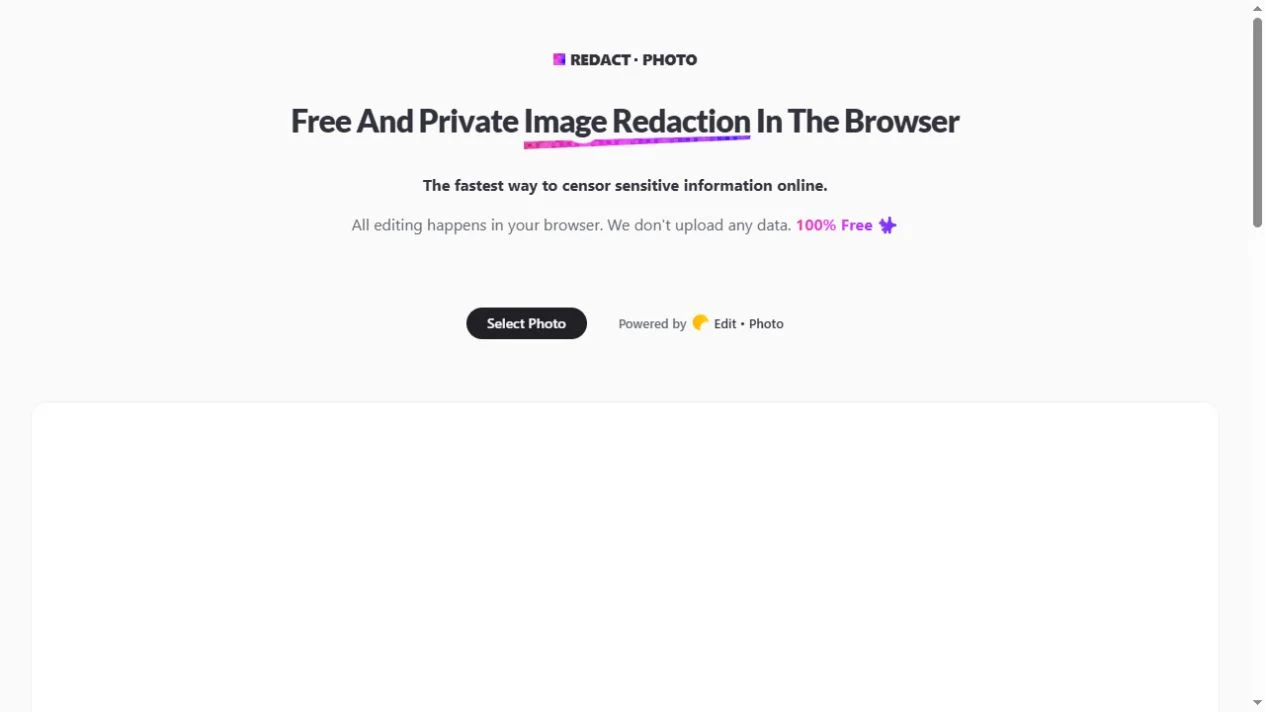
A focused browser tool for obscuring sensitive areas in an image.
View placement →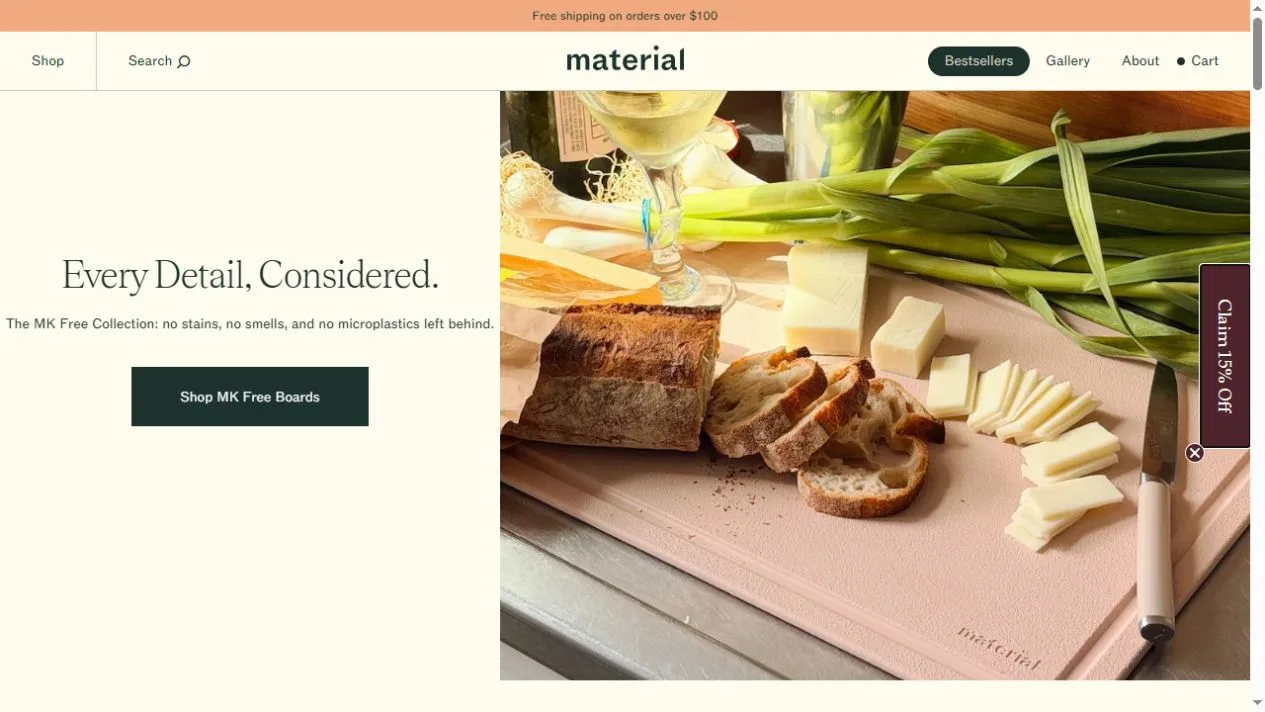
A split-screen kitchenware storefront with quiet type and food in the foreground.
View placement →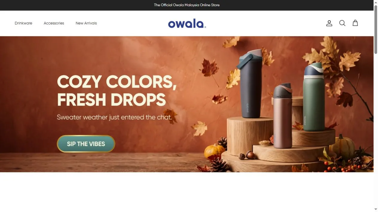
Seasonal color and lifestyle images organize the Owala Malaysia storefront.
View placement →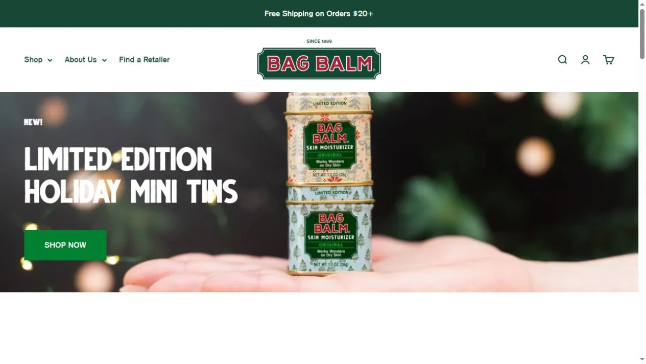
The familiar green tin connects a seasonal hero to a compact range of care products.
View placement →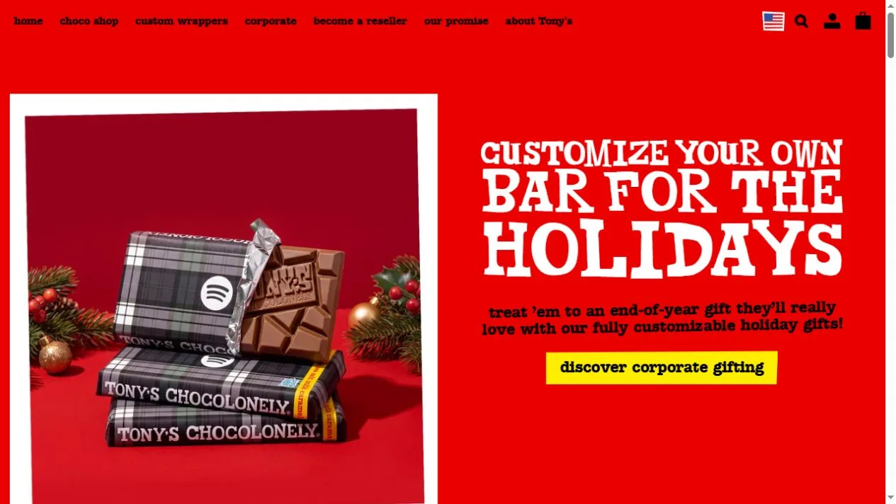
Loud wrapper-inspired typography gives chocolate gifting several clear routes.
View placement →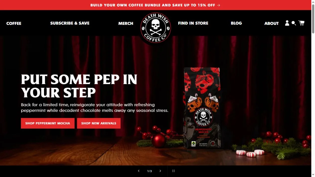
A dark seasonal campaign hands visitors off to product grids and a coffee club.
View placement →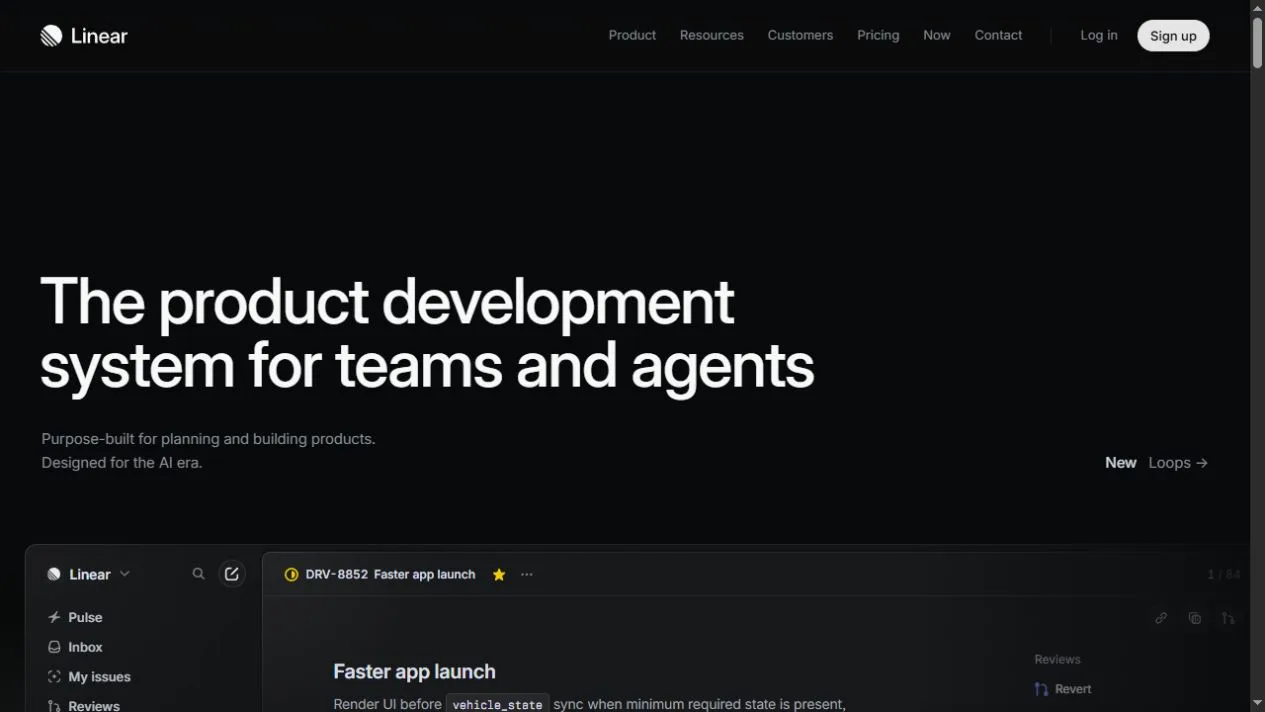
Dark typography and a detailed issue view explain a product development system.
View placement →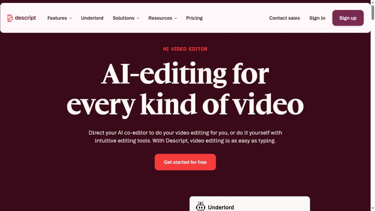
A burgundy hero leads into an editing example and named customer proof.
View placement →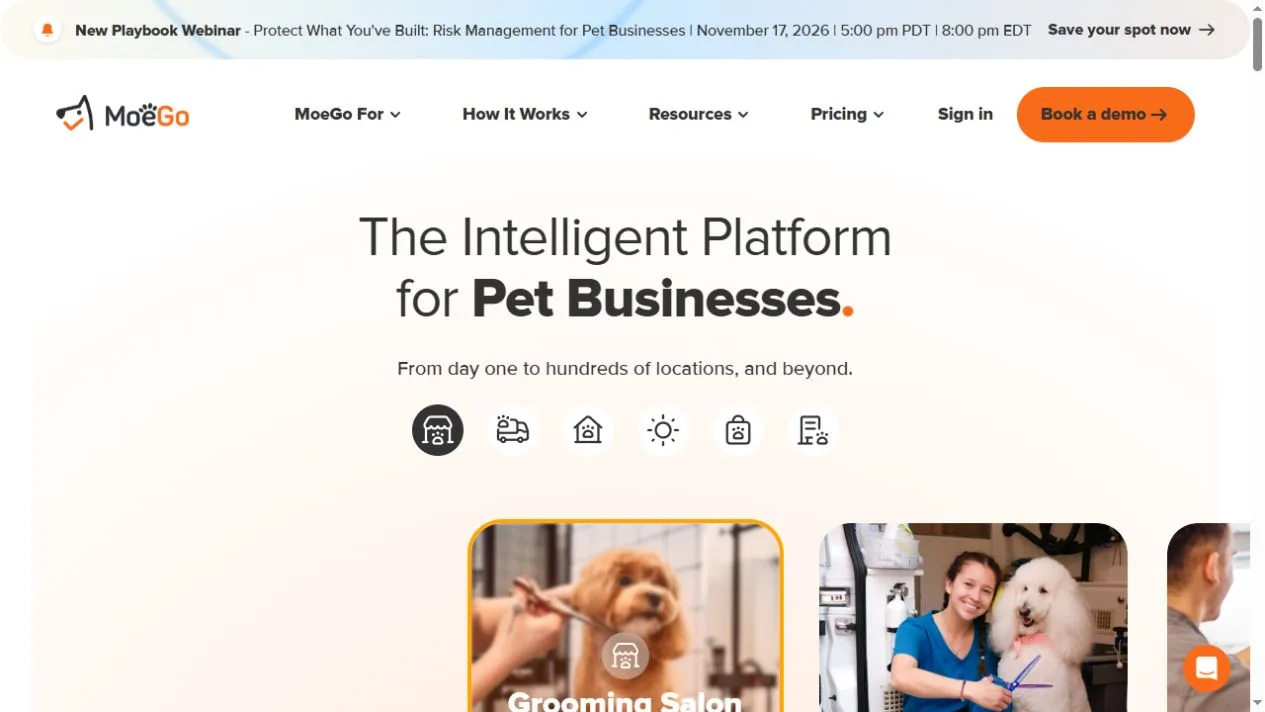
Pet-care imagery leads from business type to booking, scheduling and staffing.
View placement →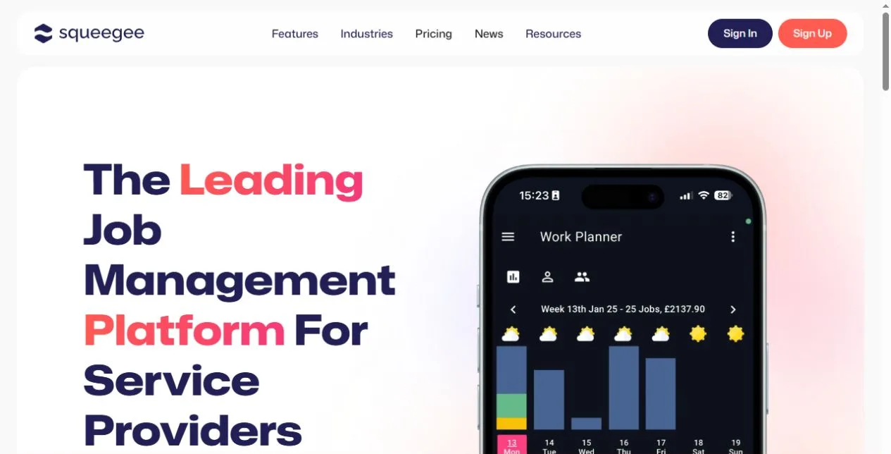
A phone-based work planner makes field-service scheduling concrete.
View placement →