Basecamp
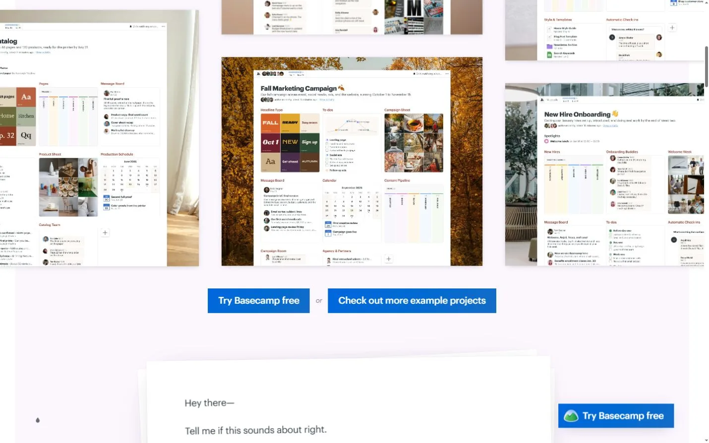
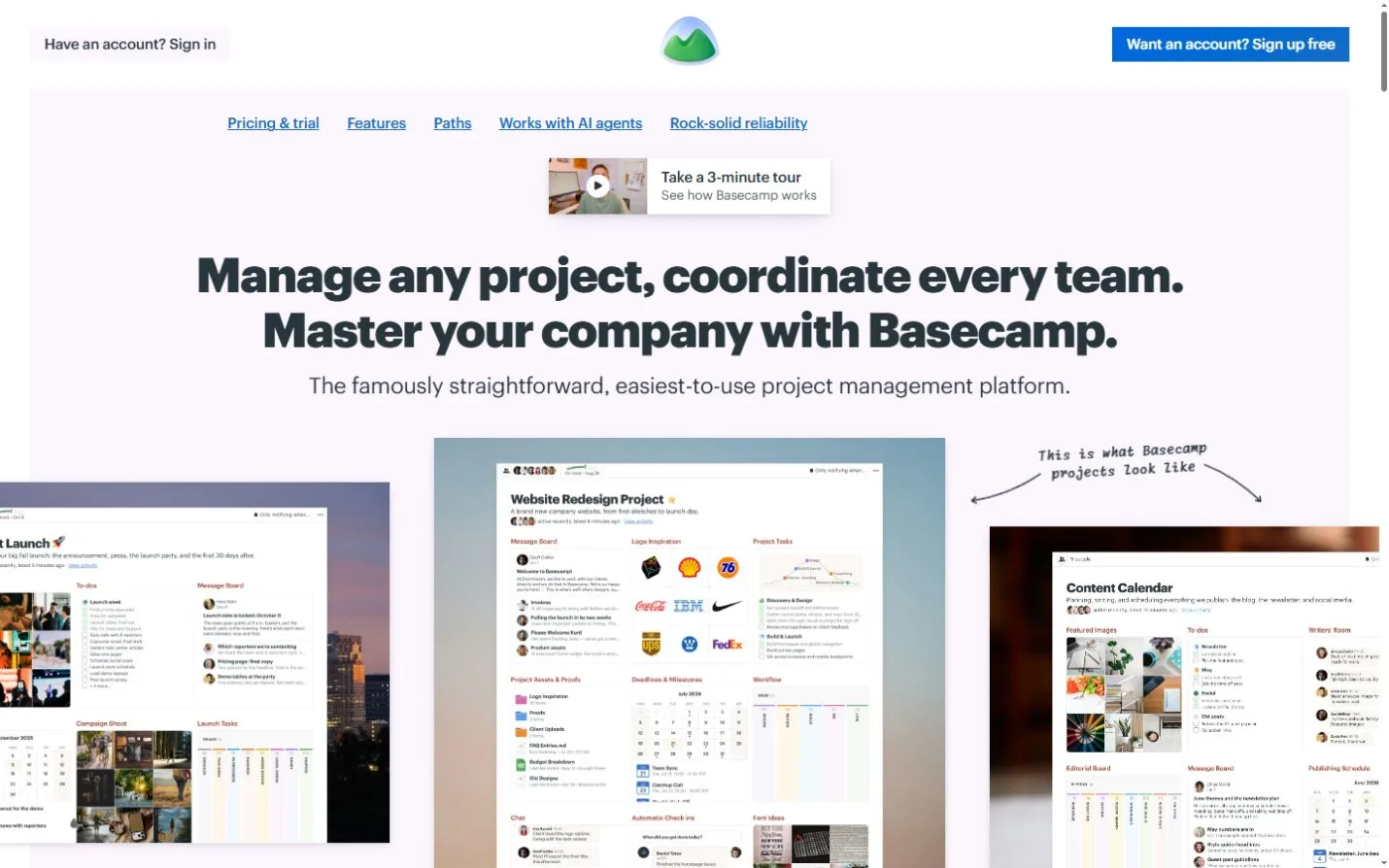
A direct headline and a gallery of real-shaped projects make the product easy to picture.
Website overview
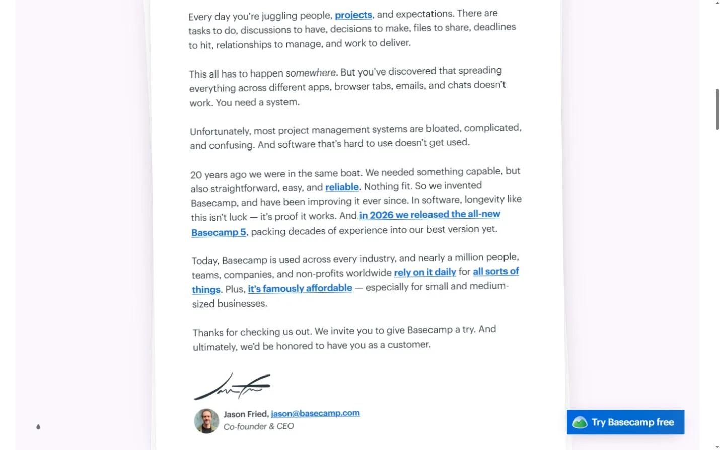
Basecamp introduces project management software through a headline about coordinating work and a gallery of example projects. The examples span recognizable activities, including website redesigns and marketing plans. Below that introduction, a signed message explains the problem the product addresses. The page offers several ways to inspect the software before choosing to start a trial.
What caught our eye
The most useful detail in the first screen is the relationship between the general promise and the examples. A broad statement about managing projects can mean many things. Showing several workspaces gives the reader a chance to recognize a familiar kind of work and see how information might be organized.
The page also changes its voice after the gallery. A longer letter speaks directly to the reader and ends with a named signature. This creates a different trust cue from a strip of organization logos. It provides an identifiable author for the product’s explanation, while demonstrations and customer material elsewhere supply additional detail.
Look at where trial invitations appear relative to the examples. A visitor can act from the opening section or spend more time reading and examining the workspaces. For a landing page with a broad audience, this is worth comparing with the needs of different readers. Some arrive with a specific problem, while others first need to understand what the product contains. The gallery and letter give those visitors different entry points into the same offer.
Who might find it useful?
Product teams studying landing-page hierarchy, examples and trust cues.
Website screenshots