Blueland
Refillable home products shown through the bottle, tablet and routine.
Website overview
The Blueland website explains refillable home products through a visible bottle, tablet and routine.
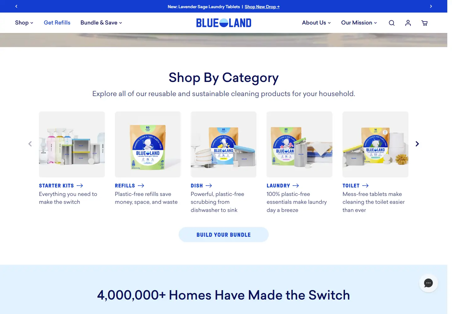
Blueland sells home-cleaning products, starter kits and refills. The site presents products by task and offers distinct shopping paths for new kits and repeat refills.
What caught our eye
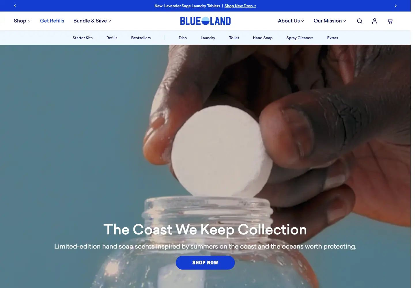
Hero: Product footage shows the container and refill format together. A visitor can see what the offer looks like before reading the wider brand mission.
Navigation: Starter kits and refills are separate routes, with laundry, dish, hand-soap and cleaner groups underneath. That distinction answers different buying situations.
Color & layout: Blue navigation anchors pale product imagery. Promotional labels and shopping buttons are visible without crowding the photographed products.
Trust strategy: The site links its packaging and mission explanations from the main navigation. Those are the company’s own explanations; environmental outcomes were not independently assessed for this feature.
Who might find it useful?
Designers studying refill-product presentation and repeat-purchase navigation.
Website screenshots