Brightland
Olive oil becomes a still life, then a neatly organized shopping shelf.
Website overview
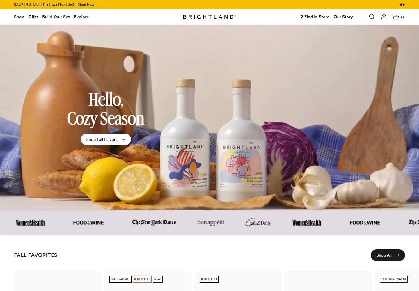
Brightland presents olive oil through still-life photography before moving visitors into a structured shopping layout.
Brightland sells olive oils, vinegars and related pantry gifts. Its homepage presents illustrated bottles in cooking scenes before moving into bundles and individual products.
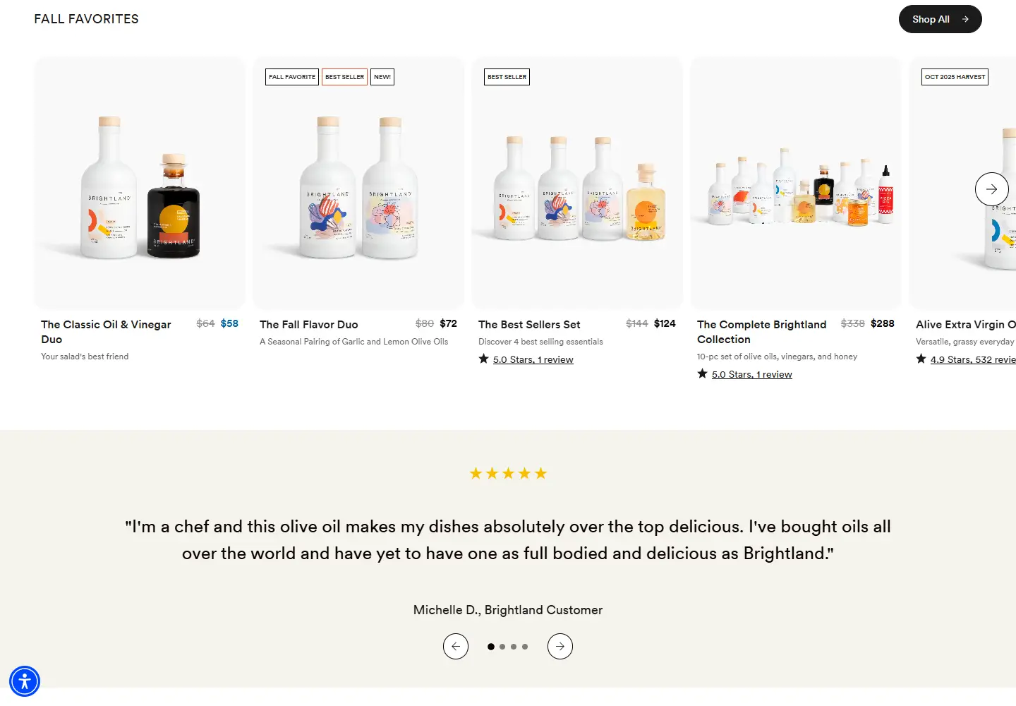
The pale still life gives the illustrated bottles a setting before the product cards turn them into comparable offers. Examine how bundle contents and badges fit around the photographs. A shopper needs to distinguish what is included as well as how the set looks. The page is useful for studying premium gift presentation because those two jobs remain connected across the sections. Press names and comments form a further layer of information around a product offer that is already visible.
What caught our eye
Hero: Bottles, bread and kitchen ingredients share a pale still-life scene. A seasonal serif headline leaves the product photography room to breathe.
Color & layout: Cream, white and lilac sections soften the page. The illustrations on the bottles supply the smaller bursts of color.
Product presentation: Product cards show bundle contents, prices and compact badges. The shopper can understand what is inside each set without opening every card.
Trust strategy: Press names and customer comments sit near the merchandise. They support the shopping narrative without replacing the product details.
Who might find it useful?
Designers exploring premium pantry brands, product photography and gift bundles.
Website screenshots