Caraway
A burgundy-and-cream campaign turns cookware bundles into a clear shopping offer.
Website overview
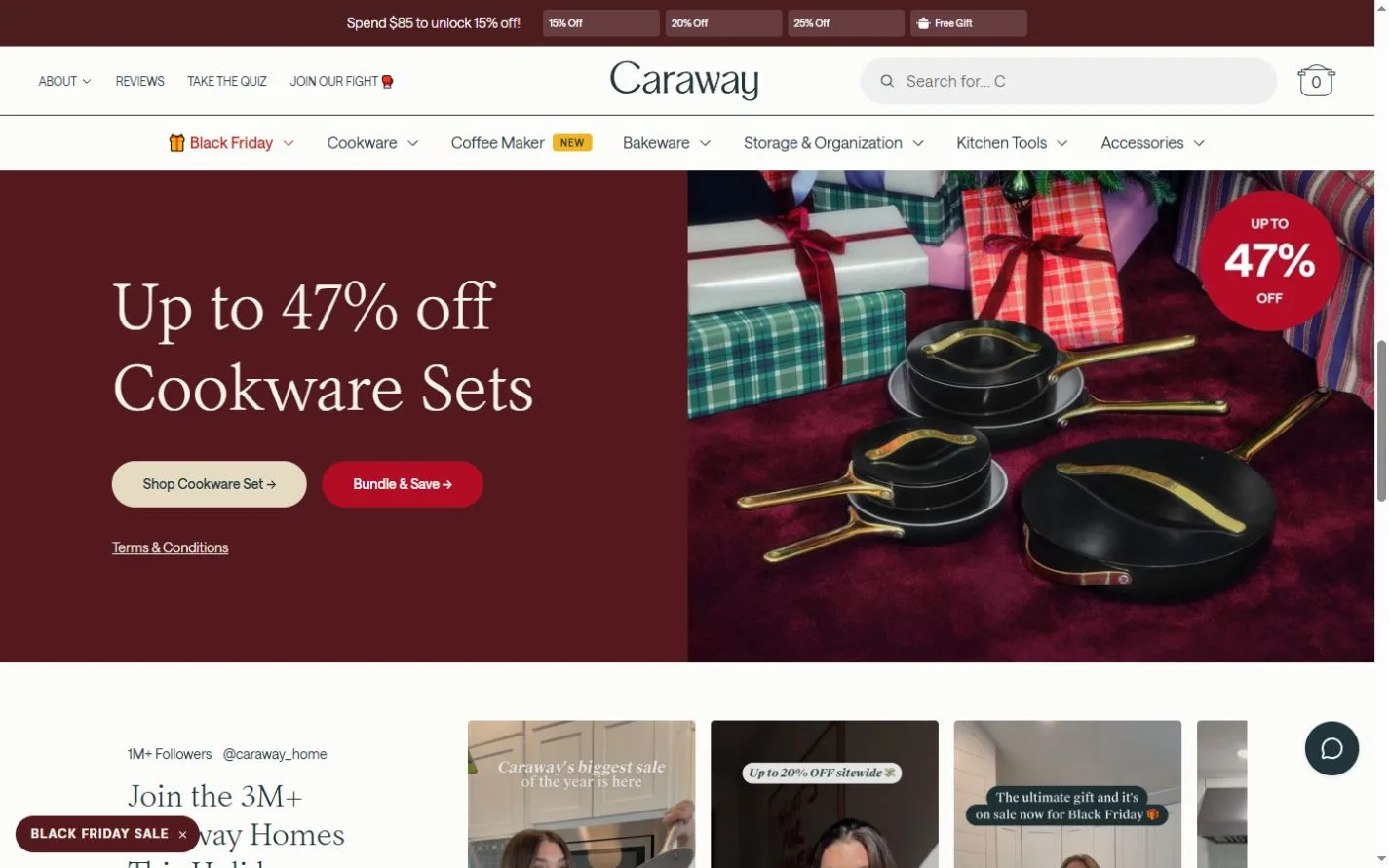
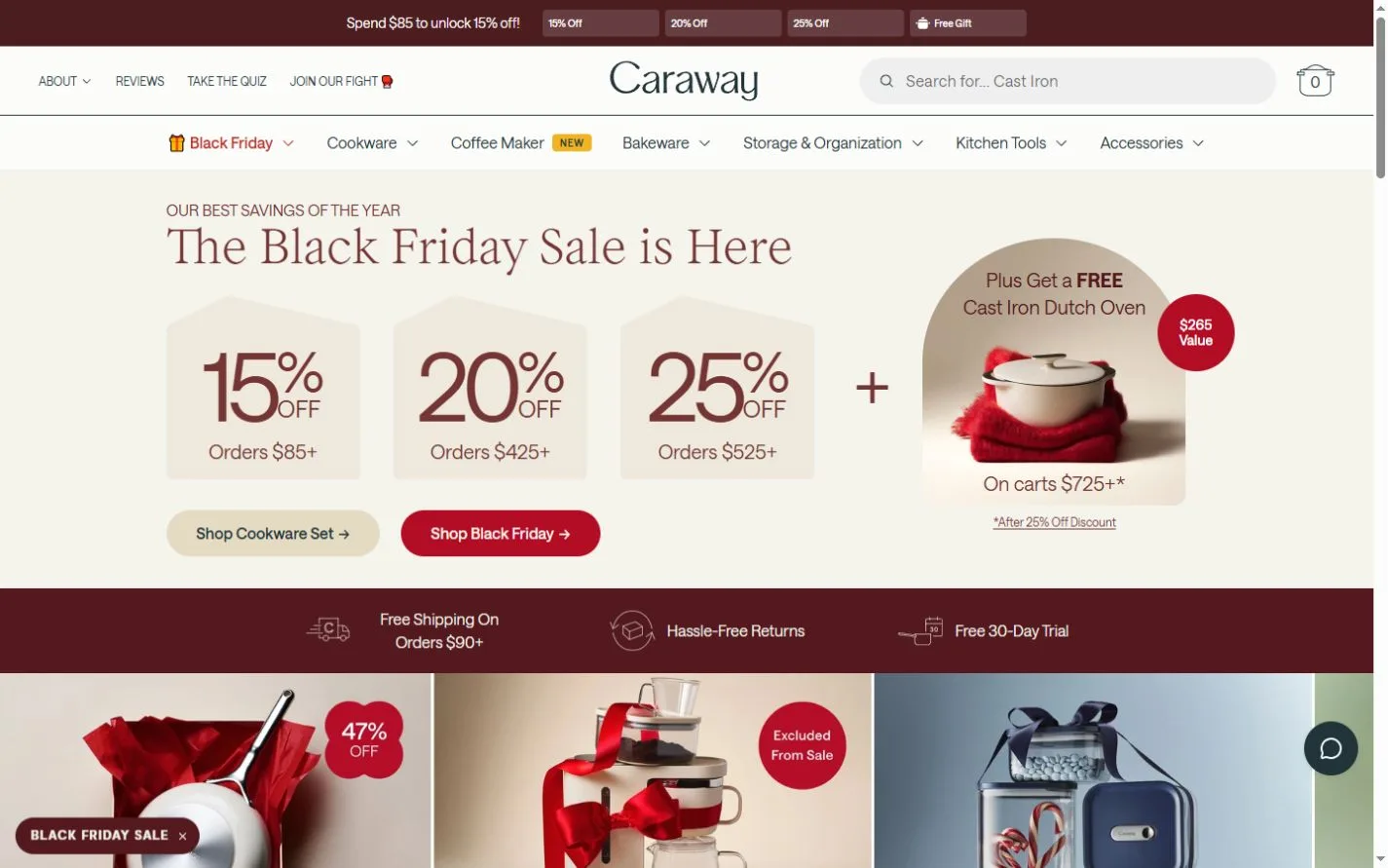
Caraway sells cookware, bakeware, kitchen tools and storage products. Its captured homepage leads with a seasonal promotion, using a cream background, burgundy type and separate shopping actions. The opening screen explains several spending thresholds through repeated graphic blocks. A supporting campaign image returns to the cookware itself, showing a set against a deep red background.
What caught our eye
The most practical detail is the hierarchy inside the offer. The discount, qualifying order and additional gift each occupy a distinct area. A visitor can scan the blocks before deciding whether to open the collection. Compare this with a single promotional sentence, where the shopper would have to keep several conditions in mind at once.
The site places delivery, returns and trial information directly below the main invitation. That is a useful trust strategy to inspect alongside the imagery. These details answer practical buying questions while the shopper is still looking at the campaign. The current terms live on the store, so the screenshot is a dated reference rather than a standing price promise.
The supporting image gives the pans more room and uses ribbon, color and texture to convey the occasion. Notice how the same serif heading and red accents connect that scene with the informational hero. For a store selling coordinated sets, this is an example of dividing the work between a clear offer and a product scene that makes the collection recognizable.
Who might find it useful?
Designers and founders studying distinctive brand websites.
Website screenshots