Chamberlain Coffee
Seasonal coffee scenes lead into a compact mix of product cards and bundles.
Website overview
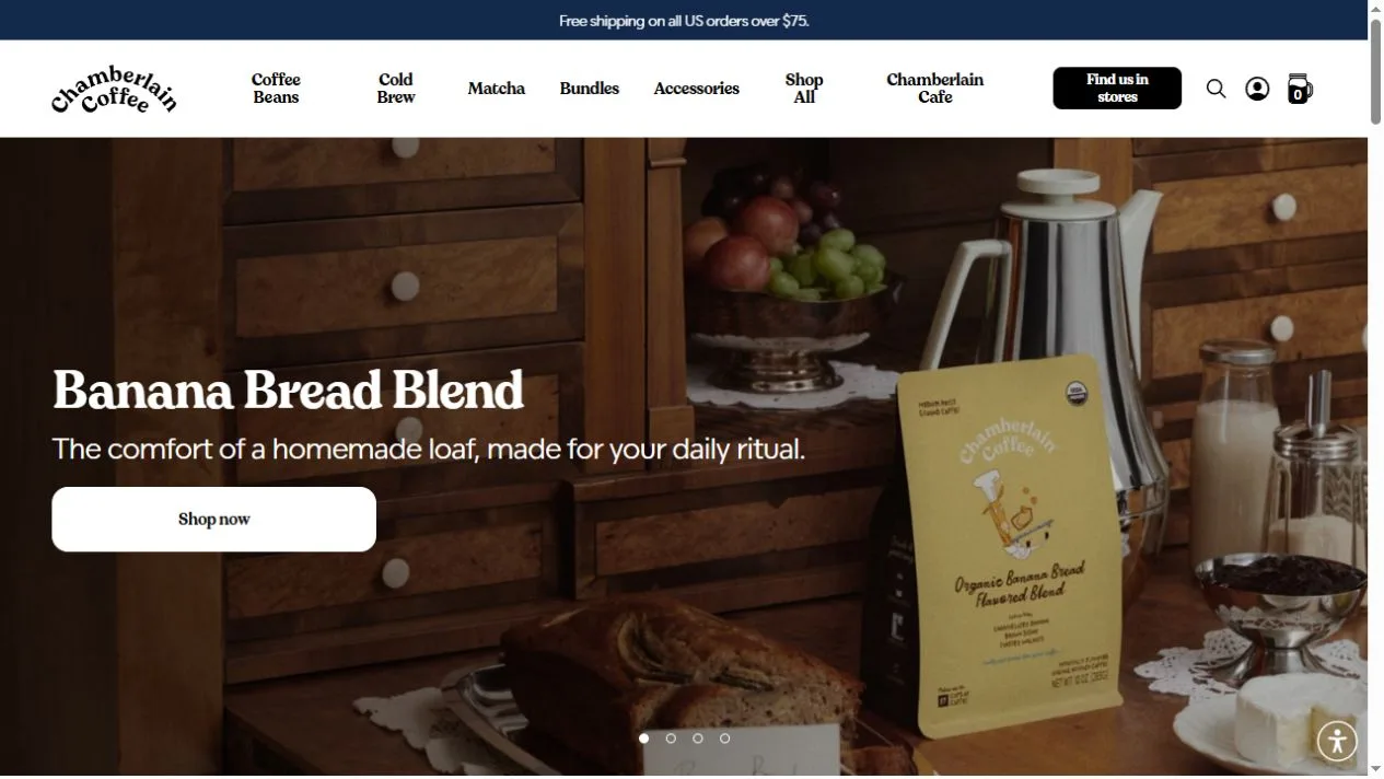
Chamberlain Coffee sells coffee, matcha, cold brew products and accessories. The homepage introduces a featured blend before moving into bestsellers, shopping categories and bundles. Product cards pair short names with size choices and buying controls. The combination makes the site a useful example of moving from a seasonal introduction into the more practical work of comparing items.
What caught our eye
The top navigation names familiar product types, so a shopper with a particular drink in mind can go straight to that section. The homepage then offers a different route through a featured flavor. These two structures serve different visits: one starts with a known category, and the other lets the visitor discover a new product.
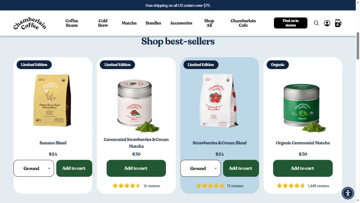
The bestsellers row uses consistent card sizes and light backgrounds. Labels sit near the top, while size and buying options stay near the bottom. That alignment makes it easier to compare a bag of coffee with another format even when the packaging differs. Notice how a limited-edition label adds information without changing the position of the main controls.
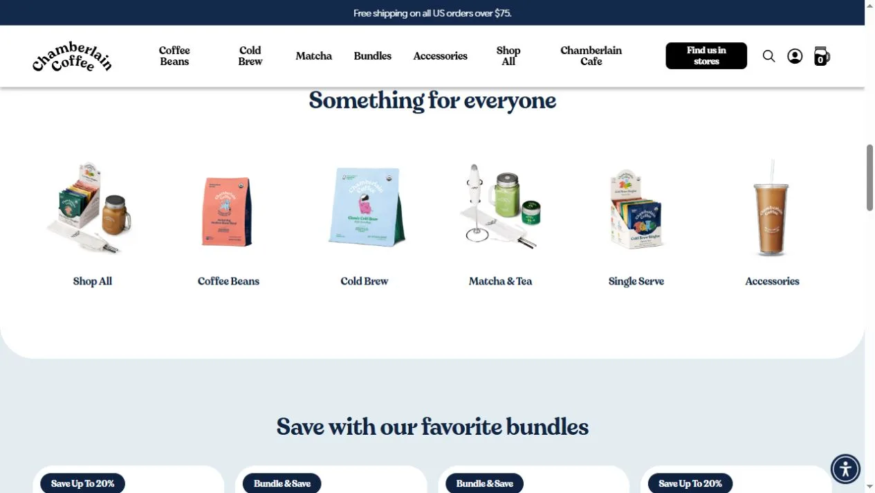
Bundle cards extend the same system to combinations of products. A group photograph explains what is included before the reader opens the detail. For stores with repeat-purchase products, this is a useful place to compare the information needed for one item with the information needed for a set. Study whether the picture, name and price together make the contents understandable at a glance.
Who might find it useful?
Designers and founders studying distinctive brand websites.
Website screenshots