Death Wish Coffee
A dark seasonal campaign hands visitors off to product grids and a coffee club.
Website overview
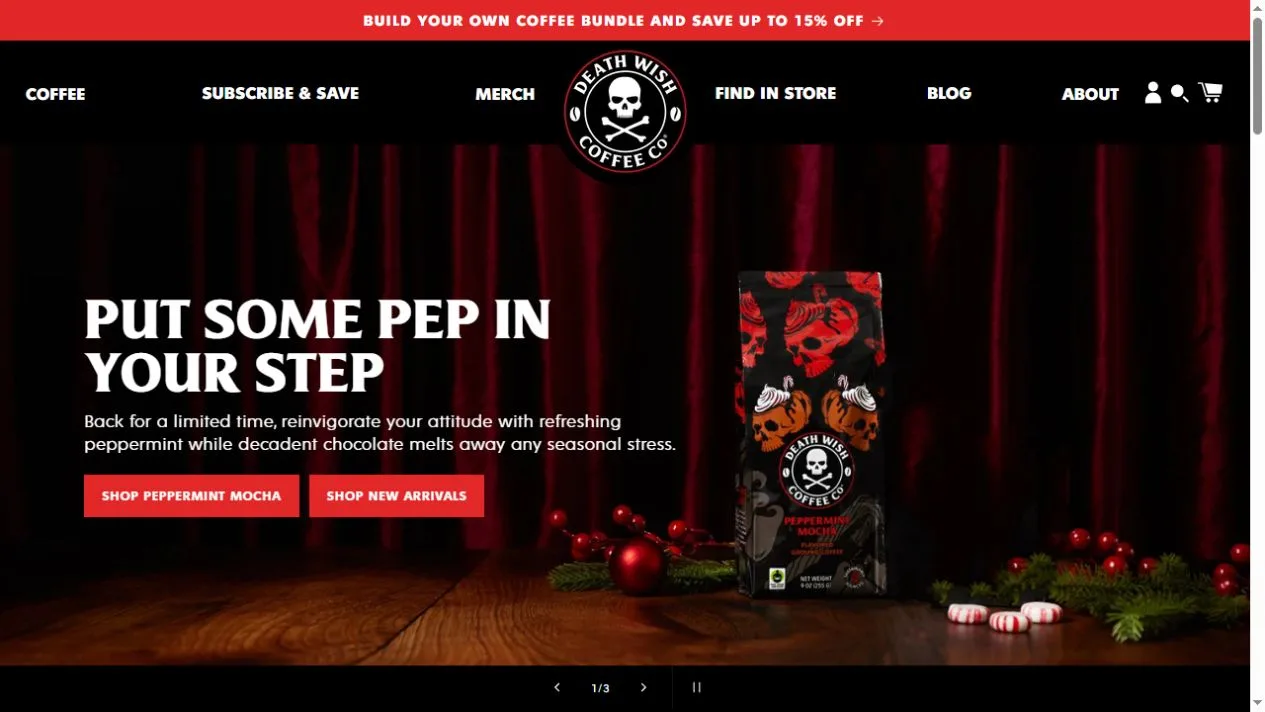
Death Wish Coffee sells coffee in several formats alongside bundles and merchandise. The homepage presents a seasonal flavor against dark curtains, with red accents, coffee packaging and props grouped to one side. As the page moves down, it offers a product row and a distinct subscription section. The screenshots show how a strong visual identity can support both discovery and routine replenishment.
What caught our eye
The skull mark is centered in the navigation and repeats on the bags. Its white lines hold up on the dark header. In the hero, the campaign heading uses a similar light-on-dark treatment. Red buttons mark the next actions. The bag does not have to fill the entire screen for a returning visitor to recognize it.
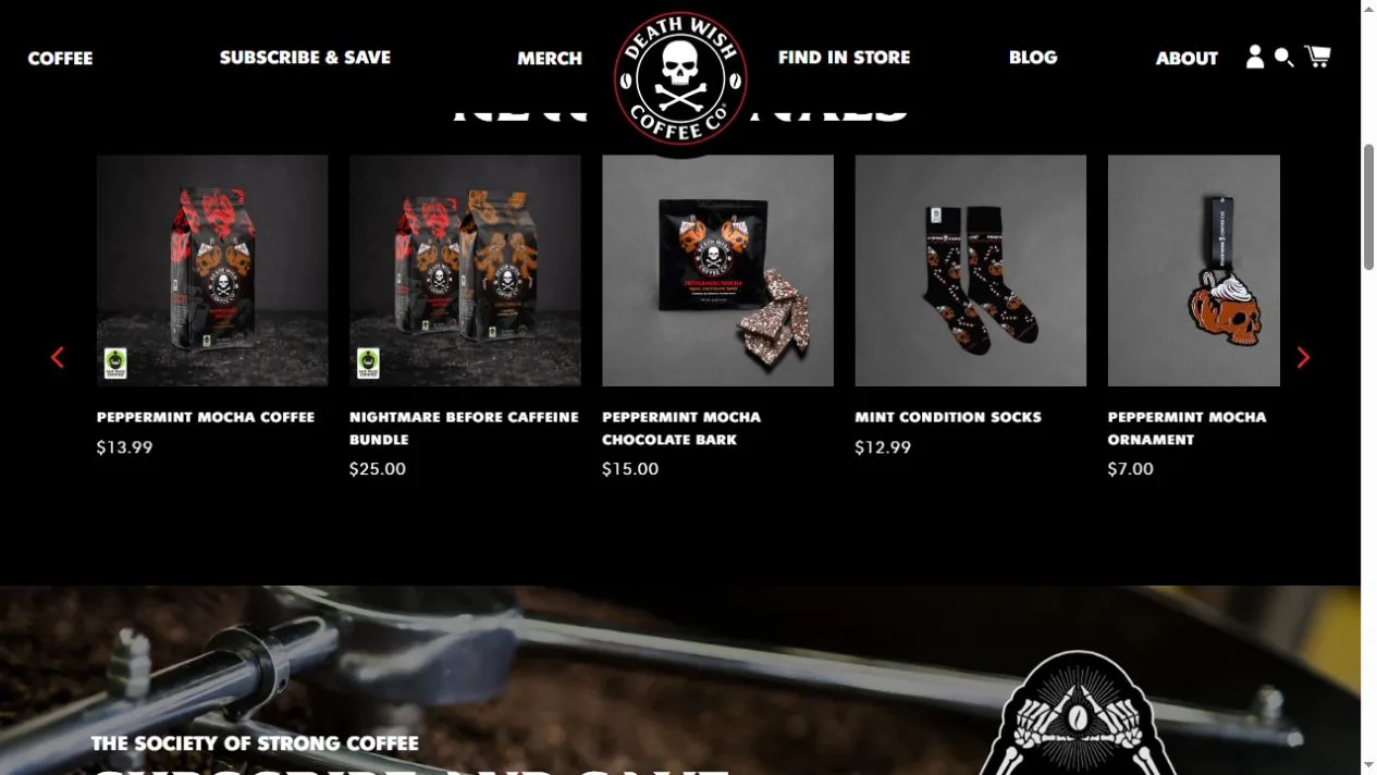
The new-arrivals row uses several dark cards, each with a contained product photograph. The repeatable card layout lets the store put a bag, bundle, snack or accessory in the same horizontal row. Shoppers can compare names and prices without the staged scene behind them. This is a useful transition when the hero includes several props but only one featured item.
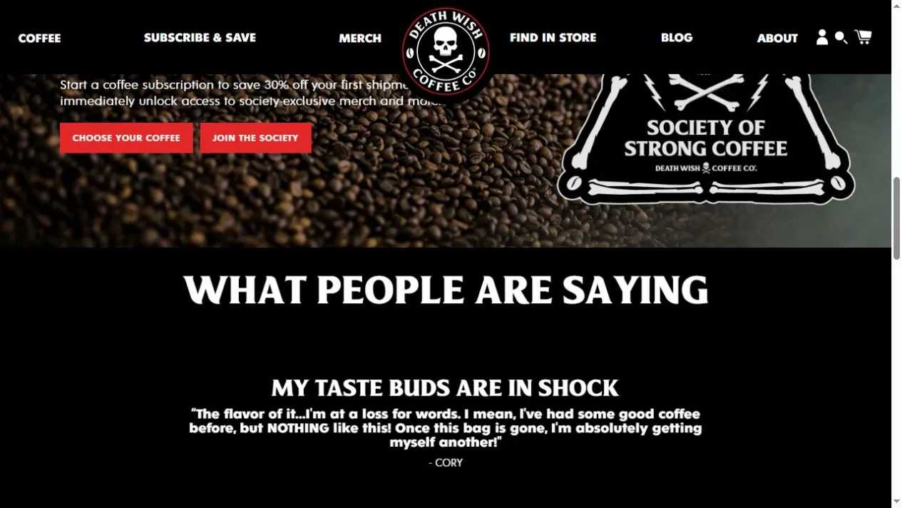
Further down, the coffee club gets its own badge and two distinct actions over a background of beans. The change in layout distinguishes a recurring purchase from a seasonal launch. Look at where the store changes from expressive imagery to short practical labels. That choice lets a single campaign set the mood without asking every part of the page to carry the same weight.
Who might find it useful?
Designers and founders studying branded storefronts.
Website screenshots