Designjoy
Oversized type meets a vivid membership card, with pricing beside the promise.
Website overview
Designjoy uses oversized typography and a visible membership offer to introduce its design subscription.
Designjoy offers a design subscription. This desktop sample examines how its landing page connects a short service headline with pricing, a request workflow and examples of design work.
What caught our eye
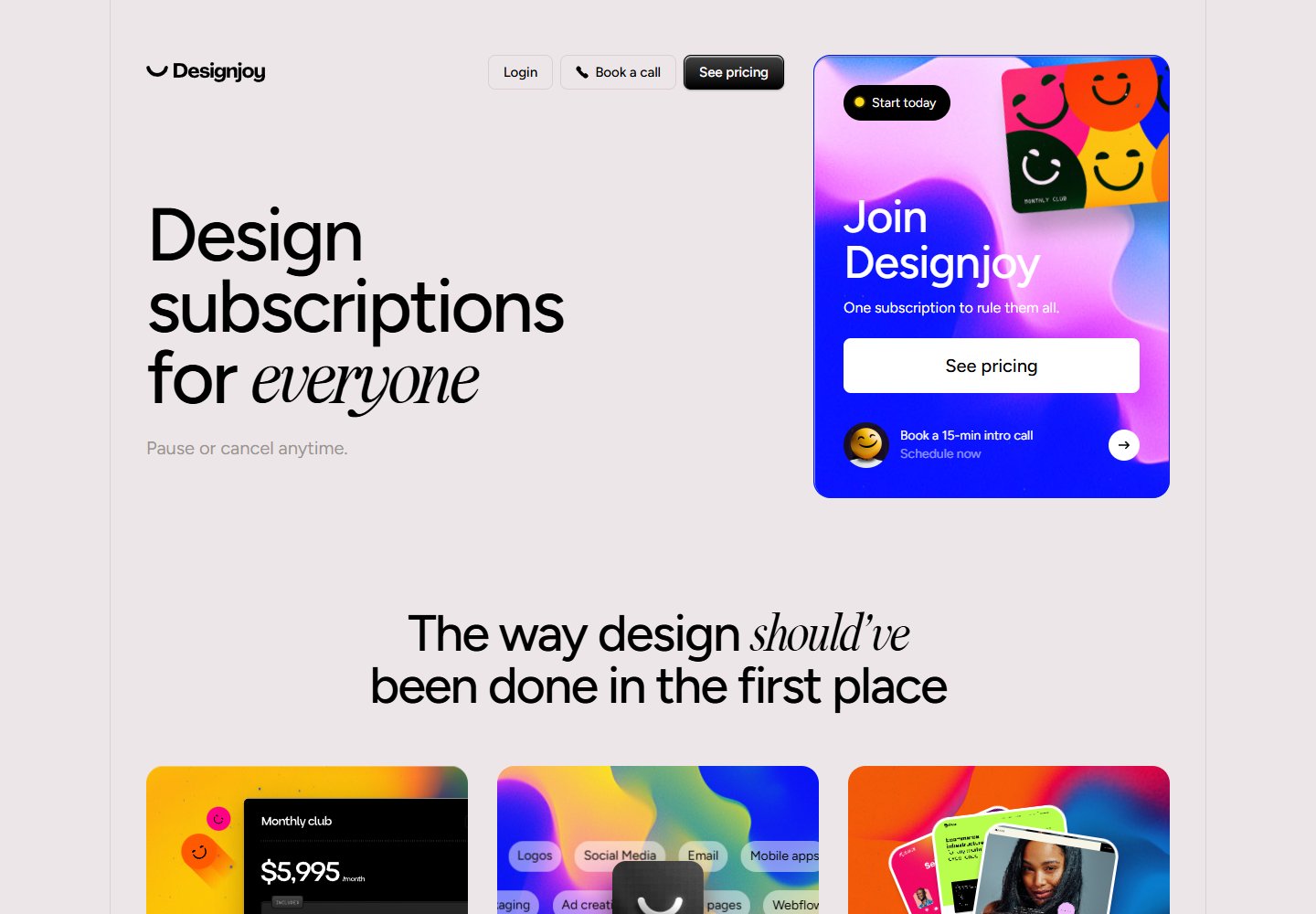
Hero & headline: A large left-aligned headline states the subscription offer. One italic serif word breaks the sans-serif rhythm. On the right, a colorful membership card groups the pricing button and introductory-call link.
Color & layout: A pale background gives the black headline room to stand out. Saturated blue, pink and yellow gradients concentrate attention on the membership and workflow cards.
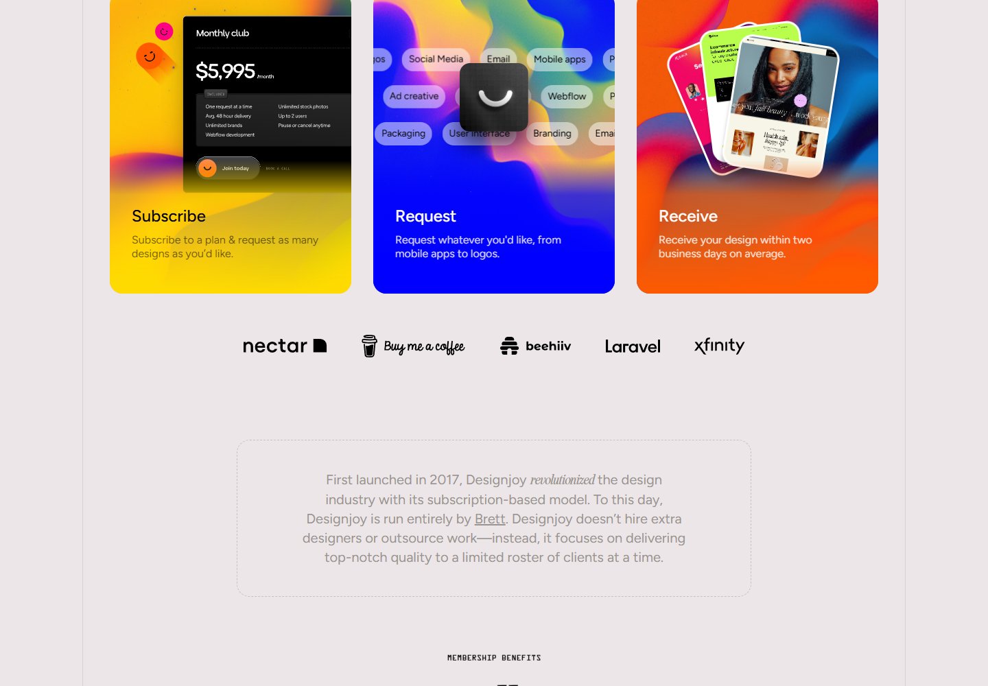
Service presentation: Three illustrated cards explain subscribing, requesting work and receiving a design. Interface mockups and request-type labels make the service more tangible before visitors reach the detailed plan.
Trust strategy: A logo row follows the workflow, with a founder introduction beneath it. Named testimonials and a recent-work section appear later, giving visitors several ways to assess the service before the pricing section.
Who might find it useful?
Designers comparing split heroes, mixed typography and the placement of proof on subscription-service landing pages.
Website screenshots