Diaspora Co.
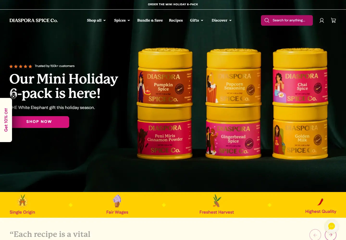
Yellow spice tins turn a pantry staple into a gift worth displaying.
Website overview
Diaspora Co. shows how spice packaging can become the central visual element of a food storefront.
Diaspora Co. sells spices and spice sets, with recipes and origin stories alongside its shop. The homepage connects illustrated packaging with cooking, gifting and a cookbook launch.
What caught our eye
Hero: Six yellow tins sit against a dark green cloth. The product colors do much of the work before the visitor reads the headline.
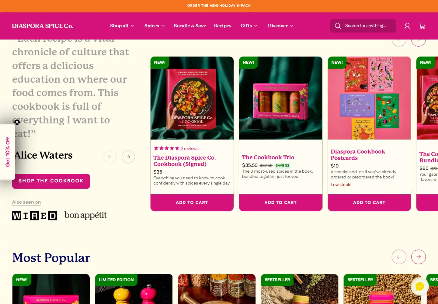
Color & layout: Pink navigation and buttons interrupt the green and cream sections. The same colors return in the packaging, so the page and the product feel connected.
Product presentation: Cookbook bundles sit beside individual spice products with visible prices. A visitor can compare a gift with a smaller pantry purchase.
Trust strategy: The site names origins and places a cookbook endorsement near the offer. These are specific details a shopper can investigate beyond the first image.
Who might find it useful?
Packaging-led food shops and designers working on gifts or editorial commerce.
Website screenshots