Fishwife
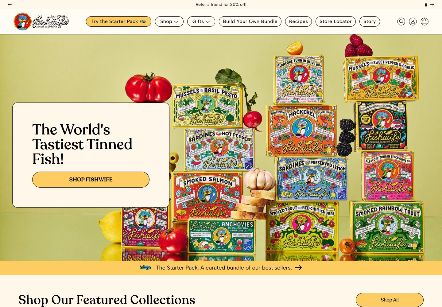
Illustrated tins fill the hero; a quiet title card makes room for the message.
Website overview
Fishwife branding carries illustrated packaging into the website hero, giving the storefront a recognizable visual language.
Fishwife sells tinned seafood, bundles and gifts. This sample studies how packaging artwork carries the homepage while collection cards provide clear shopping routes.
What caught our eye
Hero & headline: Stacks of illustrated tins fill the opening image. A pale title panel gives the serif headline and yellow shopping button a separate, readable surface.
Color & layout: Cream backgrounds and fine dark outlines repeat across navigation pills and content cards. Yellow marks selected actions against the multicolored packaging.
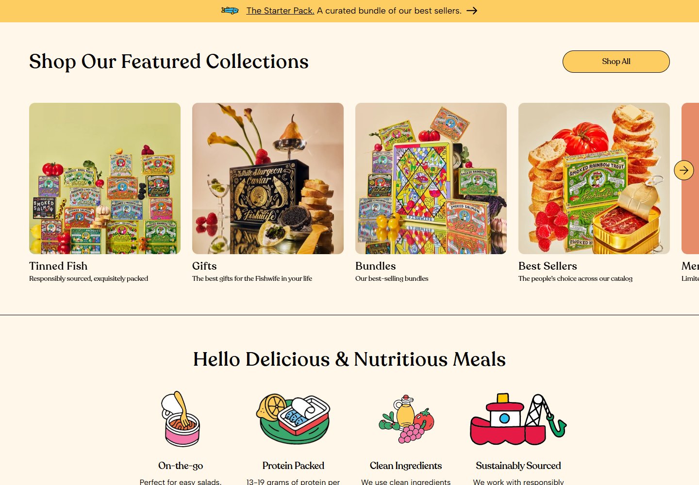
Product presentation: The collection row separates tins, gifts and bundles with styled photographs. A starter-pack entry gives newcomers a specific place to begin.
Trust strategy: Further down, social clips and attributed press quotations support the brand presentation. They are examples of proof placement, not independently verified evidence of product quality or sales.
Who might find it useful?
Designers comparing packaging-led storefronts, readable hero overlays and collection navigation.
Website screenshots