Fly By Jing
Red, yellow and oversized type make chili sauce hard to scroll past.
Website overview
Fly By Jing brings chili sauce packaging into a food website design built around bold typography and strong color.
Fly By Jing sells chili sauces, pantry products and gift sets. The storefront uses packaging, founder storytelling and recipes to connect the products with everyday meals.
What caught our eye
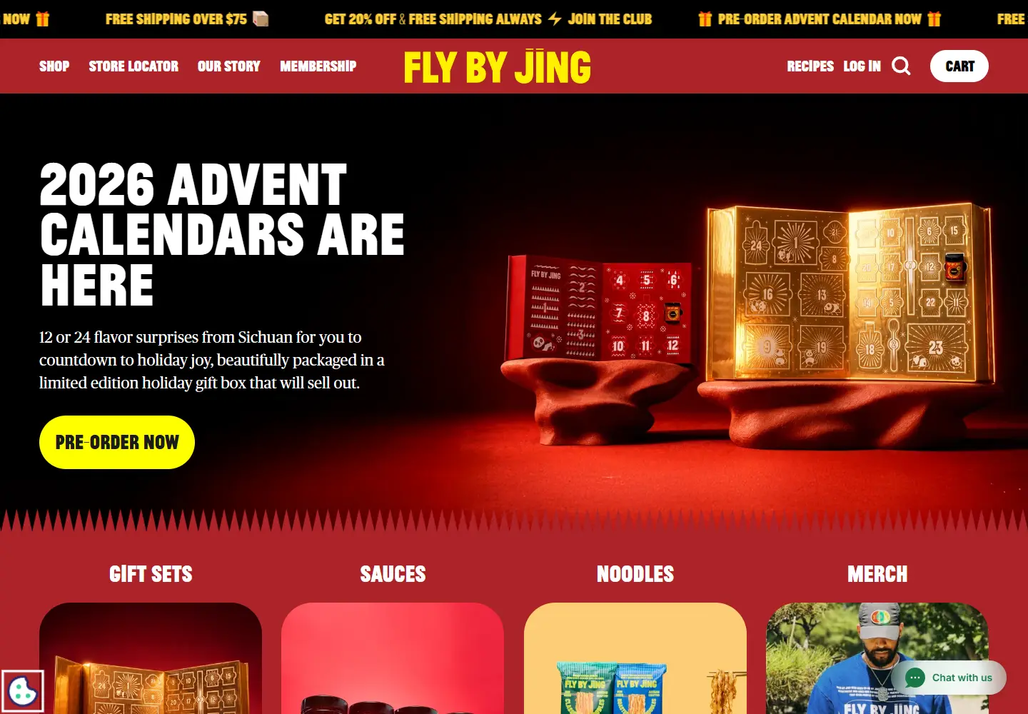
Hero: Large white condensed type sits beside a red-and-gold gift box. A yellow rounded preorder button is easy to locate against the dark background.
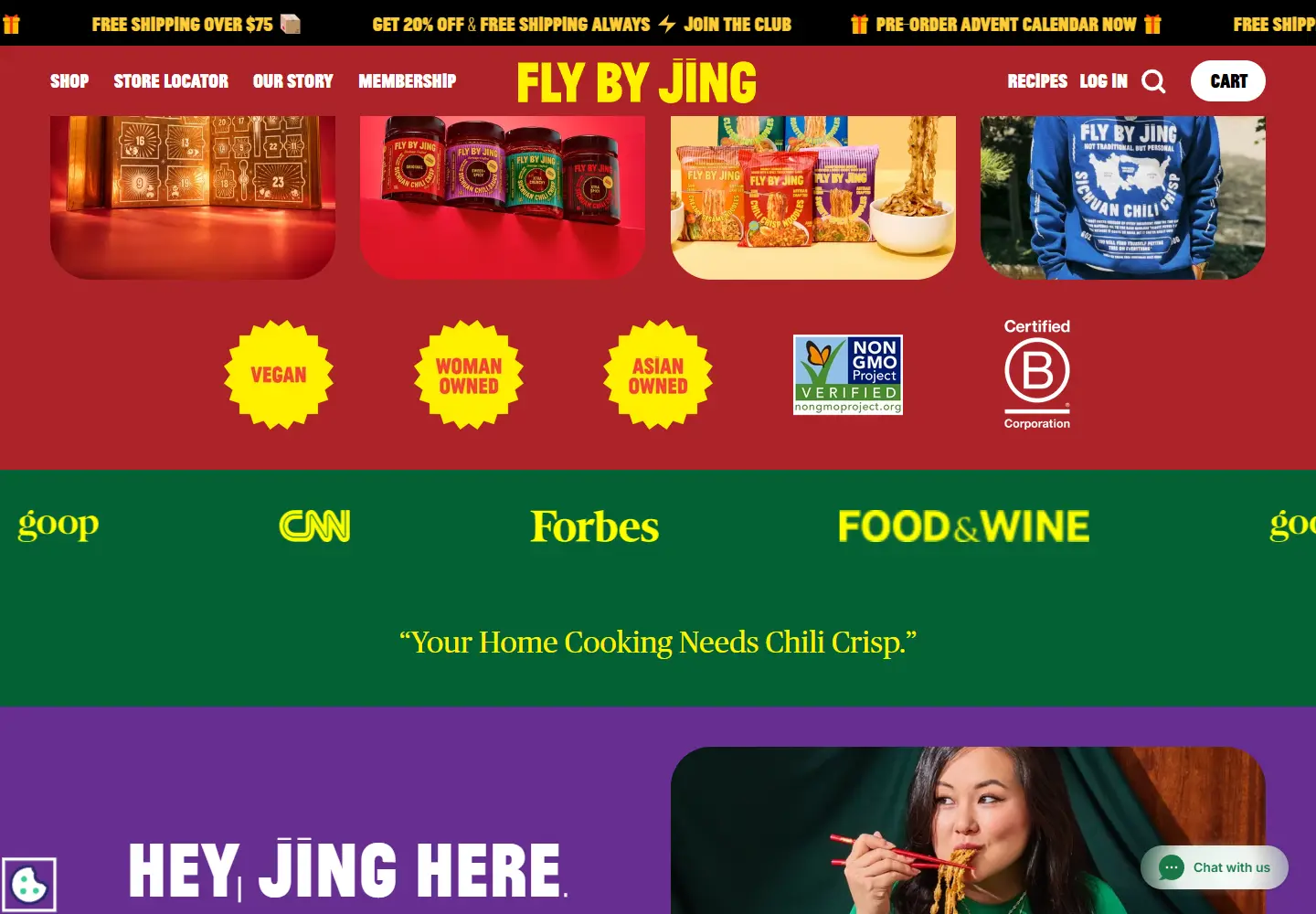
Color & layout: Red navigation, yellow accents and purple story sections keep the page visually loud. Each block has a clear job despite the changing colors.
Product presentation: Product-category links lead from the seasonal gift campaign into sauces and pantry staples.
Trust strategy: The page connects press excerpts with a founder story. This gives visitors more to assess than the packaging alone.
Who might find it useful?
Food-brand designers studying strong typography and seasonal merchandising.
Website screenshots