Ghia
A burgundy bottle, tactile photography and an aperitif brand with a world of its own.
Website overview
Ghia is a nonalcoholic drinks brand selling aperitifs and ready-to-drink spritzes. Its storefront brings bottles, glasses, cans and ingredients into a warm photographic setting. The page moves from a specific product announcement to a choice of drink formats, then into recipes and a cookbook. It is useful for studying how a product catalog can sit inside a recognizable brand world instead of becoming a disconnected grid of pack shots.
What caught our eye
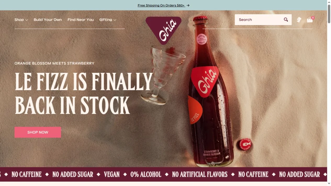
Hero & headline: The captured first screen announces the return of Le Fizz. Tall cream lettering sits on a textured scene with a bottle and filled glasses. A compact pink shopping button stays separate from the image, while the burgundy wordmark gives the composition an anchor. The message is about an available product rather than a vague lifestyle promise.
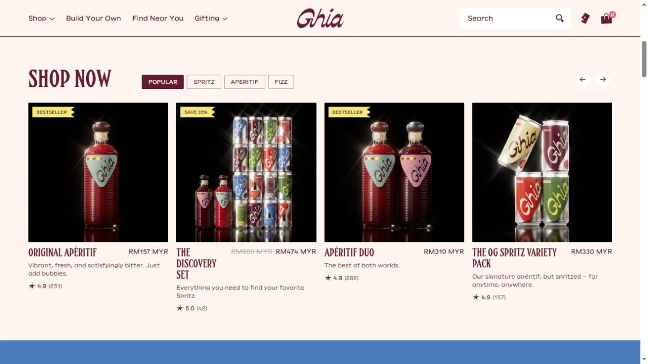
Product presentation: The next section separates aperitifs, spritzes and other formats into visible shopping choices. Product cards include names, prices and review cues. Compare the close, atmospheric hero with these practical cards: the photography establishes character, and the catalog explains what can actually be bought.
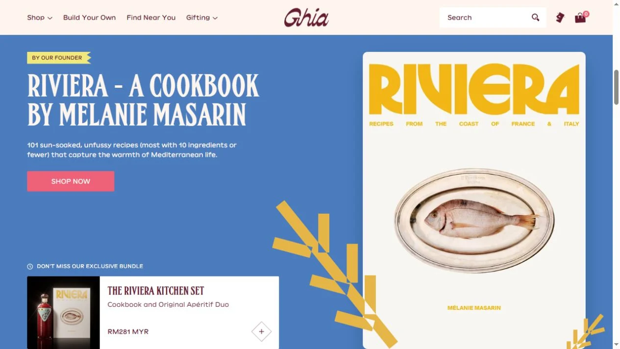
Color & layout: Burgundy, cream and pink recur in different proportions. A later blue cookbook panel deliberately changes the backdrop while keeping a strong editorial voice. The book and accompanying imagery extend the occasion around the drink.
Trust & context: Review indicators and detailed product links supply additional information, but this entry evaluates presentation rather than taste, health effects or sales performance. Study how much of the visual identity remains recognizable when the hero gives way to shopping controls.
Who might find it useful?
Brand designers and founders building a distinctive drinks storefront.
Website screenshots