Graza
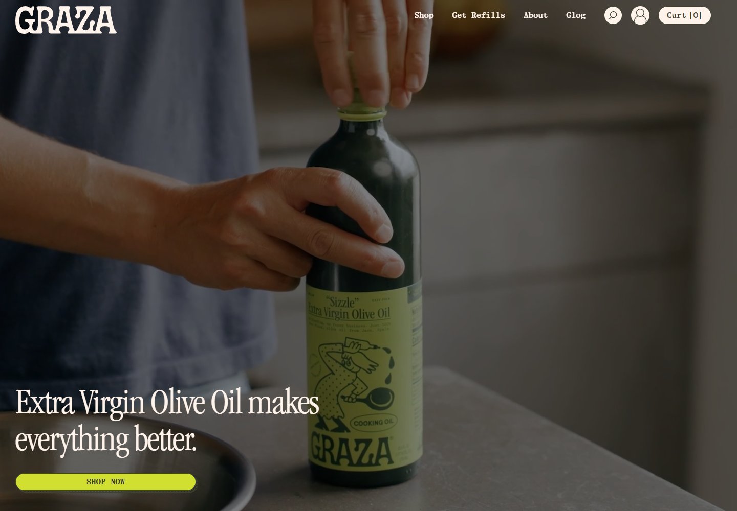
A full-screen bottle scene with a bright yellow-green shopping cue.
Website overview
Graza turns olive oil into a prominent visual subject, pairing a bottle-led hero with a contrasting shopping cue.
Graza sells olive oil and related pantry products. This desktop sample studies how its homepage moves from a product-in-use hero to product ranges and cooking uses.
What caught our eye
Hero & headline: The opening uses a full-screen product scene. A large cream serif headline sits at the lower left, with a yellow-green shopping button directly beneath it.
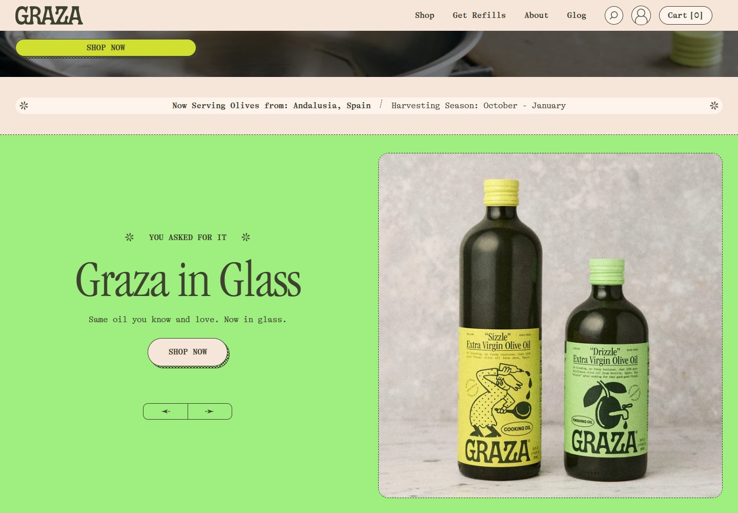
Color & layout: Cream navigation changes to dark green text on scroll. Below the hero, bright green panels pair oversized type with bottle photography.
Product presentation: The range distinguishes finishing, everyday cooking and high-heat oils. Use labels sit alongside bottle sizes and prices, giving visitors concrete differences to compare.
Trust cues: Origin and harvest-season information appear in a narrow strip between sections. This makes sourcing visible in the page sequence; the claims have not been independently audited here.
Who might find it useful?
Designers studying product-in-use heroes, high-contrast shopping buttons and clear product-range comparisons.
Website screenshots