Linear
Dark typography and a detailed issue view explain a product development system.
Website overview
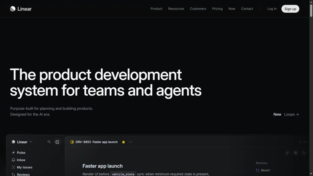
Linear presents software for planning and tracking product development. The captured landing page opens on a near-black canvas with a large white headline and a narrow supporting line. An example issue view starts below that copy. The page then organizes the product around tasks such as collecting requests, planning, automation and release work.
What caught our eye
The example issue connects the headline to something people can recognize. It contains an issue title, activity and a navigation rail. Those details show the scale of the product: the visitor is looking at a team workspace rather than a single chart. The frame begins at the bottom of the opening viewport, which gives the reader a reason to keep scrolling.
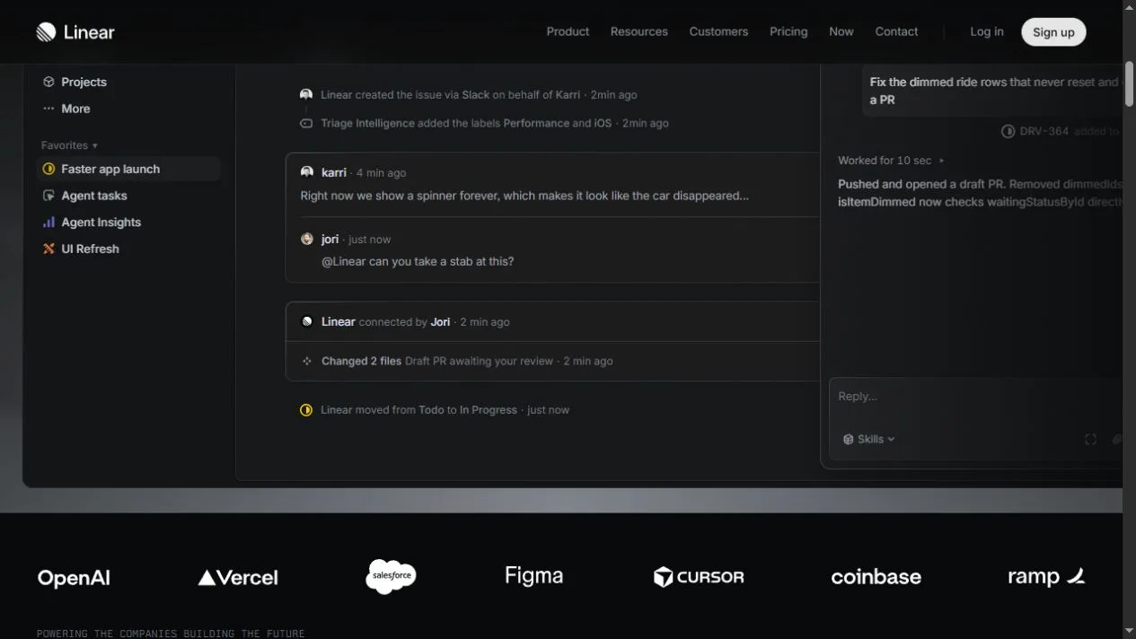
The top navigation offers separate routes to product information, customer stories and pricing. The signup button stands out as a light shape against the dark bar. Lower down, a row of customer marks provides a quick visual break between the interface and the longer explanation. The rows and links let interested visitors move to more detail at different points.
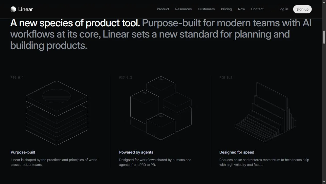
The diagrams after the introduction use thin lines and restrained color. They give the page a visual pause before the next set of interface examples. For a product team designing its own landing page, compare how much detail is legible in the screenshots with how much explanatory copy sits beside them. Linear uses recognizable labels to make a substantial product feel easier to enter.
Who might find it useful?
Product teams studying software landing pages.
Website screenshots