Material
A split-screen kitchenware storefront with quiet type and food in the foreground.
Website overview
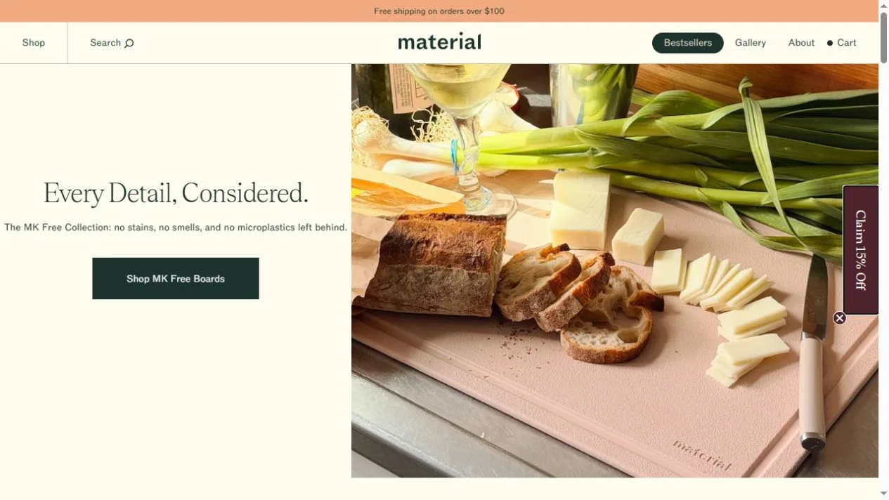
Material sells kitchenware such as cutting boards, knives and prep sets. On the captured homepage a cream copy panel sits beside a photograph of food laid out on a pale board. The photo shows the tool through the work it supports. A dark green shopping button gives the viewer a clear path from that scene to the featured collection.
What caught our eye
The hero is a useful example of using an object as the setting for a photograph. The board is partly covered by bread, produce and other ingredients, yet its surface, color and use remain easy to identify. The balance would change if the objects were packed into a tight studio shot. Here the image leaves room for people to picture the board in their own kitchen.
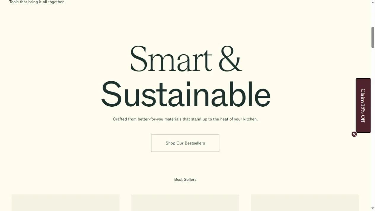
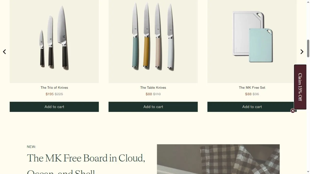
The typography alternates between a restrained serif and plain sans serif. Large blocks of cream space let the reader move from the opening scene to the bestsellers. The product cards become more uniform at that point. Once shoppers are comparing options, equal image sizes and aligned buttons carry more weight than the expressive crop used in the hero.
Look at the way the knives are presented together and the boards sit on pale backgrounds. A designer working on a homeware shop can borrow that change of pace: show how an item fits into a routine, then switch to consistent images when the visitor needs to choose between products.
Who might find it useful?
Designers and founders studying branded storefronts.
Website screenshots