Oatly
An editorial grid, oversized type and a browser-window frame give an oat brand a distinct voice.
Website overview
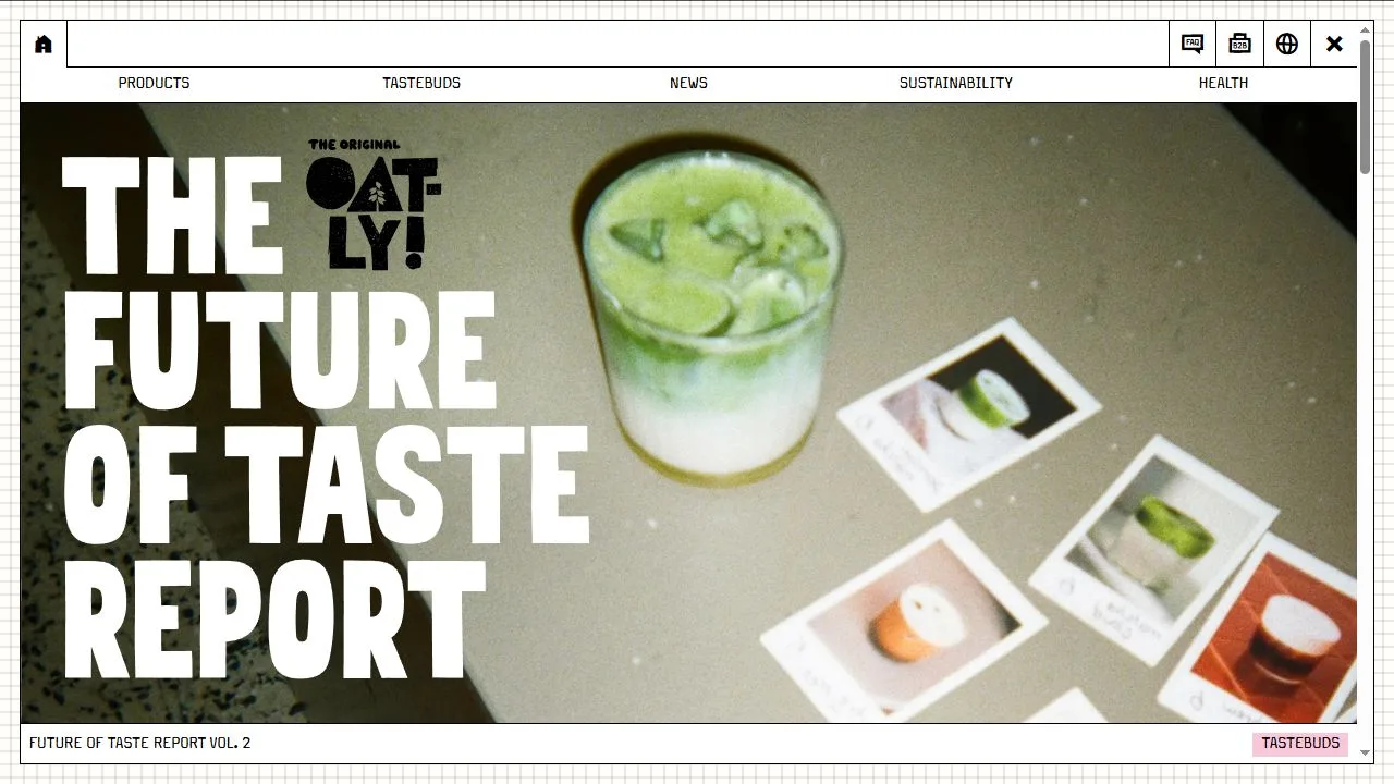
Oatly presents oat drinks and related products alongside recipes, campaigns and company information. The captured homepage gives a taste report the largest space, with tall white lettering over a drink photograph. Further down, varied editorial tiles share a fine grid background. The product menu remains available above that content, giving the visitor a second way to explore the brand.
What caught our eye
The window-like frame is a distinctive part of the desktop layout. A narrow toolbar sits above the main navigation, and a border encloses the feature image. This device turns a collection of campaign material into something that feels like one environment. It also creates a repeatable structure for photographs with quite different colors and subjects.
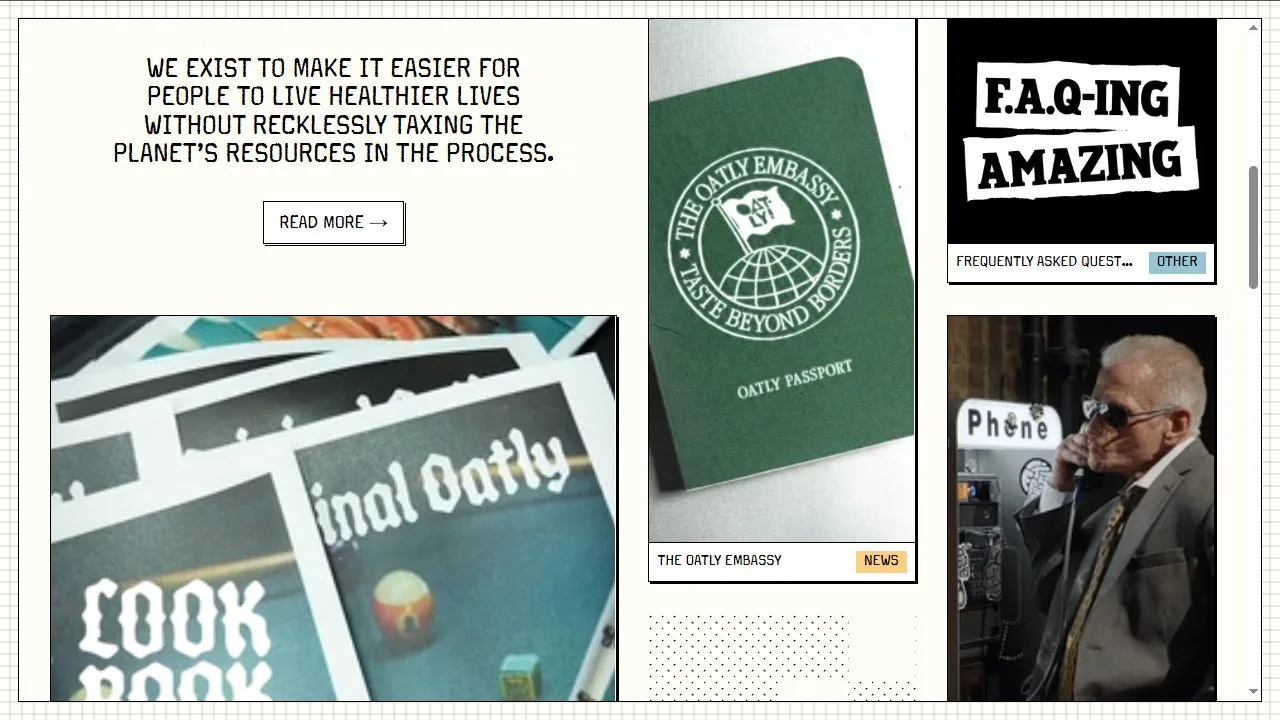
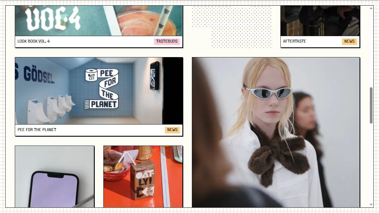
The opening image uses very large lettering, leaving the glass and surrounding printed pictures visible through the gaps. Smaller cards use their own type treatments and photographic crops. Look at how the category labels provide a common reference when the pictures change. A varied grid needs these repeated details if visitors are to understand what they can open.
For a brand with an active editorial program, the useful question is how product information stays accessible while the homepage changes. Oatly keeps products, recipes and company topics in the navigation while featuring a particular story below it. Designers can study that balance when a brand wants its website to support a broader voice than a product catalog alone.
Who might find it useful?
Designers and founders studying distinctive brand websites.
Website screenshots