OLIPOP
A soda flavor gets a full-color world around the can.
Website overview
Olipop branding builds a colorful setting around a soda flavor, carrying the can and its packaging into the website campaign.
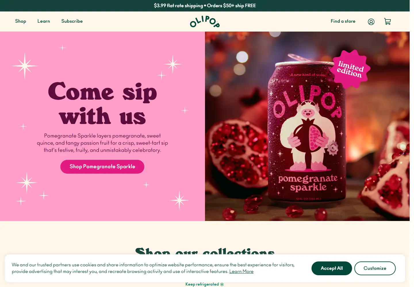
OLIPOP sells canned soda in multiple flavors. The captured homepage leads with a Pomegranate Sparkle campaign and follows with collection and flavor shopping routes.
What caught our eye
Hero: A pink illustrated scene puts the Pomegranate Sparkle can at its center. The flavor description and shop action sit immediately beside the product image.
Color & layout: The page lets one flavor own the opening palette, then changes visual emphasis for product collections. It reads like a campaign rather than a uniform product grid.
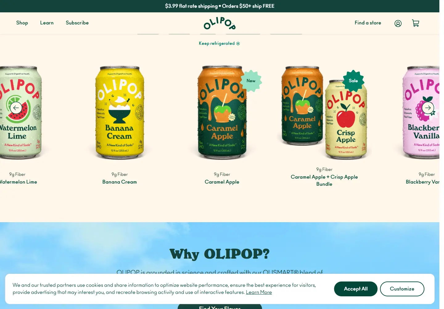
Product presentation: Flavor, pack and collection links offer ways into the store. The can remains recognizable as the same product family across different color treatments.
Review scope: The captured page includes the site’s cookie notice. We reviewed the visible storefront presentation, not the product’s nutrition or health claims.
Who might find it useful?
Designers studying beverage packaging carried through to ecommerce campaigns.
Website screenshots