Omsom
A bowl of noodles, a neon burst and almost no need for explanation.
Website overview
Omsom branding connects food photography, vivid packaging and neon graphic elements in a direct product-led hero.
Omsom presents Asian cooking sauces and noodles. Its homepage emphasizes the finished food, colorful packaging and retail availability.
What caught our eye
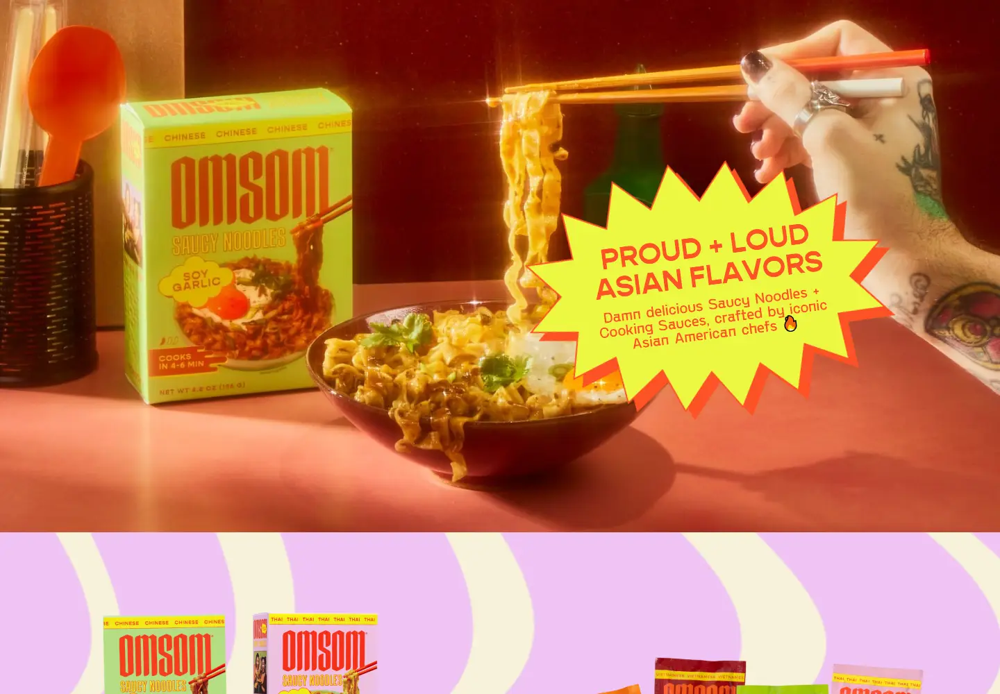
Hero: Chopsticks lift noodles beside the product box. A yellow starburst carries the main message against warm orange lighting.
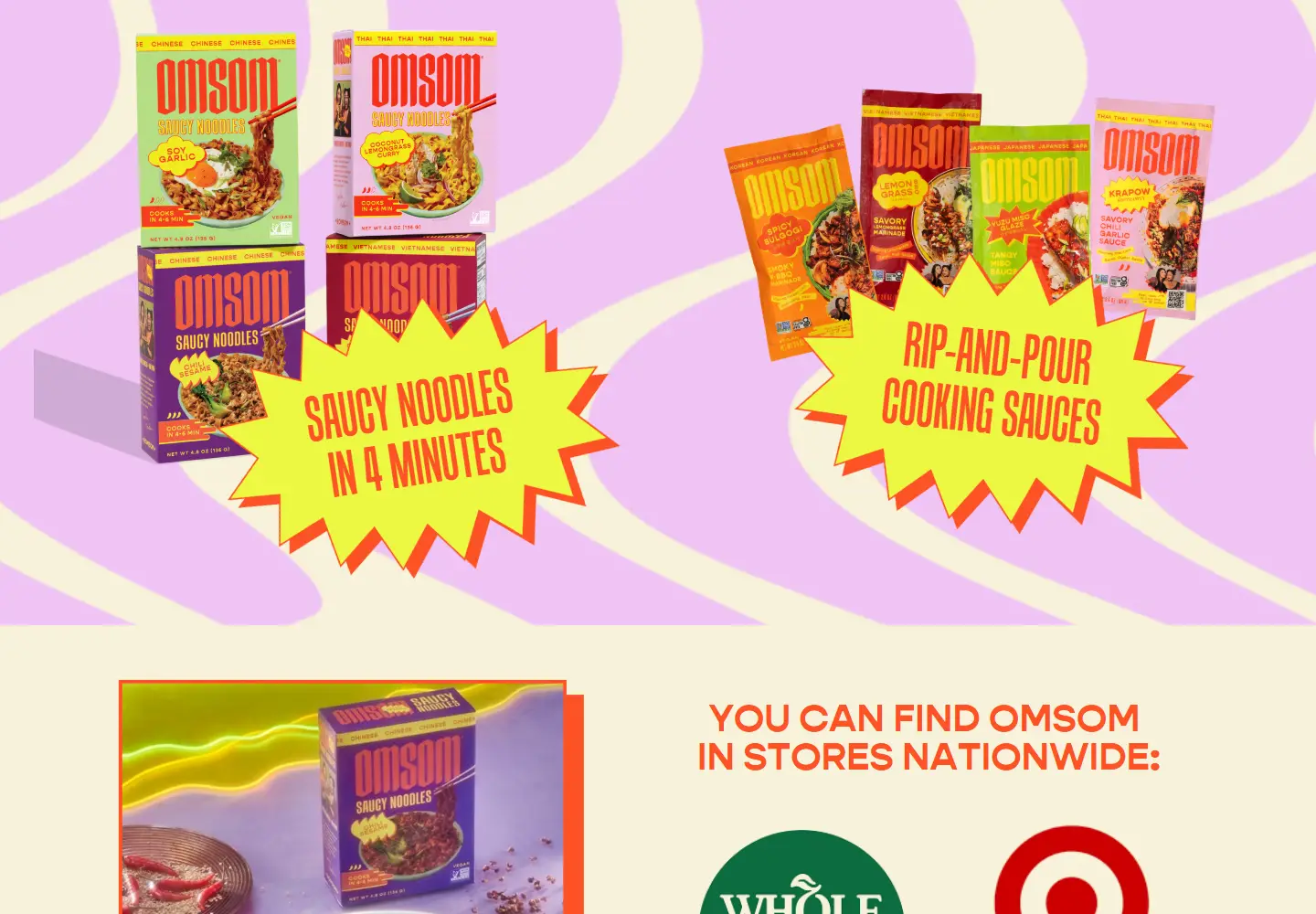
Color & layout: Neon yellow, orange and lilac continue from packaging into the page. The colors are recognizable even in a small screenshot.
Product presentation: Separate sauce and noodle sections explain the two product families. The prepared meal connects the package with a concrete use.
Trust strategy: Retailer names, press excerpts and the founders’ story follow the product introduction. The page also explains the brand’s ownership history.
Who might find it useful?
Food-brand designers studying packaging-led art direction and retail discovery.
Website screenshots