Owala
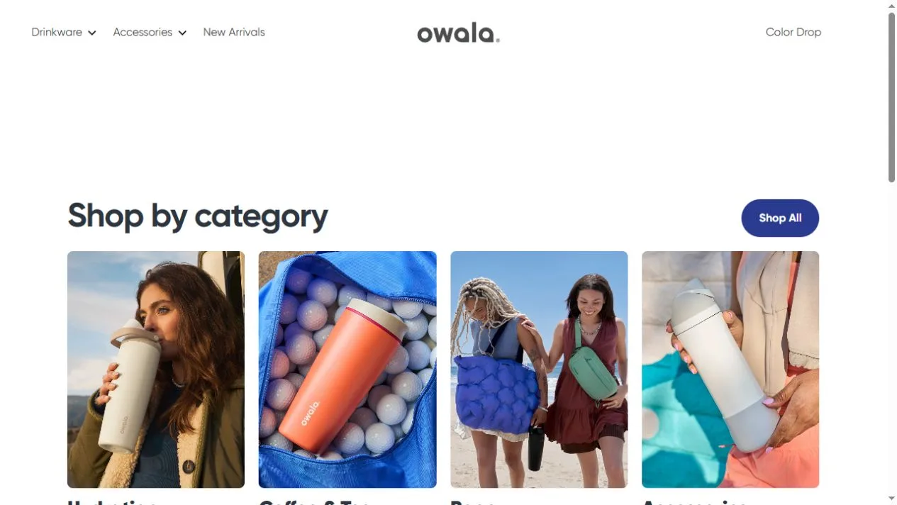
Seasonal color and lifestyle images organize the Owala Malaysia storefront.
Website overview
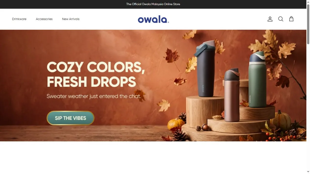
Owala sells bottles, tumblers, drinkware and accessories. The Malaysia storefront uses product photography to make color a reason to look around. The captured seasonal campaign shows three bottles on stepped wooden stands surrounded by autumn leaves. A separate category section organizes the store by what the shopper needs, such as hydration or coffee and tea.
What caught our eye
The bottle shapes stay readable because the products stand upright at different heights. Dark blue, green and brown finishes are distinct against the warm backdrop. The scene also gives those colors a connection. They look like members of the same collection, which helps a visitor understand the campaign before reading about any particular lid or size.
The top navigation stays spare. It moves visitors toward drinkware, accessories and new arrivals without trying to reproduce every category on the first row. Further down, the category cards use different kinds of photographs. A person holding a bottle gives a sense of scale, while a close view of a tumbler lets the finish and silhouette stand out. The same card grid accommodates both approaches.
This is a reference for stores where one model can have many finishes. A campaign can lead with a group of colors, while the permanent navigation leads with the job the product does. Study how the white header and category space separate those two modes of browsing. The images document the regional store and a seasonal campaign as it appeared during capture.
Who might find it useful?
Designers and founders studying branded storefronts.
Website screenshots