Raaka Chocolate
Chocolate shopping framed by a bright seasonal campaign and a distinctive process.
Website overview
Raaka Chocolate connects a seasonal storefront campaign with the process behind its products.
Raaka sells chocolate bars and related experiences. Its storefront moves from a seasonal mini-bar offer to product ranges, subscriptions, classes and an explanation of its unroasted cacao.
What caught our eye
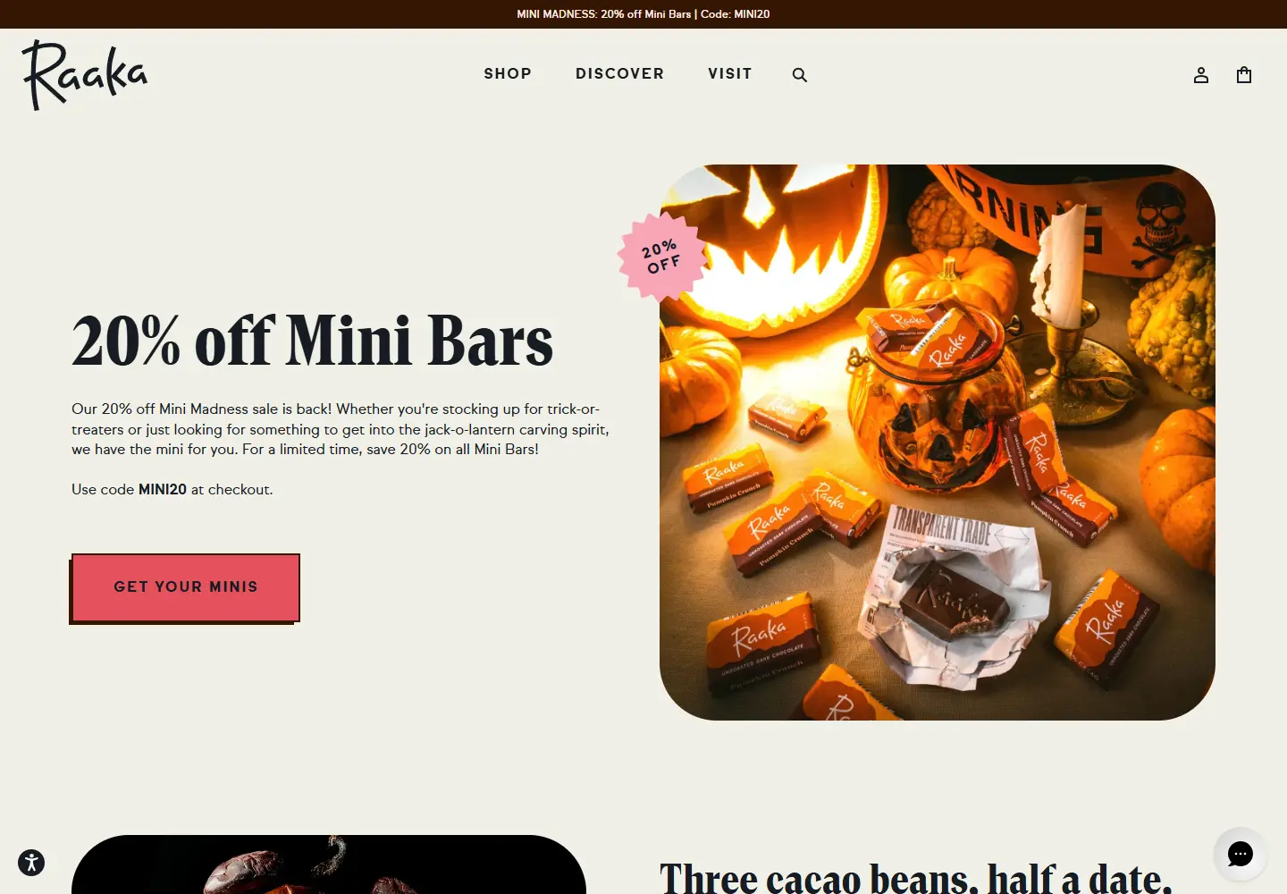
Hero: A large seasonal photograph and a direct mini-bar offer put the product before the company story. The headline is easy to scan against the bright campaign colors.
Color & layout: Warm orange and pink accents sit beside chocolate photography. The contrast makes the shopping action easy to find without flattening the visual personality.
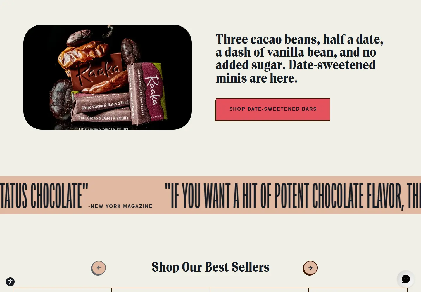
Product presentation: Date-sweetened bars and other ranges have separate routes. The shop gives shoppers a choice by product type instead of asking them to read a long brand statement first.
Brand detail: A later explanation of unroasted cacao connects the visual identity to a specific making process. The page presents that process as its own account, not an independently verified quality claim.
Who might find it useful?
Designers studying food-brand storefronts and campaign-led product navigation.
Website screenshots