SavvyCal
A scheduling page speaks to both the sender and the invitee.
Website overview
SavvyCal introduces scheduling from the perspective of both the person sending a link and the person choosing a time.
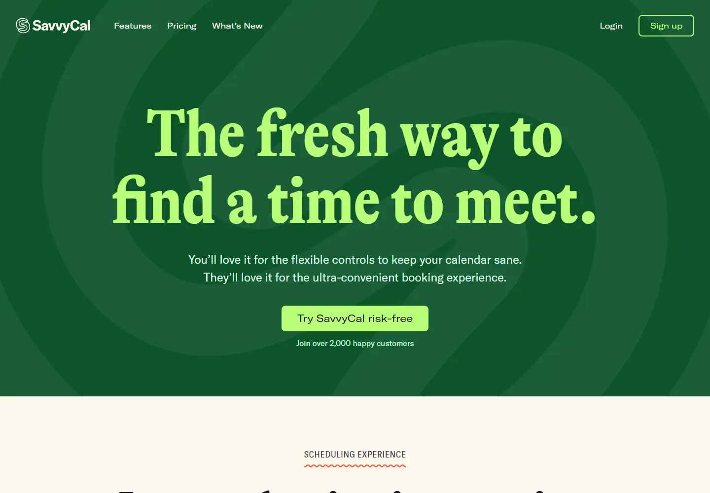
SavvyCal presents scheduling software with calendar overlays, booking-link branding and meeting controls. Its landing page emphasizes the experience on both sides of a booking.
What caught our eye
Hero & headline: An oversized serif line on a lime-green panel introduces the scheduling idea. The paired “you’ll love it” and “they’ll love it” sentences make the two-sided audience explicit.
Color & layout: Deep green and bright lime create an unusually strong frame for a calendar product. The call to action remains readable inside that contrast.
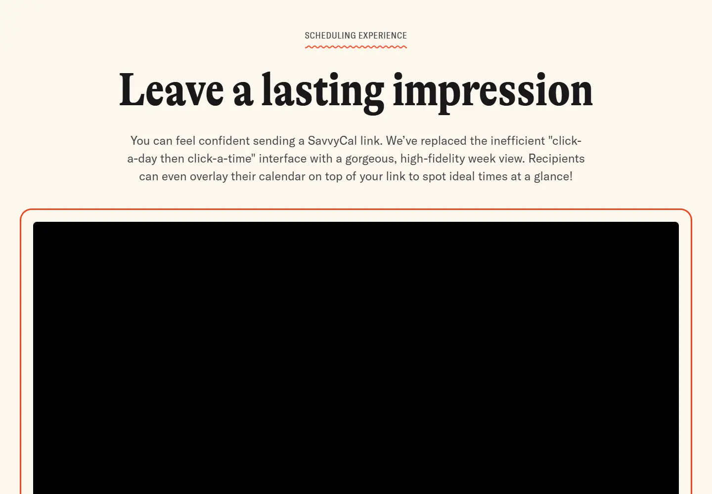
Product presentation: The next sections describe calendar overlays, branded links and meeting controls. Specific interface behaviors support the broad opening promise.
Trust strategy: The page includes a customer-count statement near its first action. It is a site claim, not a number we independently verified.
Who might find it useful?
Designers studying SaaS hero sections, dual-audience copy and strong color systems.
Website screenshots