Snif
Fragrance and candles get a product-led, campaign-heavy visual treatment.
Website overview
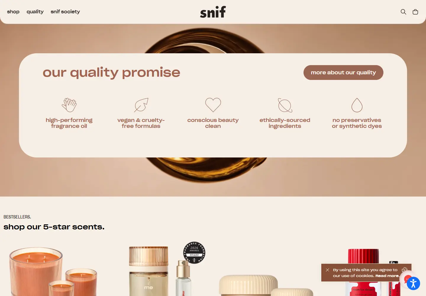
The Snif website introduces fragrance and candles through prominent product presentation and campaign imagery.
Snif sells fragrances and scented candles. The storefront uses distinct campaign imagery for collections and keeps shopping routes close to the visuals.
What caught our eye
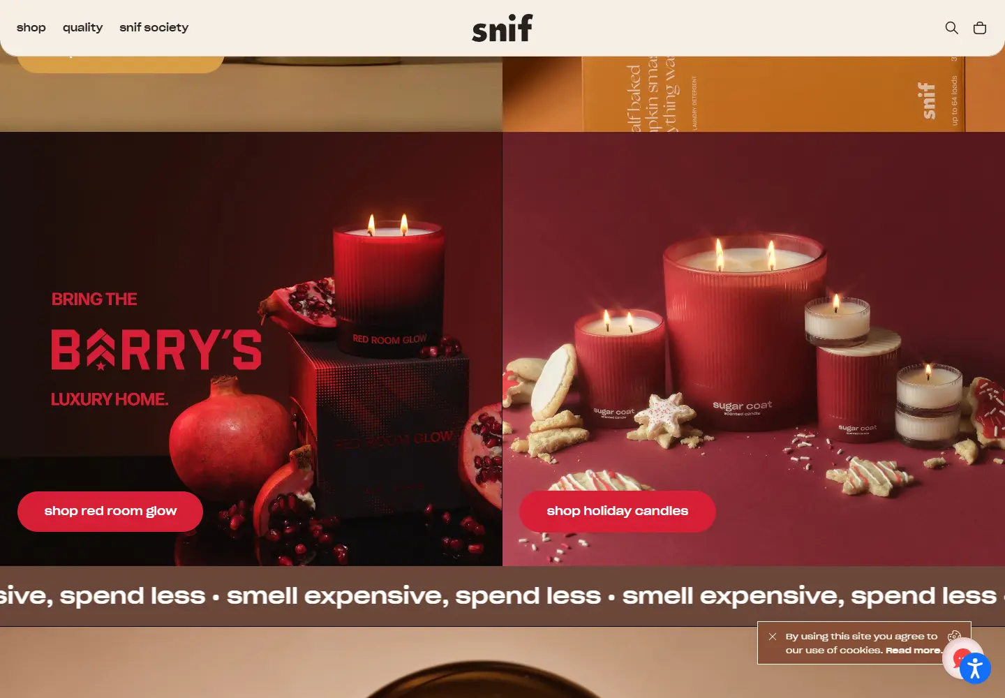
Campaign imagery: Large product photographs give each fragrance or candle collection its own atmosphere. The captured section pairs deep reds and browns with a clear shop button.
Layout: Split blocks leave room for the imagery and a short offer rather than packing specifications into the first view. The shift between collections gives the page a magazine-like rhythm.
Brand voice: The repeating “smell expensive, spend less” line supplies a recognizable verbal hook. It is a brand statement, not a comparison we verified.
Navigation: Fragrance, candles and seasonal collections have direct paths from the page. A visitor can move from the visual story into a product list without searching for the store.
Who might find it useful?
Designers studying sensory-product campaigns and editorial ecommerce layouts.
Website screenshots