Tony’s Chocolonely
Loud wrapper-inspired typography gives chocolate gifting several clear routes.
Website overview
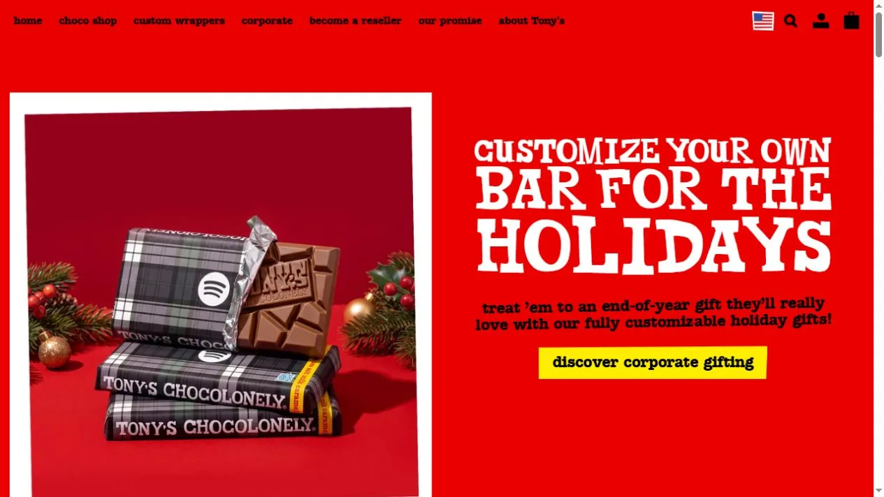
Tony’s Chocolonely sells chocolate and personalized gifts. Its US homepage puts custom wrappers in a holiday campaign. A photo of wrapped bars sits next to an oversized message and a yellow corporate gifting button. Shoppers who want standard products can go directly to the chocolate shop. The layout makes both routes visible without having to combine them into one offer.
What caught our eye
The bright red background and irregular white lettering recall the visual energy of a candy wrapper. Black navigation sits in a quiet band at the top and uses short labels. A thick white frame around the hero photo draws a boundary between the highly colored background and the darker product shot. You can still see the bars and the wrapper treatment at a glance.
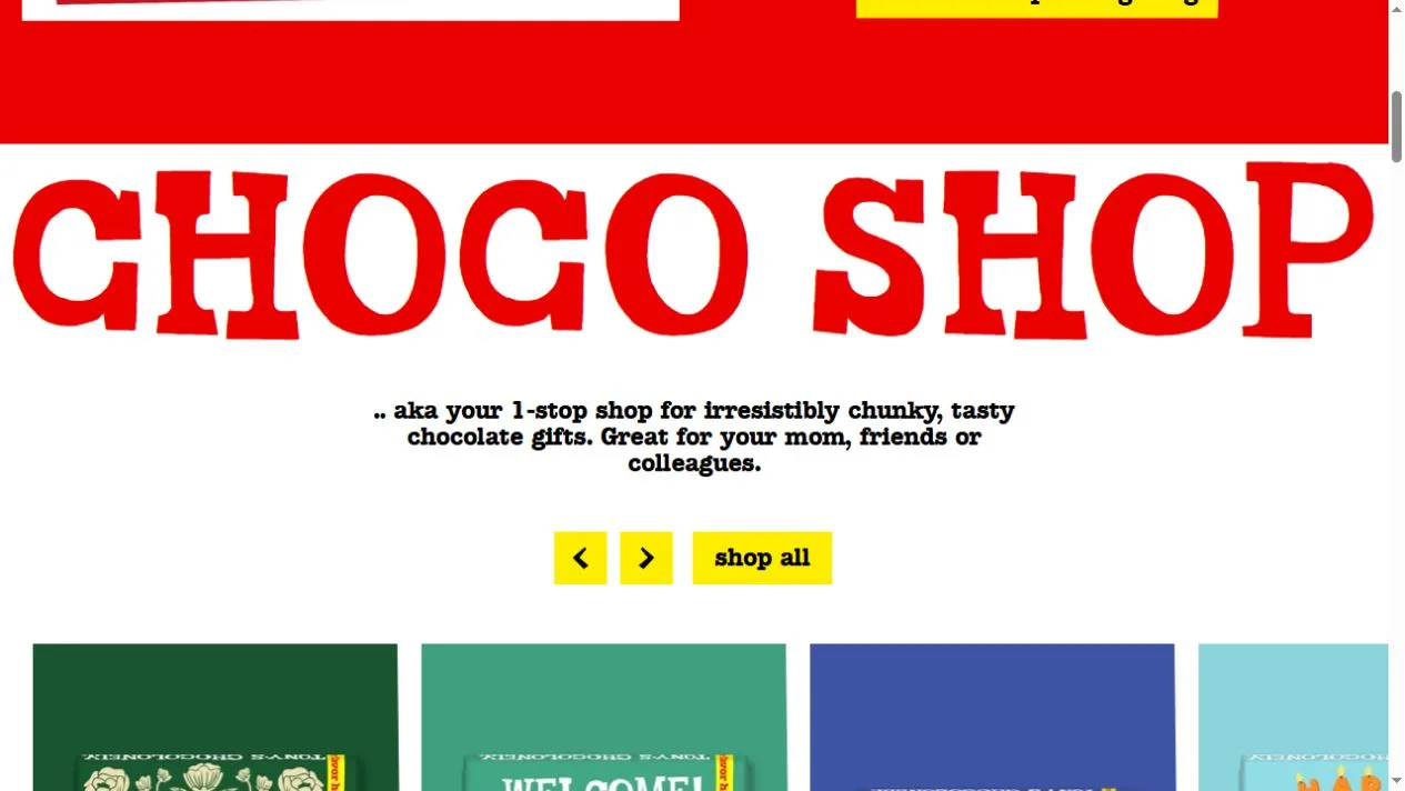
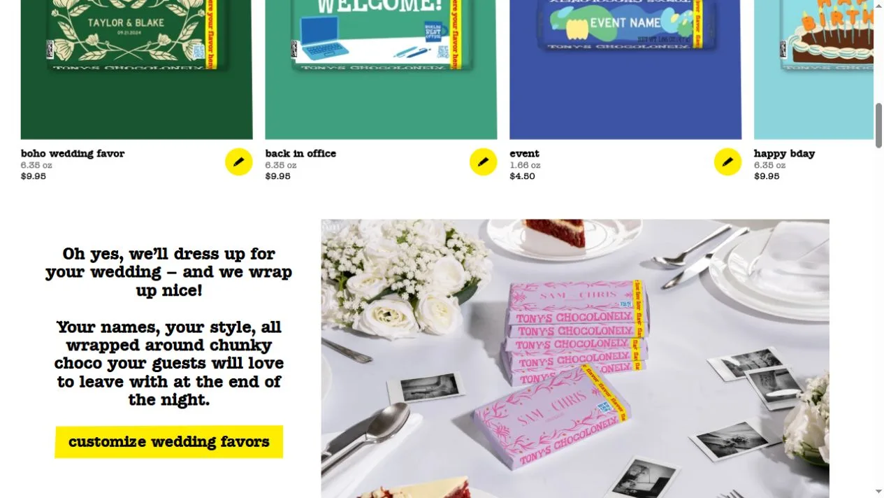
The shop section switches to an oversized section title and a row of square product blocks. Each block has a distinct colored background. Short names and prices bring the layout back to the practical task of choosing chocolate. The wedding-favor feature below applies the wrapper idea to a different use and lets the finished examples explain what is customizable.
The most useful design detail is that the gift audience changes as the reader moves down the page. Corporate gifts, standard bars and wedding favors share a visual language, while each section describes a separate reason to buy. A store with personalized items can study how the examples carry the explanation before a shopper opens any customization form.
Who might find it useful?
Designers and founders studying branded storefronts.
Website screenshots