Topo Designs
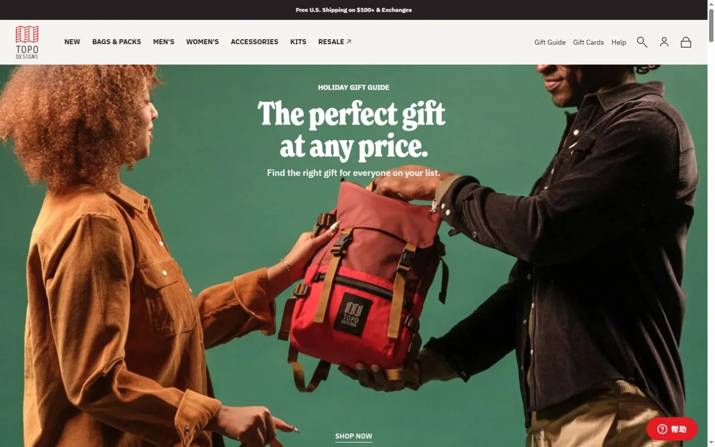
An outdoor gifting scene connects practical categories with seasonal color collections.
Website overview
Topo Designs sells backpacks, bags, outdoor clothing and accessories. Its captured homepage opens with a gifting scene centered on a red pack, then introduces categories through large photographs. Seasonal color collections and product rows follow. The store combines the feel of time outdoors with the practical distinctions a shopper needs when choosing a bag or a piece of clothing.
What caught our eye
The hero photograph keeps the pack between two people, giving the object a clear size and a reason to be there. The copy sits in the open space of the image. A small route into the gift selection connects the scene to a shopping task without covering the product.
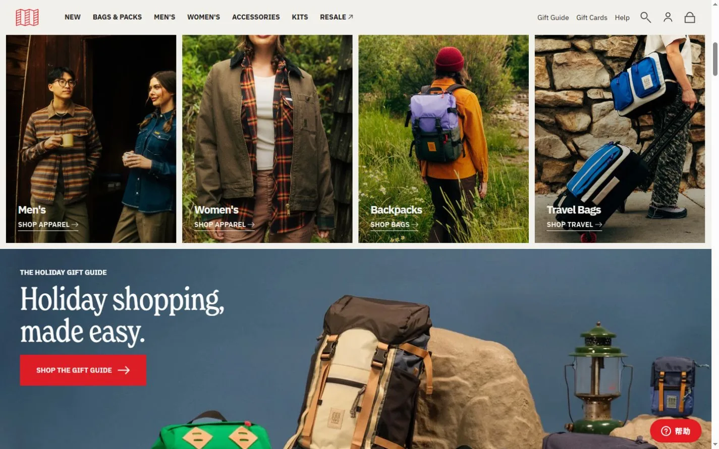
The category row uses separate subjects for clothing, backpacks and travel bags. These photos can do more than decorate the labels. A visitor can see how a pack is worn, where it sits on the body and how its colors combine with clothing. The structure gives someone browsing visually several clear directions to take next.
Further down, color collections provide a second kind of grouping. Category navigation answers what the item does, while a seasonal palette helps shoppers explore how several products look together. Designers can compare those two systems when a catalog has both functional differences and many color options. The useful reference is how the photography changes scale as the page shifts from a lifestyle scene to a choice among individual products.
Who might find it useful?
Designers and founders studying distinctive brand websites.
Website screenshots