Design notes · Five close readings
Website color palette examples you can learn from
A yellow background and a yellow button do different jobs. One can fill your first screen; the other can mark a single action. The colors in a palette tell you only part of the story. Their size and position matter just as much.
These five website color palette examples show different ways to handle that balance. Liz Wilcox gives the headline a bright stage. SavvyCal puts lime on deep green. OLIPOP lets a product campaign shape the hero. Designjoy concentrates gradients around an offer, while Buttondown brings illustration colors into a mostly white page.
Each example below refers to a desktop screenshot held in LatticeSpot's editorial collection. Homepages and campaigns change. Treat these as observations of the captured designs, rather than a record of every site's current appearance.
Liz Wilcox gives the headline the largest area of color
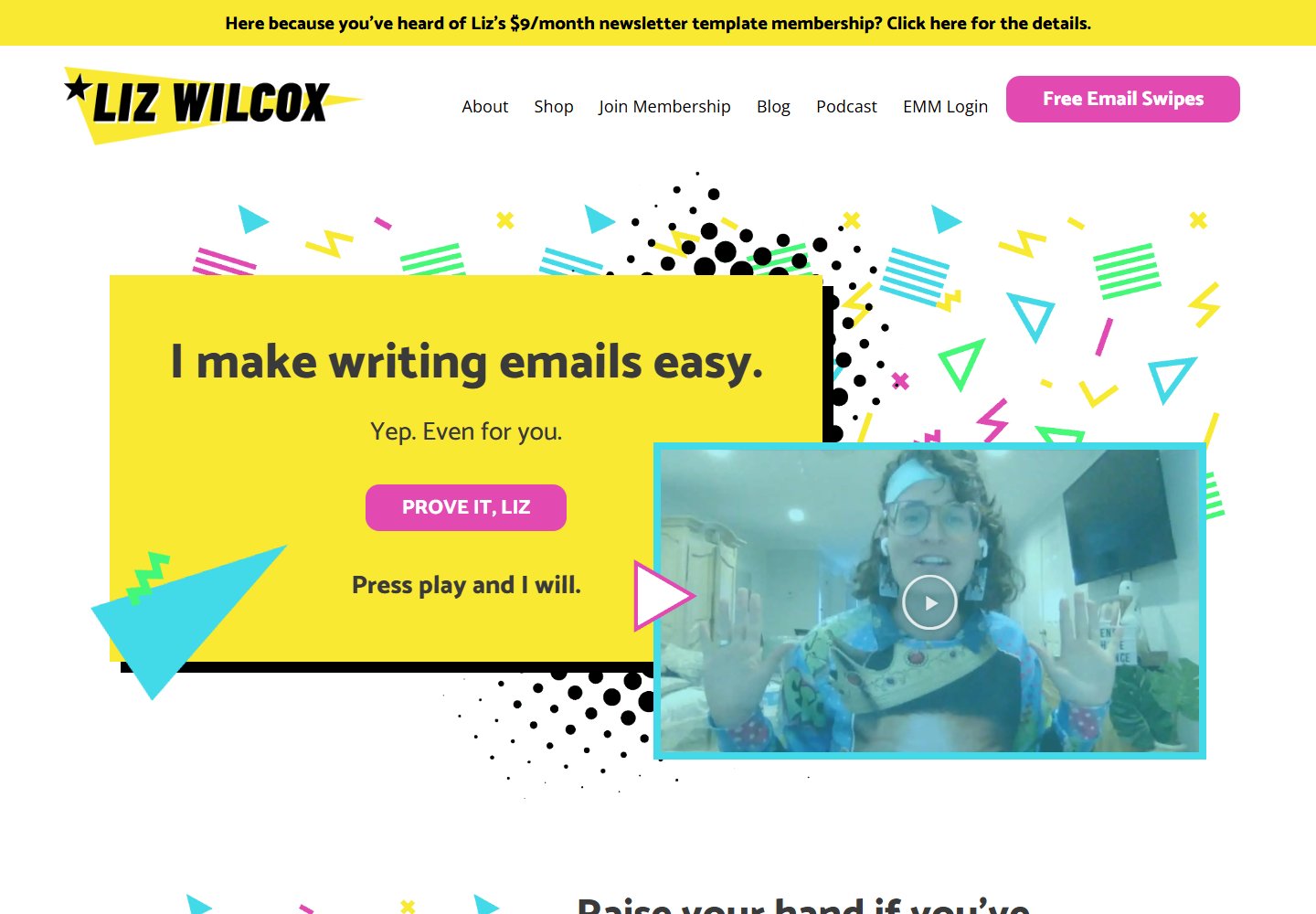
The yellow panel takes up a substantial part of Liz Wilcox's captured hero. It holds the headline, supporting text and a pink button. A turquoise frame surrounds the overlapping video. Small geometric shapes repeat those bright colors across a white background.
There are several strong colors, but their areas differ. Yellow gets the broad surface behind the message. Pink marks a compact action. Turquoise draws an edge around a separate piece of content. White space keeps the scattered decorations from becoming one continuous pattern.
That distribution is useful to study when a page needs both a distinctive personality and a clear opening message. Giving every element an equally vivid background would create a different hierarchy.
Try it: Put your headline inside one colored area. Give the primary button a contrasting fill, then leave space around the pair. Compare that version with one where several surrounding sections are equally bright. Check which message you notice first.
See the Liz Wilcox screenshot and details.
SavvyCal repeats lime across the headline and action
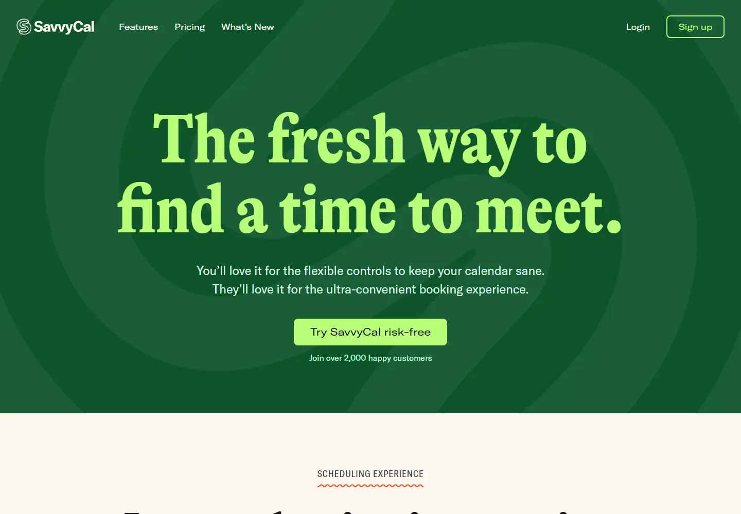
SavvyCal's captured hero uses a deep-green background with large lime lettering. The call-to-action button repeats the lime. The headline and signup route belong to the same small set of colors.
This example is especially useful beside Liz Wilcox. In one, the bright color fills a panel behind dark text. In the other, it forms the lettering itself. A similar sense of brightness comes from two different relationships between text and surface.
The button still needs its own shape and spacing. A shared color alone cannot explain which text is interactive. Read the hero once for its color, then again for the boundaries of the button and the words inside it.
Try it: Make two versions of a hero using the same pair of colors. Reverse the background and headline colors in the second version. Keep the wording and layout fixed so you can compare the effect of the color roles.
OLIPOP connects the text panel to the product photograph
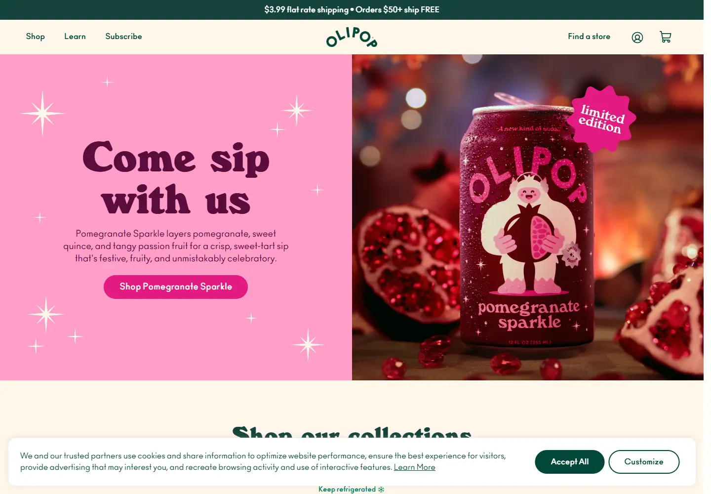
The captured Pomegranate Sparkle campaign pairs a pink text panel with a product photograph in a related color family. Dark plum lettering sits on the panel. Deep-green navigation frames the opening above it.
Here, the photograph contributes a large share of the palette. Looking only at CSS background colors would miss much of the composition. The can, lighting and surrounding image occupy enough space to influence how the whole hero reads.
The green navigation also matters. It gives the campaign a separate frame rather than extending the pink across every part of the screen. That separation is worth examining on a storefront whose featured product changes over time.
Try it: Place the actual product photograph beside your text before choosing the hero background. Compare a background drawn from the image with a neutral alternative. Review the navigation separately so its labels remain easy to distinguish from the campaign.
Designjoy concentrates gradients around the membership offer
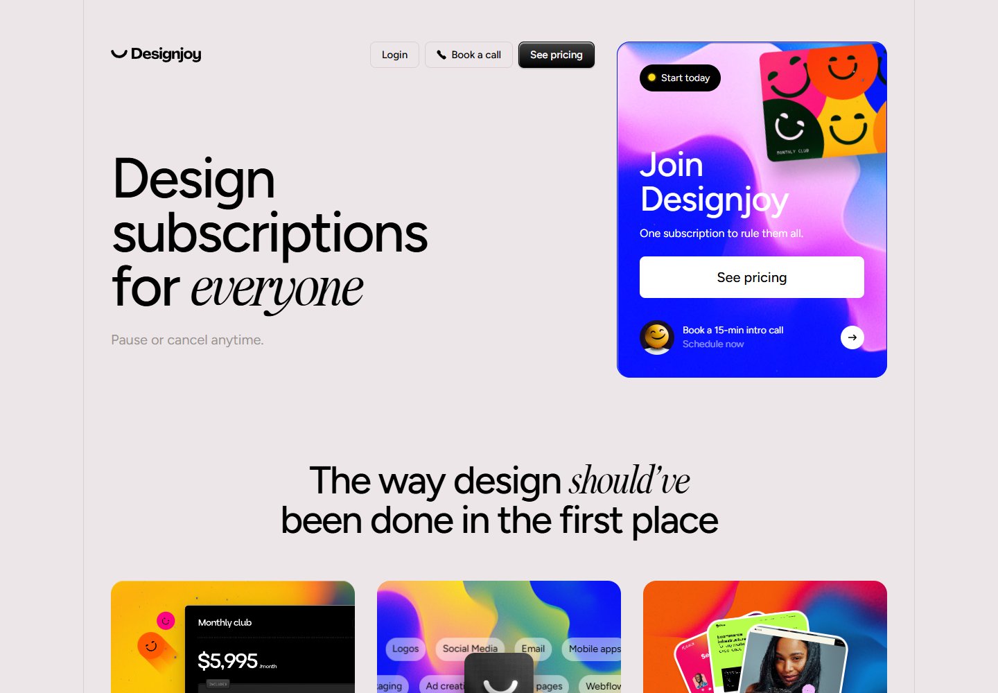
Much of Designjoy's captured page uses pale gray and black typography. Blue and pink are concentrated in the membership panel. Related colors return in the workflow cards further down the page.
The colored panel has more visual weight because much of its surroundings stays restrained. Its placement also connects the strongest color to the offer rather than spreading it evenly across every paragraph.
This is a useful reference when you like a vivid palette but want long stretches of copy to remain visually simple. The screenshot shows where the gradients are placed; it does not establish that this treatment increases purchases.
Try it: Apply a gradient to the offer panel in one version of your page. In a second version, extend it across the entire section. Compare the boundaries of the offer and the surrounding explanation at the same viewport size.
Buttondown carries illustration colors into interface elements
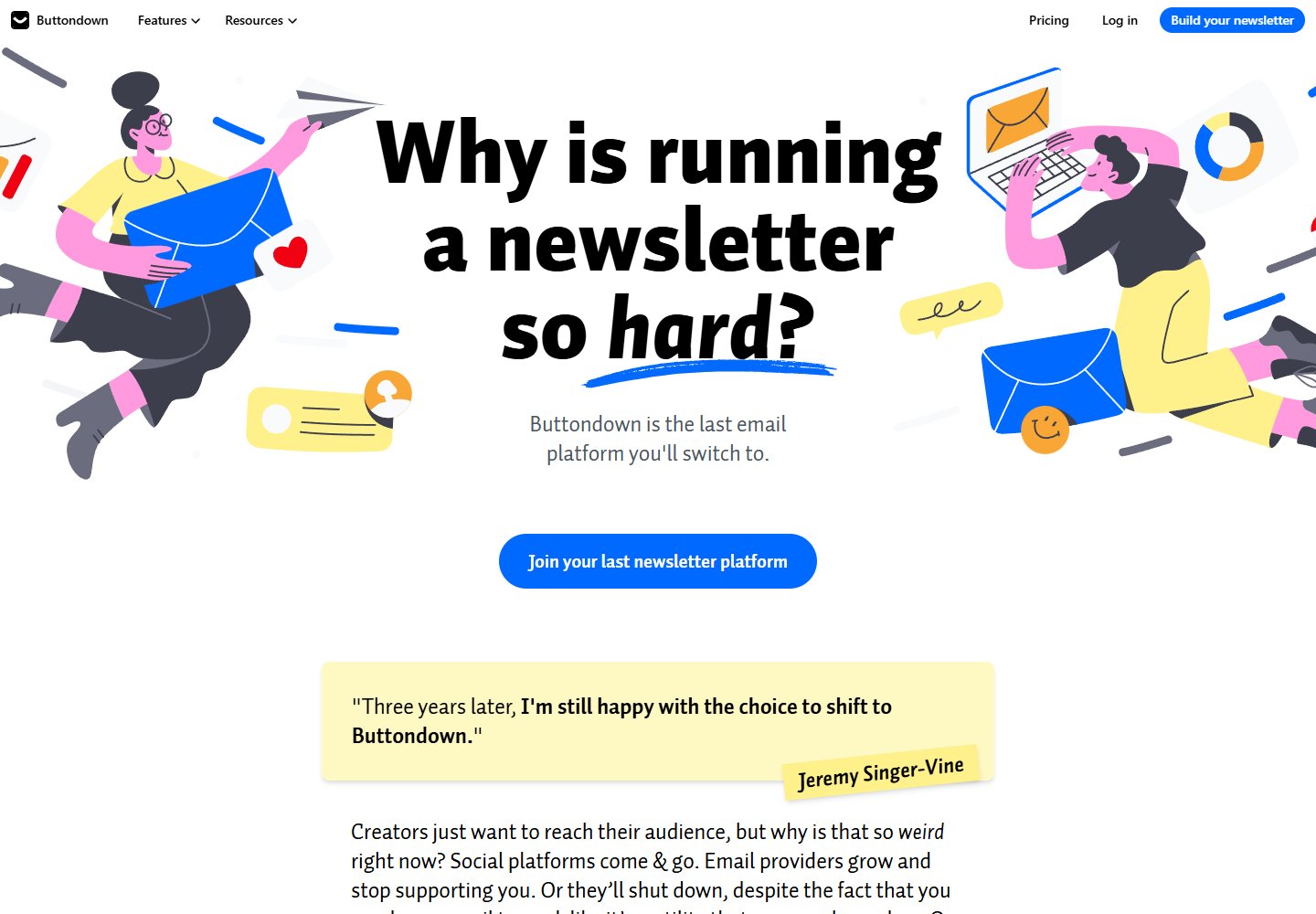
Buttondown's captured page is mostly white. Blue, pink and yellow figures surround a black headline. A blue signup button and a pale-yellow testimonial repeat colors from the illustrations.
The drawings supply much of the personality, while the interface borrows selected colors from them. That connection makes the illustrations relevant to the surrounding page rather than a separate decorative layer.
Notice how little colored background is needed. The white surface remains visible around the headline and figures. The page gets its color through objects and smaller blocks instead of a full-screen fill.
Try it: Choose one illustration already used on your page. Borrow a color for the main button and another for a supporting panel. Check whether each borrowed color still suits the text placed on it.
Build a palette reference that records the roles
When saving an example, annotate the screenshot before collecting swatches. Mark the largest background area. Identify the main text color and the primary action. Note which colors come from photography or illustration.
A short record might read: “Deep-green hero; lime headline and button; a separate button shape establishes the action.” That tells you more about the SavvyCal example than a row of green squares alone.
Keep the surrounding conditions with your reference. A pink panel next to a matching product photograph may behave differently beside another photograph. A gradient confined to a small offer card will occupy a different share of attention when stretched across the screen.
For your own page, check:
- Which area has the strongest color, and does it match what you want readers to notice?
- Can readers distinguish the main action from decorative elements?
- Does the actual product image work with the background you selected?
- What happens when the layout narrows and the image moves above or below the text?
- Have you checked text contrast and interaction states in the implemented page?
A screenshot can suggest a direction. It cannot confirm keyboard behavior, hover states or text contrast throughout a working website. Check those on your own implementation before treating a palette as ready to use.
Browse more examples with these details in mind
Open the colorful websites collection and pick a screenshot that catches your eye. Trace the largest color area, then find the action and the quieter space around it. Compare its use of color with a different example before choosing what to borrow.
For a wider selection of layouts, browse all websites or the brand design collection.
These are independent editorial observations of recorded screenshots. The featured websites have not endorsed this article. Color descriptions are approximate; this article does not present official brand specifications or measured conversion results.